A decade ago in e-commerce, nobody really cared what a team, that make products to consume, actually looks like.
However, with the rise of social media, a lot has changed. Facebook and other social networks made the web (and e-business landscape in particular) much more personal, and face-centric.
There is an obsessive need to see faces! Faces and personal information. Still, beyond photos, candidates must package their experience coherently. Checking out smart, modern resume formats is a quick way to do that.
DoMyWriting emphasizes that sometimes it goes so far that we prefer to see social media accounts instead of portfolios or resumes.
So here is a light DJ-set of best team pages to the date.
Page Builder
Get Page Builder to create an unforgettable presentation of your team on your website and win customer trust from the get-go!
Want to Make Your 'Meet the Team' Page Stand Out?
- Use 30+ building elements to create unique page designs. No coding skills required!
- Easily connect with users of all devices thanks to the built-in mobile-responsive design.
- Seamlessly integrate with any theme.
Sub Rosa
Here is an outstanding one from Sub Rosa. The idea is not to stick to the common face-centric logic of a presentation and to show what is usually hidden. We don't know whether guys from Sub Rosa had to turn their pockets inside out - but the idea is remarkable, no matter what was the source of the team page design inspiration.

Alquimia WRG
How good are you in chemistry? The guys offer an outstanding solution for the cool 'meet our team' page: each member is a vital chemical element. Yet together it is even more than chemistry - it is Alquimia. The message is - everything we touch turns to gold.

Stink Studios
Lightness is a keyword. The Stink's awesome team page design convinces us that there are no difficult challenges for their team. Their workflow is light and airy as their UI appears on the screen. Trendy background colors to say they are eager to work with young active enthusiasts - and hate boredom and conservative attitude.

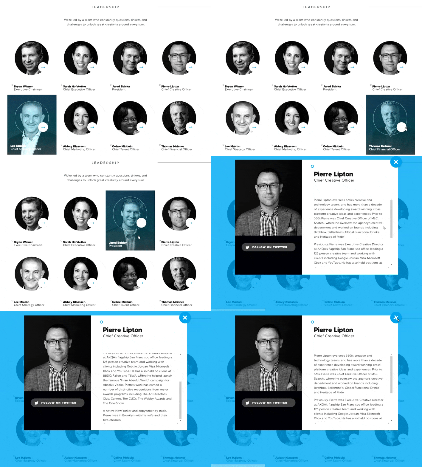
360i
The page represents a mobile and business-oriented team. The navigation is rapid and design is sharp as if the page was about the Formula 1 drivers. Cold colors underline that clients will be taken with all the seriousness they deserve. Trendy, rich and extremely official.

Leap
Leap company team page has a very creative drop-down. What type of employees would you like to know closer: Pet owners, Film geeks, Sports Junkies? It's obvious, the team work is splendid, for they are all either beer nuts or caffeine addicts.

Globule Bleu
A hypnotizing kaleidoscopic puzzle. No links to social media, no biographies, no cold official photos. Only a piece of favorite literature, 3 tracks music playlist, and a personal photo. Isn't it more than enough to feel the team's vibe?

Lateral
Just take a look - each member of the team is watching your every gesture and will hear your every whisper. The message: You will be treated as a king, any whims! No potential customer will resist such recognition.

Want to see more creative trends like these?
Subscribe to our newsletter to get them right in your inbox!
Targetprocess
Out of the box alternative for the 'meet our team' page. The company decided to show all their staff from tip to toe. With a single mouse click, you can move the whole departments hither and thither. Imagine, how you will be treated as a customer!

Blue Fountain Media
There are two modes: Party On and Party OFF. In other words, your face on a Monday morning and your face on a Friday's night. When the dudes are not working, they are partying and vice versa. What a life - maybe, this is why their agency often appears in various marketing top lists.

Big Cartel
Big Cartel are creative people who help creative people. The guys have funniest private videos compressed to half-dozen seconds. Sometimes it is a collage from various videos, sometimes slow-motioned web-selfies, sometimes a picture of an abandoned street. But always extremely dazzling.

Electric Pulp
Behind official photos, there are funny GIF's. Perhaps, they were even linked randomly but this is not the point. The message is to show that behind any official impersonal manager, there is a human being - sometimes a comic, sometimes a tragic one. As well as you, he or she watches funny movies, likes unhealthy food, and has same odd habits. And you want to work with people, not robots, right?

Latitude
Animated creative staff pages produce a very cozy vibe. How come you don't trust the guys if they are cartoons, ha? The animated page helps to escape the tense of official photos. You may like the people on photos or not, but with cartoons things are different. You just enjoy them and they make you feel safe and light-hearted.

Exponent
Another alternative with animation. Looks like drawings from a sketchbook. A very good and easy way to convert official and impersonal photos into something cozier and more intimate, with the warmth of home. With such page you trust the company eagerly, don't you?

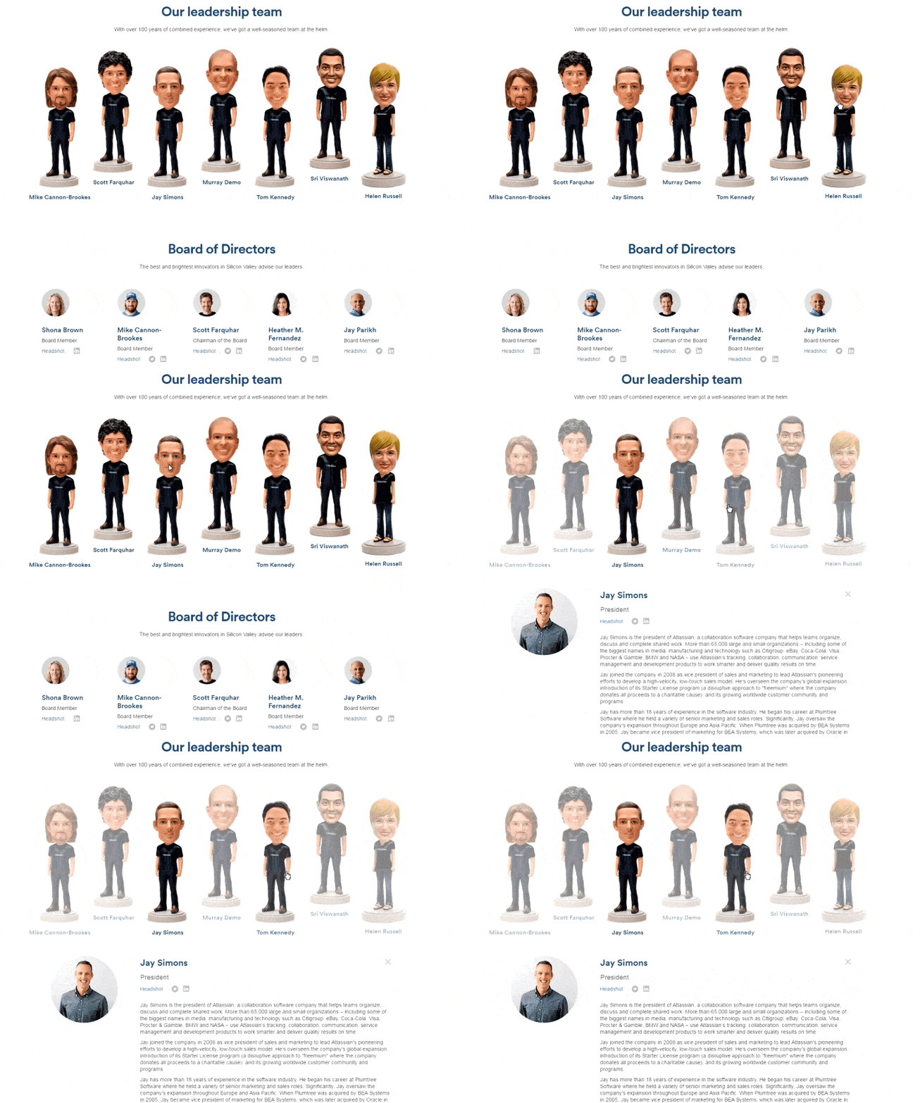
Atlassian
Shaking head toys invite you to relax and take everything easy: the guys who stand behind the toys are professionals and while they are working you can simply take a nap, after twitching their toy-heads a bit.

6tematik
The team page design inspiration was probably art covers of 60s Jazz records - they're nimated neat silhouettes with colorful patterns. There is a place for you personally - the company invites you for a cup of coffee as a client or a future partner.

Sagmeister & Walsh
The most stylish staff page you can imagine. The agency keeps an old rock and roll tradition alive and kicking - a great homage to Andy Warhol's screen tests. Jim Jarmusch and Lou Reed enjoy coffee and cigarettes somewhere behind the screen.

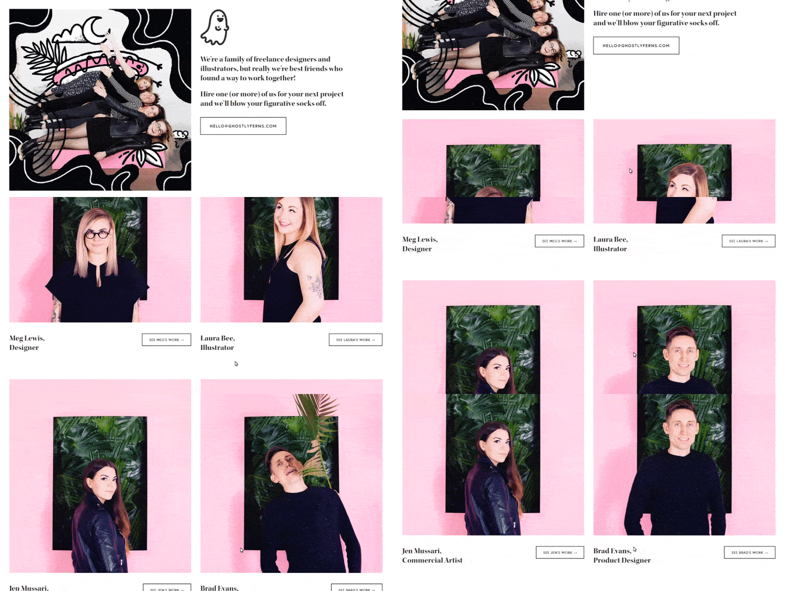
Ghostly Ferns
Bad girls have an excellent taste. Ever doubt this? A hipsterish mixture of pink colors and green leaves, Instagram photos from woman anti-Trump demonstrations, they even used to have "graveyard of interns" on their team page. Riot girls and boys with punk attitude - collaboration with them will definitely break you working routine.

Brave People
The creative team page rather looks like a prospect of Milano Fashion Week. This is a very simple magazine style design, but it looks fashionable and trendy all over.

Kickstarter
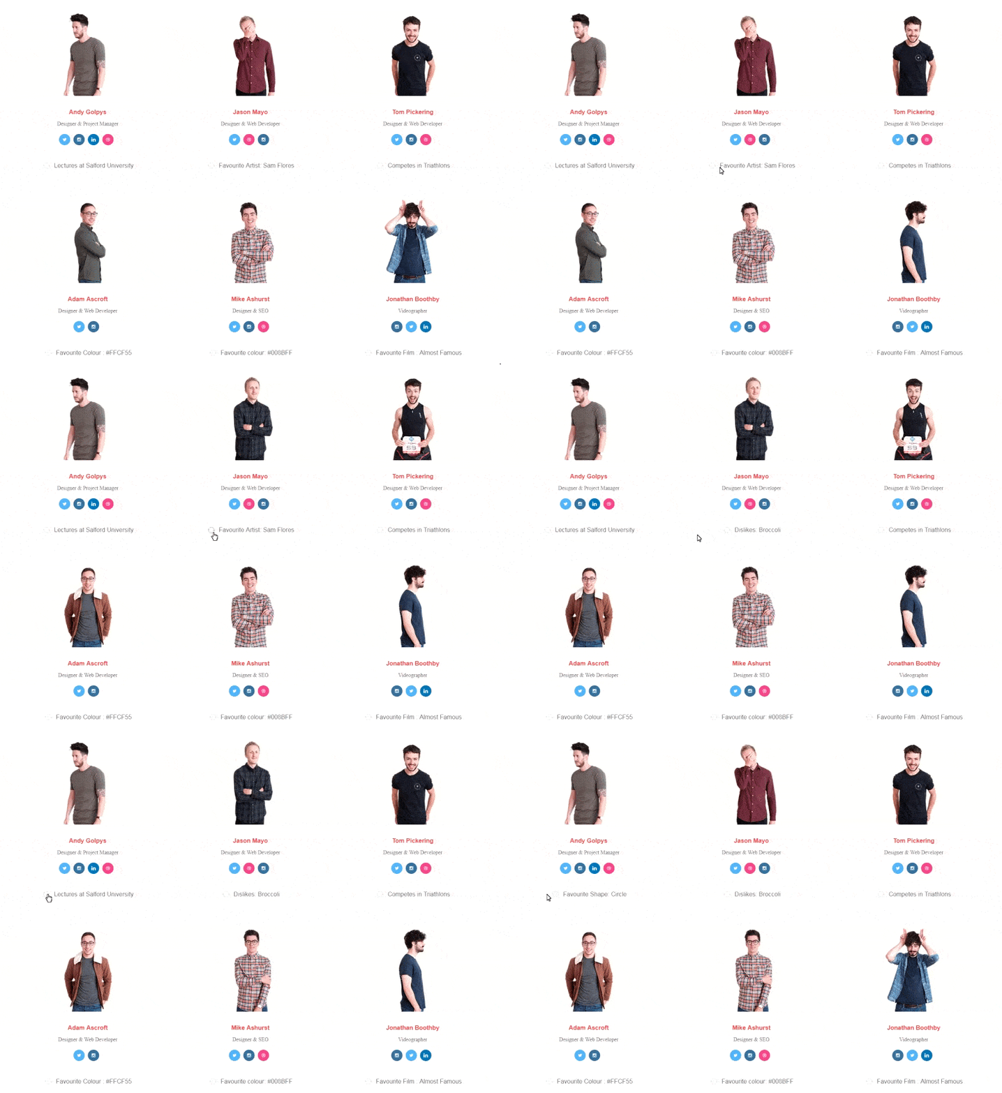
Thanks to Kickstarter many brilliant pieces of art were brought to the world. Who are the guys who made this possible? There are handy filters to monitor the team: look for musicians, poets, hackers. In personal information, there are numbers of completed projects and favorite category.

Carrot
Even if you have a carrot allergy, you are going to enjoy their creative meet the team page. They managed to present their huge team very compactly and in a good light. We may wonder why they need an employee number, but a second number usually links us to a very personal info. Perhaps, the two numbers are to contrast these formal and informal dimensions.

Bukwild
Lots of flickering layers, a lot of motion - which brings a feeling of density and frequency - people appear always in action, going somewhere, running, chatting etc. Private pages are informative and comprehensive as a compressed Facebook page - any personal info starts with "husband", "dad", "devoted wife", etc.
This Crowd
A blackboard as a background may symbolize that team is overloaded with ideas, always generating new solutions. They can easily change their view (and "erase" an outdated one) to fit their customer most demanding taste. There is also a handful of digital skittles flying here and there. Partly to defuse a monochrome look, partly to assure that collaboration will be fresh and sweet.

Passion Digital
An easy and neat solution, yet seldom to occur. The page has a slider, the slide show is automated, the photos are wide and clear. With a mouseover, you see social media icons. Backgrounds of photos are mainly bricks and folding screens to signalize: our team is something solid and stable, it is hard to knock us down, you are backed by trusted professionals.

Towa Digital
The slogan says Towa is Jung-Dynamisch-Hungrig. Sharply designed modular layout to present a collage of interesting facts and colleague's opinions. Simple, stylish, and nice.

Etch Apps
Another clever UI/UX solution - the personal page has everything and more to tell you about its owner. Photos with narration like "this is the park where I am jogging", "this is what I do when I am bored" and etc.

Studio MPLS
The crew has style. Black and white photos with lovely snowflakes can't be too elegant. There is no animation or perplexing navigation, but professional photography impress with the feeling of space, as a good piece of art. Quality and reliability - that what the page represents. The absence of motion seems to show that the studio is a trusted reliable partner - you will get what you expect.

Made by Shape
There is a witty generator of important facts about each member of the team. The generator saves a lot of space on the company page - you don't see the information you are not interested in.

Cinco
Skyblue background and light ajax scroll, fancy photos with dogs, nice smiling people - what should clients expect from such agency? Right - everything will be very, very cute! Like in the fairy tales.

Madwell
Brilliantly written bios and plain neat photos perfectly go together. There are some odd facts in every bio to get the feeling that you ran into an old good friend. Besides, you can easily filter the team by the departments.

AREA 17
No extra stuff with layers or navigation, no overcomplexity. The page represents mobility and confidence. Simple but reliable service with everything in right place. We can be sure that during negotiations they are open and fair, and their production is clean and precise - without awkwardness and unnecessary complexity.

Cultural Solutions UK
Parallax scrolling is combined with unusual solution for the team and partners presentation. No photos and social media: just the facts that concern the business.

Little tips for a creative Team Page:
Did you like those cool team pages? Be ready to create your own one!
I guess it's not necessary to say that you have no invest into proper photography and to be creative when describing your colleagues. What else can be done here?
- Have fun. Yes, this is number one advice. Have fun and don't do anything that will make anyone of the crew feel uncomfortable. Because an awesome team page is not only for your potential customers, but also it's something to rise up the fighting spirit of your little army.
- The creative team page is a wonderful place to show that you're hiring.
- Try video. It gives a real good panoramic overview: people in motion, in their routine environment. There is no need in talking or acting special - you are not a group of entertainers. Today the quality of the Internet connection allows not to be afraid that the page becomes too heavy.
- You'll be impressed by what you can actually do with modern HTML and CSS, so don't limit your design team.
- If your team is on the bigger side, consider dividing it into departments with the help of visual tricks.
- Team pages should be responsive. Well, frankly, all your site’s pages should be responsive. But this time, challenge your e-commerce management team to ensure fast performance for such a design-heavy page.
- In 2017, a surprise factor became a must. Now visitors are looking for it on team pages. Don't disappoint them!
New services for business growth
Struggling with a technical issue? Our custom development team is always ready to help you deal with any challenge and create a custom solution to cover your business needs. Check out our new services - Shopify Custom Import Service, Shopify Integration Service.


