The average conversion of an online store is somewhere between 1% and 2%, which means that up to 99% of users that visit your website don't make a purchase. There are dozens of reasons why this happens, but today we will focus on one of the main — poor product filters.
According to Baymard Institute research, 84% of online stores offer a poor or passable filtering experience, and only 16% of e-shops have good product filters. And at the same time, improving your store navigation can increase your revenue by 76% and conversions by 26%.
We’ve prepared an overview of the 5 mistakes in product filters and how to fix them in your Magento 2 store using only one tool - Improved Layered Navigation.
Mistake #1. Lack of category-specific filters
Over 40% of e-commerce websites don’t have any category-specific filters. For example, home appliances stores can sell laptops and washing machines, but these categories are completely different and should include additional filters like spin speed for washing machines or screen size for laptops.
Best practice: When choosing what features you want to display on the frontend as filters, check what specifications you already display on the category page. (For example, color, size, type of package, price, etc.) Thus, you will not only make convenient category-specific filters but also remind users that these parameters are important.
Mistake #2. Don’t highlight important filters
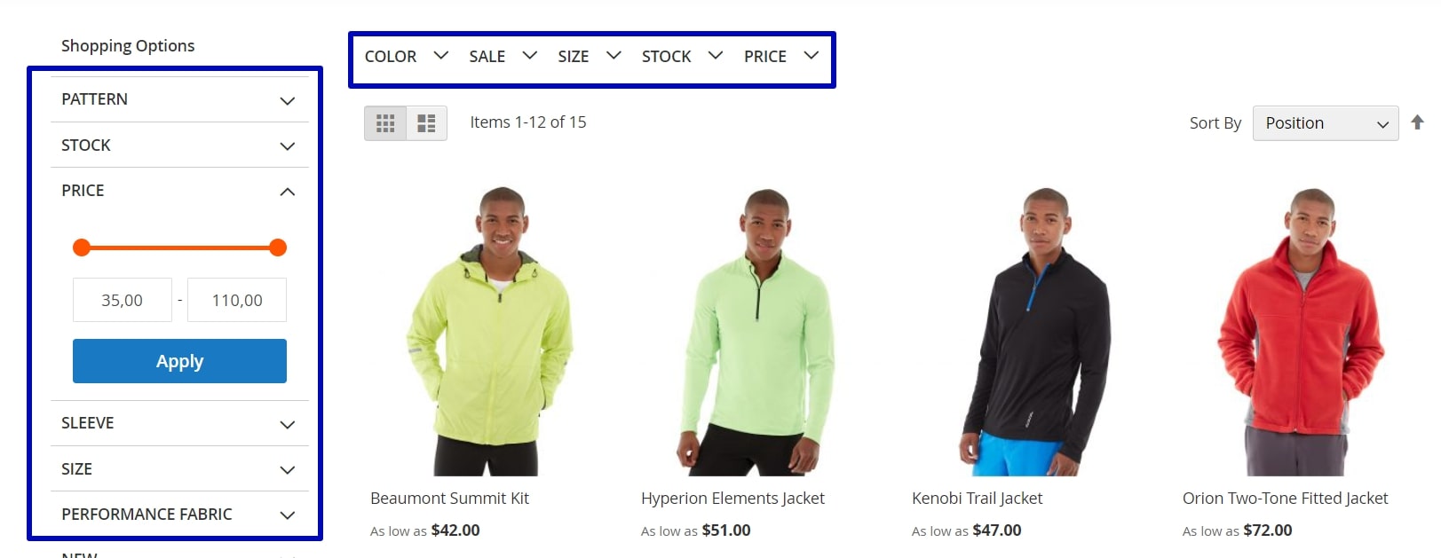
According to research, users perceive top navigation, for example, a mega menu where you choose a category, as something you should select obligatorily, and filters that are displayed on the sidebar as something optional or unnecessary. That’s why experts recommend highlighting the most important filter on top of the product list. However, 84% of online stores don’t do it.
Best practice: Choose a couple of the most common and important filters and highlight them on top of the product list, but be careful and use them where they are really necessary. Also, it is a good idea to keep these filters on the sidebar as well:
Most shoppers are used to reaching for the sidebar when they want to use filters.
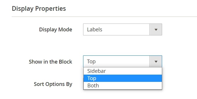
How to enable the Magento 2 horizontal layered navigation?
Here's what you need to make important filters visible: To enable the Magento 2 horizontal layered navigation feature, go to Stores > Attributes > Products, choose the necessary product characteristic, and open the Improved Layered Navigation tab. In the Display Properties section, set the position of a specific filter:
Mistake #3. Display a long list of filtering options
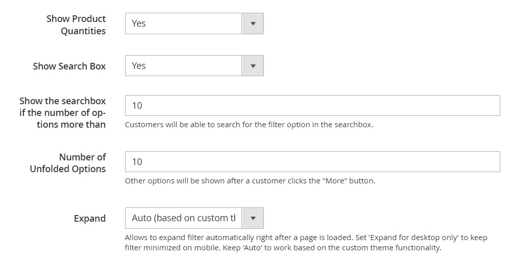
Over a quarter of e-commerce websites display a long list of available filter options. However, it’s not recommended to display over 10 values of 1 filter.

How to shorten visible filtering options: To specify how many filtering options should be displayed on the frontend, go to Stores > Attributes > Products, choose the necessary attribute, and open the Improved Layered Navigation tab. In the Display Properties section, you can enable the search box for this filter and set the number of options that will be displayed before the More button:
Mistake #4. Don’t make filters clear for the target audience
When you set up layered navigation category filters, you need to speak to your customers in the same language and make filters and their values as clear as possible. Otherwise, users won’t use them.

Also, if you are running a promotion that involves products with specific parameters only, you can create custom pages with this product collection using pre-defined layered navigation filters. Thus, users will see all the products that participate in this promotion.
Mistake #5. Don’t let visitors use back-button
Research shows that users perceive the application of any filter as a new page loading. Even if you use AJAX technology that allows you to apply filters to the product list without reloading the whole page, users expect that the back button will return them to the previous filter states. However, a third of e-commerce websites don’t meet these expectations and don’t save filter changes as separate events in the browser history.

The ?stock=1 part is the alias that will allow the user to go back to the previous filter state.
Also, you need to remember that your URLs should be user and SEO-friendly. Don’t forget to exclude unnecessary pages from crawling.
Learn more about SEO best practices for navigation →
How to implement user and SEO-friendly URLs: When you configure product attributes as described in Mistake #1, you can open the SEO section and see the following settings available:

For more SEO features, check out our user guide.
Bonus tip for multi-brand stores
People that visit multi-brand stores often have just a few favorite brands, and they are looking for their products only. So it is important to let shoppers filter by brand, have a special brand-related page, and the All Brands page. Also, you can upsell products from a particular brand to increase your average cheque:

How to configure brands: To add brands and allow your customers to find needed products in your store, follow this video guide:
Bonus: How can I create a vertical menu in Magento 2?
To create a vertical menu in Magento 2, go to the admin panel, navigate to Content > Elements > Widgets, and create a new widget with the "Catalog Category Link" type. In the widget settings, select the desired category and configure the display options, such as choosing a vertical layout and setting the maximum depth of subcategories. Finally, place the widget in a sidebar or another desired location using the Layout Update XML or Widget Instances settings.
To sum up, here are the main tips for you to follow when you create navigation in your store:
- Create category-specific filters and highlight important filters on the top of the product list
- Make filters compact, clear for the audience, and visually appealing
- Let visitors use back-button
- Don’t forget about SEO and adapt URLs of filtering result pages to search engine requirements
- Use brand-related functionality if you sell products from different brands


