
When running a Magento store, your number one goal is offering an anytime anywhere access to your customers. A mobile optimised website can offer a seamless user experience across different devices and ensure that your customer will walk away satisfied and with a purchase.
Magento offers a range of tools and features that make it easy to create a mobile-optimised website. In this article, we'll walk you through the steps you need to take to make your Magento site mobile-friendly.
Subscribe to our blog newsletter and get the latest e-commerce trends, our extensions updates, and news in your inbox
Maximize the potential of your website with our Magento 2 extensions! Get set to revolutionize your online presence and skyrocket your success.
Step 1: Choose a responsive Magento theme
The first step in making your Magento site mobile-friendly is to choose a responsive theme. A responsive theme is one that adjusts to fit the screen size of the device it's being viewed on. It means that your website will look great on desktop computers, laptops, tablets, and mobile devices. There are many responsive Magento themes available, both free and paid. Choose one that suits your needs and customize it to match your brand.
When selecting a theme, make sure that it's compatible with the version of Magento you're using and that it has good reviews from other users.
One of the top-reviewed free Magento theme is Luma, which is included with every Magento installation. It's a clean, modern, and responsive theme that is highly customizable. As for paid themes, one of the new favorites is Hyvä. We have compared these two themes in one of our recent articles, especially in terms of performance, so you're welcome to check it anytime.

Step 2: Optimize visuals for mobile devices
Content is king, especially for a store. You want to have many descriptive images, videos, gifs, but being uploaded as is they can slow down your site's load time and hinder user experience, especially on mobile devices. To make your Magento site mobile-friendly, you need to optimize your images for mobile devices. Specifically, it involves using the right file format, compressing the images, and choosing the right dimensions. You can also consider reducing the number of images and videos on your site, or using lazy loading techniques to load images and videos only when they're needed.
When reducing the image size without blurring or compromising its quality, opt in for lossless compression techniques and manually adjust the compression level based on your site's needs. Additionally, it's important to use the correct image format for each image type. For example, JPEGs are best for photographs, while PNGs are better for graphics and logos.
Step 3: Simplify navigation
This is one of the most complicated steps, because mobile navigation is inherently different from desktop navigation. To simplify your site's navigation, you can use a drop-down menu or a hamburger menu to display your site's categories and pages. You can also reduce the number of items in your menu and make sure that your menu is easy to read and use on a small screen.
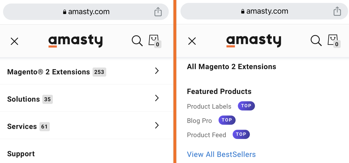
Our UX/UI expert, Veronika Dovydenko, says that "the most annoying thing stores can do when optimizing for mobile is assigning 2 different actions to a single control."
Here’s how we’ve solved this mystery at Amasty. On our desktop website version the Mega Menu allows hovering and clicking, so that each category expands with subcategories upon hover and leads to a subsequent subcategory page upon click.

This behavior isn’t applicable to mobile devices, therefore we’re splitting this action to 2 separate taps. On mobile devices, the user will be able to tap on the category (marked with an arrow to show additional steps available), get the list of subcategories and then tap again to land on a chosen subcategory page:
Step 4: Use mobile-friendly fonts
Fonts that are easy to read on small screens are essential for mobile users. Avoid using fonts that are too small or difficult to read, and make sure that your fonts are large enough to be readable on a small screen. You should also choose fonts that are widely available on mobile devices to ensure that your site looks the same on all devices.
Some examples of open source fonts that can be downloaded and used without any cost include Open Sans, Roboto, Lato, Montserrat, and Source Sans Pro. They are popular, easy to read on both desktop and mobile devices as well as quite simple and elegant.
Step 5: Test before you trust (on mobile)
It's crucial to test your site on different mobile devices to ensure that it looks and functions correctly. You can use cross-browser testing tools, such as BrowserStack or Sauce Labs, to test your site on a variety of devices and browsers. Make sure that your site's pages load quickly, that your site's navigation is easy to use, and that all the site's features are functional on all devices.

Here are some of the must-test metrics with general performance benchmarks to help you easily pinpoint areas for improvement:
Page load time: Make sure that your site's pages load quickly on mobile devices. A good page load speed for mobile-friendly or responsive websites is typically under 3 seconds. Aim for a page load speed of under 2 seconds if possible.
Time to First Byte (TTFB): This measures the time it takes for the server to respond with the first byte of data. A good TTFB benchmark is under 200 milliseconds.
First Contentful Paint (FCP): This measures the time it takes for the first piece of content to appear on a mobile device screen. A good FCP benchmark is under 2 seconds.
Time to Interactive (TTI): This measures the time it takes for a page to become fully interactive and usable on a mobile device. A good TTI benchmark is under 5 seconds.
These benchmarks may vary depending on the type of website and the industry. Therefore, it's important to conduct research and benchmark against competitors to ensure that your site's performance is on par with industry standards.
Being ahead and staying ahead
In summary, by following these five steps, you can make your Magento site mobile-friendly, which will improve the user experience, increase engagement, and ultimately drive more conversions. Remember to re-check your store according to these 5 steps regularly to ensure that it remains responsive, user-friendly, and fast.


