
During the holiday season, store owners rush to make their Magento 2 most appealing. However, some of these speedy solutions may only make matters worse. I’ve been designing sites and apps for various customers for 10 years. These were both small e-shops selling just a couple of goods and large stores with multimillion overturn and endless lists of categories and items.
If I had charged a penny for any design mistake I fixed in those projects, I'd become a millionaire. No, a multi-millionaire. ;) In this article, I share Magento UX design tips to help you avoid unobvious mistakes in an e-store design, namely in the following elements:
- Main page
- Catalog/product page
- Shopping cart and the checkout
Magento Store Design: Popular Issues with the Main Page
There are 4 key problems here.
Mistake #1: Top navigation menu doesn't fit into the 1st screen area
This usually happens due to the banner size. To avoid these situations, you need to adapt your banner size to different screen resolutions. This way the banner won’t take up over half of the screen:

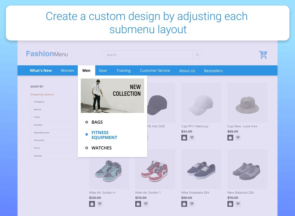
Mistake #2: Drop-down lists of categories don’t fit on one screen
This happens if you have a horizontal menu and multiple subcategories:
Here you have several options to follow:
- Navigation is not a sitemap, so making it grapes-like is not a good option not only for the Magento 2 UX design but also for your site SEO. Instead, I offer you to take a look at the sitemap and rank the elements by importance. Here's handy advice: "If it needs to be a landing page, it’s a category, otherwise, it’s an attribute". (Toni Anicic, Magento Certified Solution Specialist from Inchoo).
- When working on site navigation, don't focus on the number of clicks. The three-click rule is no longer considered an optimum. What does matter are clear navigation pathways so that the users always know where they are and how to get to their point of interest.
- You can hide some page elements that are not related to navigation in the footer or move them to additional navigation. These elements include settings that are rarely applied, contact info, and more.
- Though many stores still have top sales on desktop, today's Google is mobile-first, and it's the mobile version of your store that accounts for its ranking. To make sure mobile is well-covered, go to your Google Analytics account to detect the most popular devices and screen resolutions. Follow the path: Reports ->Audiences ->Mobile ->Devices. In this section, you'll find the list of mobile devices used to access your site. You can also check with the screen resolutions: Reports ->Audiences ->Technology ->Browser & OS. When designing the site or introducing new features, cover these resolutions first.
Mistake #3: Unwanted negative space around the website
This space is called whitespace, and in some cases, it serves as a design element itself.  If it’s not what you want, you can take some steps to fill it. You can fill the blank space with the login block, the shopping cart, your promo campaigns, recently viewed products, or additional info on your store’s benefits.
Mistake #4: Inefficient use of space on the adaptive site
This problem boils down to the following issues:
- Displaying contact info in the header of the mobile page.
- Links and info on non-product sections of the site are in the header.

To prevent these issues, you can try the following recommendations:
- To use the space efficiently, you can minimize the logo and collapse the search to icon size. Besides, it’s better to arrange promos, phone numbers, and drop-down menus in the hamburger menu.
- In the desktop version, you can place additional info in the menu. As for the adaptive site, it’s better to hide this info and only place links to your store’s categories.
Useful Magento 2 modules:
And here comes the promised extension tip:
- Mega Menu, a special menu-centered module:

Popular Magento UX Issues with a Product Page
This page is like a shop window in brick-and-mortar retail: it showcases products to motivate for a purchase. Therefore, it's important to deliver most engaging user experience.
Good intentions here often lead to different design mistakes.
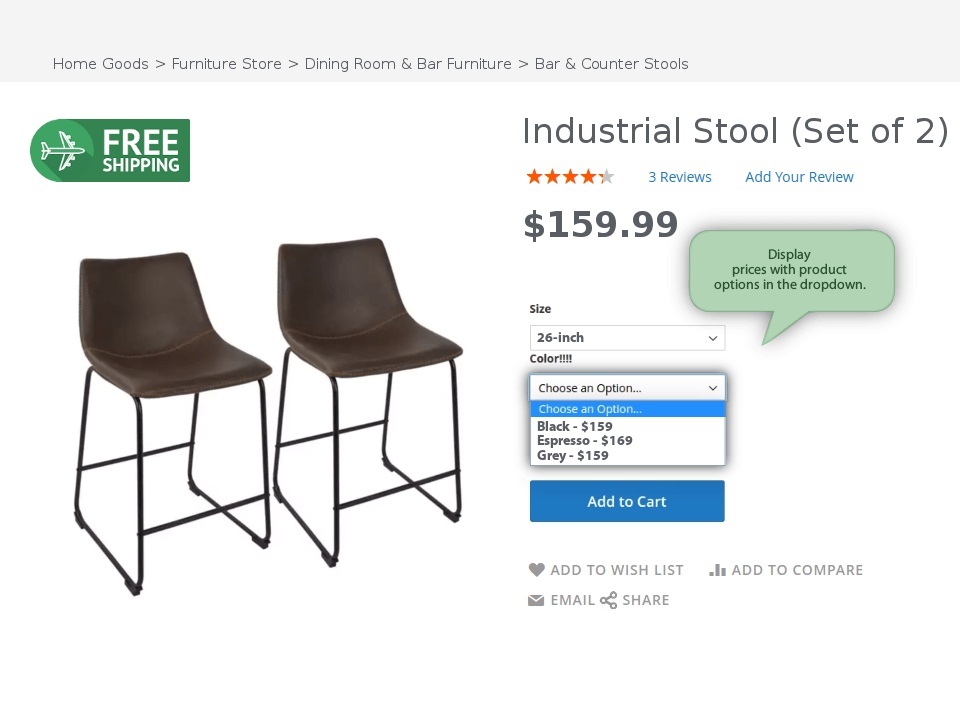
Mistake #5: Faulty use of labels on a product picture
 To avoid this issue, bear in mind the three tips below:
- Use labels that don’t overlap with the product photo
- Place labels out of the image area
- When it comes to large elements (counters, long-label images, etc.), they can be placed horizontally below the image
Useful Magento 2 modules:
There are Magento 2 modules that can make labeling easier:


Mistake #6: Poor accents in the 1st screen area
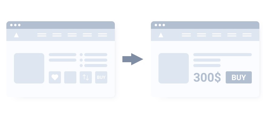
In the majority of cases, you should follow this hierarchy of accents:
- Product photo
- Price
- Call-to-action (e.g. Buy now)
Mind that the price element should be more catchy than the elements that drive customers away from the purchase button. Favorites, the product comparison button, and other functionalities should be less noticeable than the previous three points.
Useful Magento 2 modules:
- Item Labels;
- Magento 2 module for choosing item color.
Mistake #7: Excessive product info in the 1st screen area
We faced this issue when working on our website design. This situation is usually the result of conflicting demands from different teams/stakeholders.

Example. One team wishes to emphasize the new functionality, another team stress seamless compatibility with other products, and stakeholders believe that positive reviews should be stressed first of all.
You should stress the product info that is useful for visitors, i.e. how the product can help them and not your colleagues or partners. Move other data out of the first screen or hide it using the UI tools (bookmarks, spoilers, etc.)
Useful Magento 2 modules:


Mistake #8: Unclear interface
There are 3 key points to remember here:
- Always be honest with users. On the buttons, write clearly what happens upon clicking them (Submit → Confirm Payment). This is valid not only for buttons.
- Timely notify users about additional costs. This way you will foster trust in your store and lower the cart abandonment possibility.
- Avoid dark patterns, and specific design techniques that aim at deceiving the customer in some way. For example, you may be pushed to click on a brightly colored button and accidentally purchase a good you don’t need. In the short run, dark techniques may increase sales. But this has a reverse side that is often silenced: dark patterns cause an increase in returns, support overload, and the loss of customer loyalty.
Mistake #9: Out-of-stock goods not announced
I faced this problem when working on a shop that expanded faster than the owners expected. The turnover grew, and so did the customer base. At one point, the growth stopped because the owners had contracts with only one supplier a single delivery service.

To avoid this problem, you should connect with several suppliers of goods and carrier services. If the good is out-of-stock at the moment, the stock will be refilled soon, you should offer to notify shoppers about the good availability
Useful Magento 2 modules:


Mistake #10: Limited choice of payment and delivery options
You should let your customers choose a payment method as long as the carrier and delivery date and time. Sometimes the goods are needed urgently and the client is ready for an extra fee, and they don’t mind waiting for the standard delivery time. I urge you not to overdo it - customers will be grateful if you don’t make them think over these simple patterns of interacting with the interface for too long.
Useful Magento 2 modules:


UX Magento Design Issues in the Cart and the Checkout
There are 2 common mistakes here.
Mistake #11: Long and unhandy information fields in forms
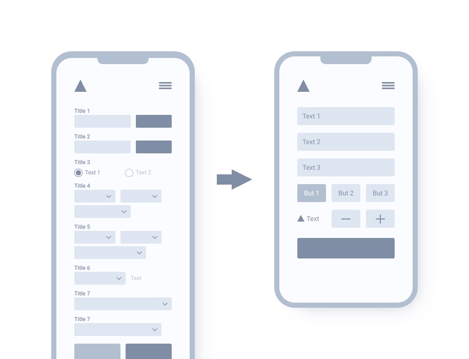
In this case, I recommend the following steps:
- Group fields by the meaning.
- Break lengthy forms into steps and screens. Few people like to fill out information “sheets”.
- Make use of UI components' powers to reduce the number of fields and interactions with them.
- Create default values based on frequently used data inputs or ready-made data (IP, data from the user account, etc.)
- Stress the field a user is filling at the moment.
Form field captions should always be visible. Don’t simply highlight mistakenly filled or missing fields. Try to explain the mistakes:

Useful Magento 2 modules:


Mistake #12: Inconvenient shopping cart
It seems nothing can go wrong when the customer has chosen the good and already added it to the cart. However, a complex and unhandy shopping cart page can put an end to their session on your site. On average, 70% of shoppers abandon carts without proceeding to the checkout. In some industries, the cart abandonment rate exceeds 80%. Disturbing, isn’t it? To solve this issue, you can simplify the shopping cart. Try out the following measures:
- Save users from mental arithmetic. Don’t force them to do math in your interfaces.
- Make ordering simple and make it registration-free.
- Let customers sign in via social networks. This way you’ll get the required data minimum without bothering them.
- According to stats, 56% of users aren’t ready for immediate purchases. They gather items in the cart to proceed with the checkout later. Such users are likely to get distracted. That is why it’s vital to hold goods in the cart until they return.
- If users have left their emails during the checkout, you can send them a reminder about the incomplete purchase. Such email notifications are most effective in the first 12 hours after they’ve left the site.
Useful Magento 2 modules:

Magento 2 UX Recommendations: Summing Up
As a rule, interfaces only cover the needs that lie on the surface. Broaden your focus. Consider why exactly users need this or that function or information. Then offer the solution they really need. In the majority of interfaces, mistakes are unavoidable. And if they arise, help your users overcome them quickly and easily.
Be sure to avoid these common mistakes and also don't stop learning because UX is changing very fast across the years. Read this Maze's UX design guide or any other guide from a well-known and reliable brand to stay up to date with the UX trends.


