
Sidebar
magento_2:banner-slider
Table of Contents
For more details see how the Banner Slider for Magento 2 works.
Guide for Banner Slider for Magento 2
Create an unlimited number of eye-catching banner sliders with no programming skills required. Embed Magento 2 Sliders anywhere in your store. Add target URLs to lead visitors directly to your special offers.
- Highlight sliders with a rich set of animation effects
- Automatically resize images depending on a screen resolution
- Simplify exploring sliders with navigation bullets and arrows
- WCAG compliance (for Luma Theme)
Extension settings short overview
- Each slider may contain from several banners or from just one;
- Banners and sliders should be configured separately on the specified grids for each;
- Several different sliders can use the same banner;
- You can assign specific banners to the sliders on a slider configuration page;
- You can specify the banner width only, the length will be adapted automatically;
- Sliders are embedded on the website through the widgets.
The extension is compatible with Hyvä Theme. You can find the ‘amasty/module-banner-slider-hyva' package for installing in composer suggest. The compatibility is available as a part of an active product subscription or support subscription.
The extension is read compatible with GraphQL. Expose the data like post page, recent posts, posts grid, recent comments, comments, categories tree, tags, author page, category page, etc. in order to build PWA/JS-based frontend
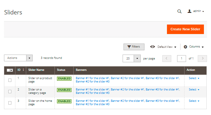
Grid of sliders
All sliders could be monitored and managed on the sliders grid. Please navigate to Content → Amasty Banner Slider → Manage Sliders to use it.
Here you can use mass actions to enable, disable, and delete sliders from the grid.
Click on the 'Create New Slider' button to configure a new slider.
How to create new slider
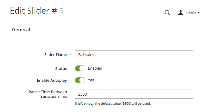
Slider name - please specify slider name here, e.g. 'Fall sales' or 'Slider with coupon code'.
Status - use the switcher to enable and disable slider. Its status will be automatically updated on the grid in a 'Status' column.
Enable Autoplay - set 'Yes' to enable the automatic slideshow. If switched off, users will have to click on each slide manually to see the next one.
Pause Time Between Transitions - If the Autoplay is enabled (set to 'Yes'), you can specify the time between one slide changes to another, in milliseconds. If left empty, the default value (3500) will be used.
Animation effects
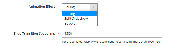
Animation Effect - use this setting to apply animation effects with which the slides transition will occur.
Three different animation effects are available for now:
Slide Transition Speed - please specify in milliseconds how fast the animation will be displayed. For proper slider display, we recommend setting a value of more than 1000 here.
Styles of arrows & bullets
To simplify user navigation through the banners on a slider you create, we've added an opportunity to equip sliders with navigation bullets (they show how many banners this very slider contains) and navigation arrows (thus user naturally understands how to see other banners in your slider).
See how three available arrow & bullet styles look on the frontend:


Navigation Arrows - set 'Show' to enable navigation arrows on the frontend.
Arrows Style - stylize slider navigation by choosing from three available arrow styles.
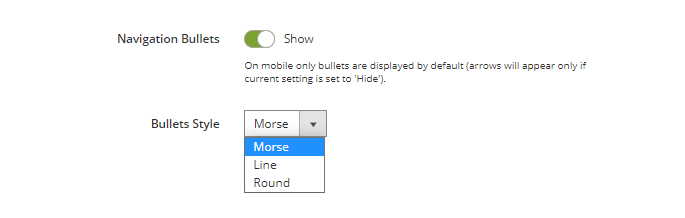
Navigation Bullets - set 'Show' to enable navigation bullets on the frontend.
Bullets Style - stylize slider navigation by choosing from three available bullet styles.
Enable Built-In Lazy Load - Use this setting to optimize your site performance through the optimization of the way how banners are loading. This option applies the Lazy Load effect only to the banners from the second to the last in the slider.
To enable the Lazy Load effect for the first banner in the slider please use the setting 'Enable Lazy Load for The First Slider's Banner' below.
Please note that only if the setting 'Enable Built-In Lazy Load' is set to 'Yes', the setting 'Enable Lazy Load for The First Slider's Banner' becomes available (see below).
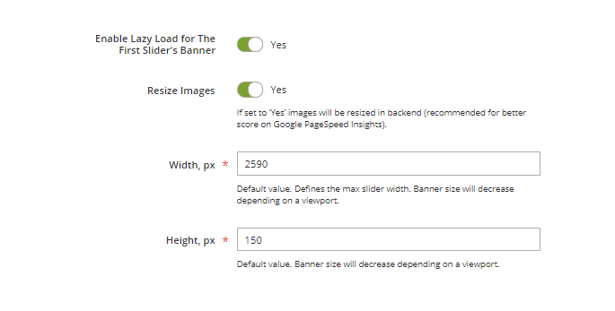
Enable Lazy Load for The First Slider's Banner - Use this setting to enable Lazy Load for the first banner on your sliders, otherwise, Lazy Load will affect all the banners starting from the second banner in the slider only.
Resize Images - If set to 'No', you'll be able to specify banner width only, and the height will be resized automatically. If set to 'Yes' images will be resized in the backend according to the width and height values you set (recommended for a better score on Google PageSpeed Insights).
Width, px - here you can specify the banner width in pixels.
Height, px - here you can specify the banner height in pixels.
Please note, that the setting Height, px is unavailable if you set the 'Resize Images' setting above to 'No'.
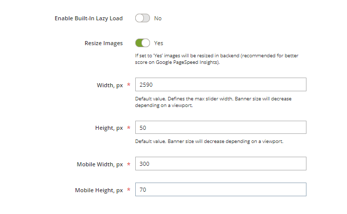
Please set to 'No' the 'Enable Built-In Lazy Load' setting' in order to configure the mobile width and height for your banners, otherwise it won't be visible.
Mobile Width, px - here you can specify the banner width in pixels for the mobile devices.
Mobile Height, px - here you can specify the banner height in pixels for the mobile devices.
How to assign banners to a slider
Please consult with the 'How to create a new banner' section of this guide first if you haven't created any banners yet.
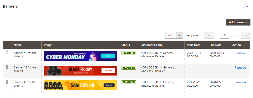
There's a simplified grid of banners below the configuration settings of each slider.
Here you can:
- see how many banners are assigned to this slider,
- monitor banner statuses,
- remove some banners,
- see the start and the end dates of the promo campaign (for how long the banner is active if specified),
- add new or even change their order with the drag-n-drop feature.
The banner preview feature helps to quickly navigate through the banners assigned to a specific slider.
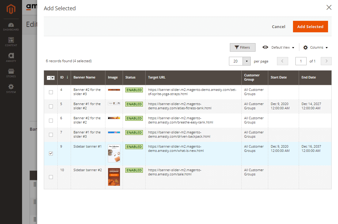
- Click on the 'Add Banners' button to add a new banner to the slider you are setting up. You'll see the vertical curtain menu with the banners grid and banners available for the selection.
- Put the checkboxes on banners you'd like to put in the slider and click on the 'Add Selected' button. These banners will appear on the simplified banners grid.
Grid of banners
There's a separate grid with banners only where you can:
- monitor statuses of the banners (enabled/disabled);
- see the minified banner image as a banner preview;
- see if a banner leads to any promo URL (the 'Target URL' column);
- see to which customer groups this banner is assigned;
- see the start and the end dates of the promo campaign (for how long the banner is active if specified),
- track the performance of your banners (impressions, clicks and click-through-rate or CTR),
- delete banners individually or apply mass actions for their deleting, enabling or disabling;
- edit banners.
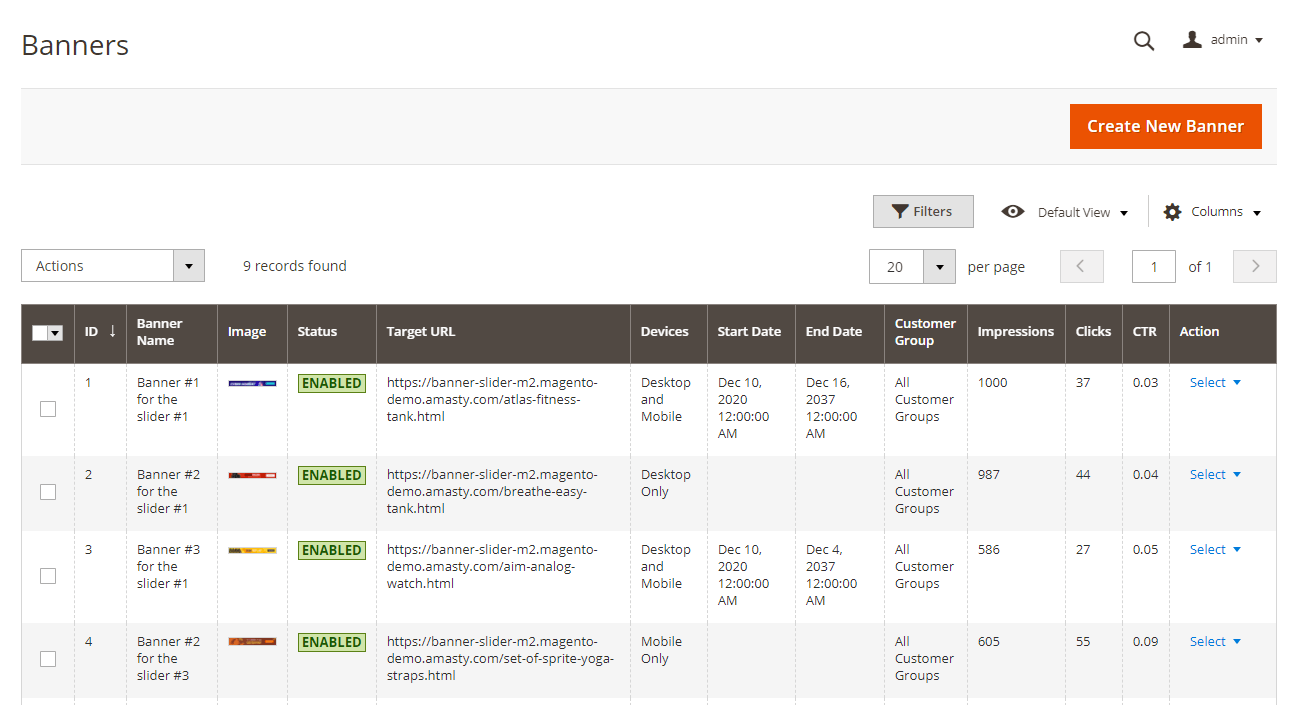
Please note that the banner performance statistics do not update instantly as the new data is collected. The data is updated automatically once a day by cron instead.
Some clarifications about the banner performance statistics:
- Impressions - here by the impression is understood the first real view of the banner by a site visitor (which means if a shopper didn't scroll to the bottom of the page to see the banner then it won't count as an impression).
- When the same user reloads the page and sees the same banner for the second time, it counts as a new impression.
How to create a new banner

Status - Set 'Enabled' to make banner visible on the frontend.
Start/End date - Here you can limit the slider display time (i.e. your promo campaign time) by specifying a certain period when the slider will be visible for your customers on the frontend.
Name - please specify the name of your banner here.
See an example how the Image Alt will be displayed on a frontend:

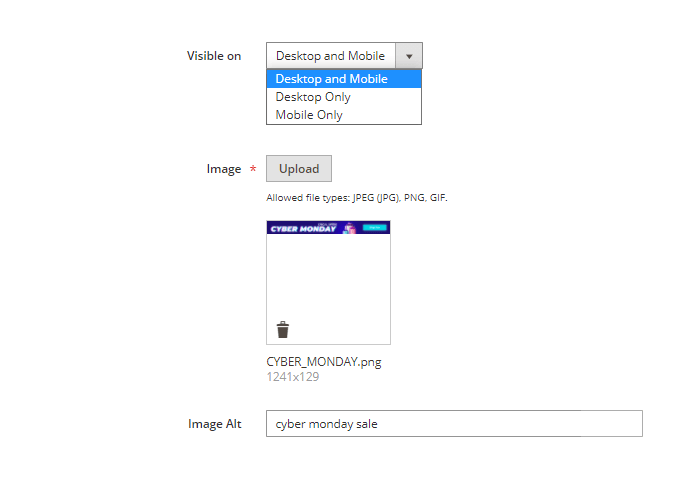
Visible on - Specify here whether this very banner will be available for both desktop and mobile view or for the desktop/mobile view only. This feature is especially helpful for adjusting the mobile view.
Image Alt - here you can specify the image alt to provide additional information about the image.
Image - upload your banner here. Please keep in mind that supported file types are the following: JPEG (JPG), PNG, GIF.
Please note that the size of the uploaded image is limited by the server settings.
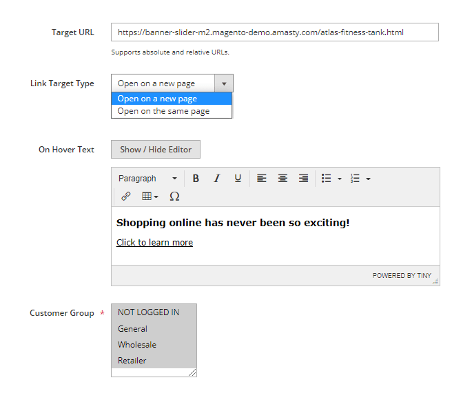
Target URL - you can specify any URL here so the banner will lead to it by a click.
Link Target Type - Choose how pages will open for the shoppers: on a new window or in the same window.
On Hover Text - here you can specify any text to provide shoppers with more information about the offer and thus motivate them to click on a banner. This text will be shown only on a mouse hover.
Customer Group - please specify customer groups for which this banner will be displayed.
How to embed sliders on store pages
If you configured all necessary settings for the banners and sliders, then it's time to specify where your slider or sliders will be displayed.
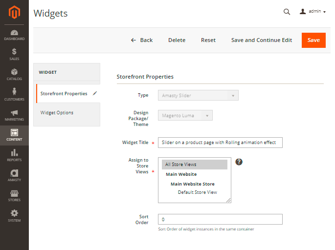
Please navigate to the Content → Widgets and click the button 'Add Widget' to create a new one.
Please note that the type of new widget should be 'Amasty Slider'.
Then choose the Magento theme which is applicable to your case and continue configuring a new widget.
Set the widget title, assign a widget to the needed store views, and specify its sort order (Sort Order of widget instances in the same container).
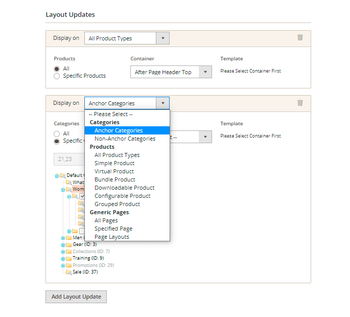
In order to configure the display of a slider widget on a certain store page or pages, please use the 'Layout Updates' settings below the 'Storefront Properties' section.
First, please choose if you want to embed your widget on Categories (anchor or non-anchor), Products (depending on the product type), or Generic Pages. Depending on that choice you'll see the available containers for that type of store page.
As per products and categories you can choose whether to display the slider on all store product/category pages in bulk or on the specific only.
As per Generic pages, there's the choice from three options, depending on which you'll see the unique set of the available containers:
- All Pages;
- Specified Page;
- Page Layouts.
As you're ready with choosing a specific location for the slider display, please navigate to the 'Widget Options' to configure two more important settings:
Show Slider Name - If set to 'Yes', the slider's name will be used as a title of the widget on the frontend. Set 'No' for the slider to be displayed without any title above it.
Slider - please choose that slider the display of which you're configuring.
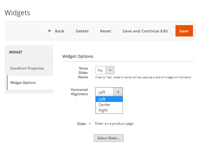
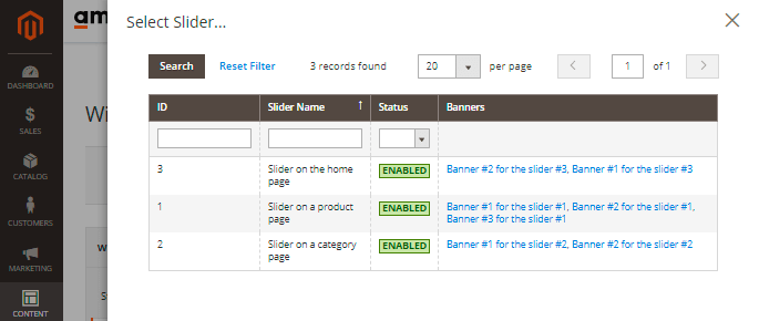
Click on the 'Select Slider' button to see the vertical curtain with the simplified slider grid with the sliders available for picking up.
Moreover, you can embed widgets to the store pages via the WYSIWYG editor or the Page Builder by clicking on the 'Insert Widget' button.
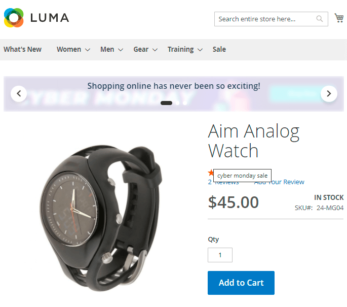
Frontend Examples
Product Page

Home Page

Category page (Sidebar)

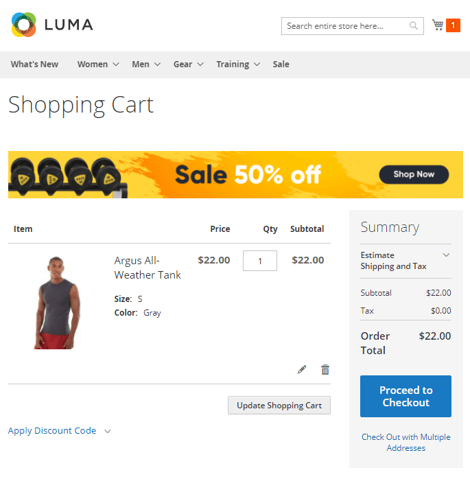
Shopping Cart (Main Content Top)
Find out how to install Banner Slider extension for Magento 2 via Composer.
Varnish Cache Compatibility
The compatibility with Varnish Cache for the extension is enabled, but it is necessary to configure it in a right way. If you need different types of cache for mobile and desktop devices, please, insert this code (line 2-8) into the section vcl_hash in the varnish configuration file (vcl):
sub vcl_hash {
    if (req.http.X-UA-Device ~ "^mobile"
        || req.http.X-UA-device ~ "^tablet"
    ) {
        hash_data("mobile");
    } else {
        hash_data("desktop");
    }
}
For the correct work of this code, please make sure that you have this library installed.
magento_2/banner-slider.txt · Last modified: 2025/06/30 12:45 by tihomirova