
Sidebar
magento_2:mega_menu
Table of Contents
For more details see how the Mega Menu for Magento 2 extension works.
Guide for Mega Menu for Magento 2
Apply dynamic and flexible navigation menu to your webstore with Magento 2 Mega Menu extension. Add various types of content right to the menu bar to attract customers’ attention and enhance their shopping experience.
- Adjust your menu display using different layouts
- Add dynamic blocks, videos, images and links
- Apply various catchy labels
- Configure the menu without any technical skills
- Make your menu mobile friendly
- ADA & WCAG compliant (for Luma and Hyva Themes)
- API REST support
- GraphQL compatible
The extension is fully compatible with the native Magento Page Builder functionality.
The extension follows the WCAG (Web Content Accessibility Guidelines) standards, which makes it more accessible to people with disabilities. For the most correct work of this feature, please install the Screen Reader extension to your browser.
Mega Menu Lite
The Mega Menu Lite extension is compatible with Hyvä Theme. You can find the ‘amasty/module-mega-menu-lite-hyva' package for installing in composer suggest. Note: the compatibility is available as part of an active Support Subscription.
This version has a set of features for desktop menu customization. Using the Lite version, you can:
- change a color scheme;
- enable hamburger menu for desktops;
- create custom menu items with links;
- adjust the sort order using the menu builder;
- highlight particular items with labels.
Keep in mind, that you won't be able to create engaging content for your categories and subcategories.
General Settings
To choose a menu type and customize a color scheme, navigate to Stores → Configuration → Amasty Extensions → Mega Menu Configuration.
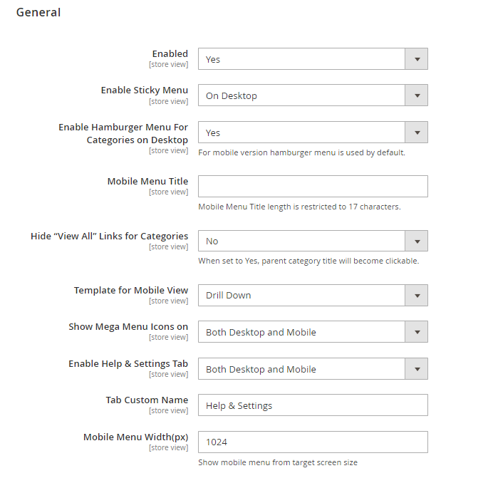
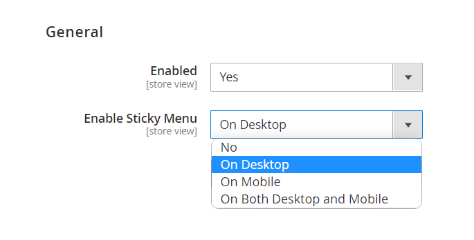
Enabled - set to Yes to activate Mega Menu.
Enable Sticky Menu - use this setting to choose for which views the sticky menu should appear. You can opt for mobile, desktop, or enable it for both views. If necessary, you can also disable the sticky menu.
Enable Hamburger Menu For Categories on Desktop - enable this option to hide the categories into a separate menu type for desktop view. For mobile version hamburger menu is used by default.
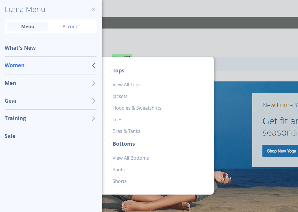
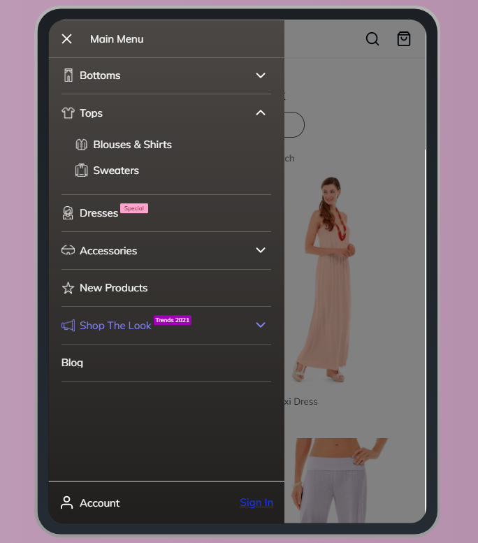
This type of menu is hidden under the three lines in the left corner:

A hamburger menu display:

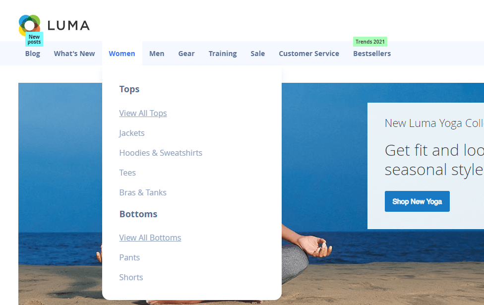
A horizontal menu display:
Mobile Menu Title - Specify title for the menu in this setting. Please note that the title length is restricted to 17 characters.
Hide “View All” Links for Categories - When set to Yes, parent category title will become clickable.
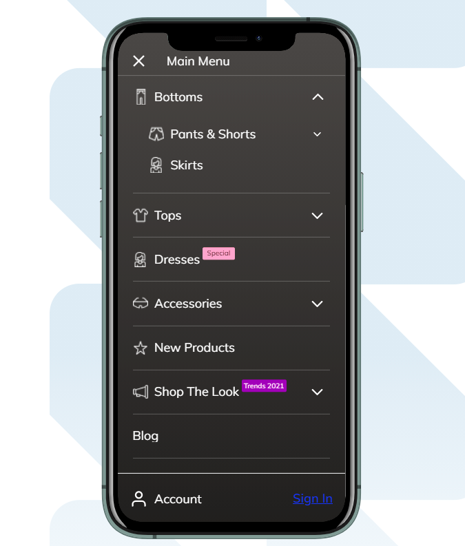
Template for Mobile View - Specify the template for mobile view. You can choose 'Drill down' or 'Accordion'.
Show Mega Menu Icons on - Choose for which views the mega menu icons should be displayed. You can opt for mobile, desktop, or enable it for both views.
Enable Help & Settings Tab - When enabled, this tab appears on both desktop and mobile devices.
Tab Custom Name - Here you can customize the name of the 'Help & Settings' tab.
Mobile Menu Width(px) - Show mobile menu from target screen size.
Color Settings
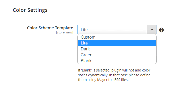
Color Scheme Template - select one of the ready-made templates ('Green', 'Dark', 'Lite') or choose Custom to adjust colors manually.
If 'Blank' is selected, plugin will not add color styles dynamically. In that case please define them using Magento LESS files.
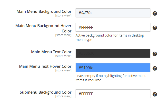
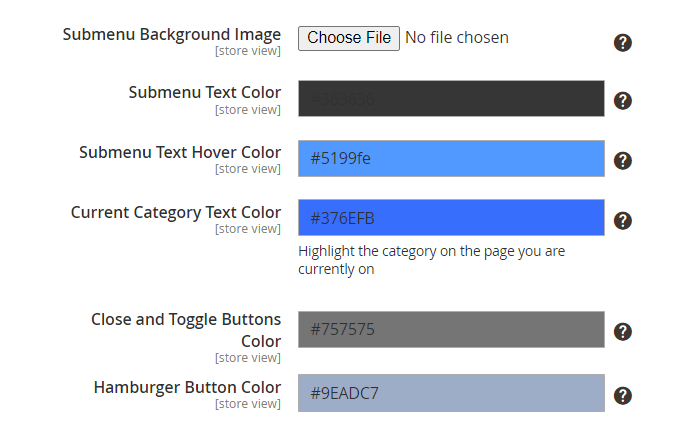
With a handy color-picker tool it is possible to configure the colors for:
- Main Menu Background Color
- Main Menu Background Hover Color
- Main Menu Text Color
- Main Menu Text Hover Color
- Submenu Background Color
- Submenu Background Image
- Submenu Text Color
- Submenu Text Hover Color
- Current Category Text Color
- Close and Toggle Buttons Color
- Hamburger Button Color
You can also set a custom submenu background image if needed.
Submenu background image sample (green color scheme):

Please note that background images are displayed on a desktop hamburger menu, but not on the mobile menu types.
Custom Menu Items
With the extension, you can add custom items to the menu bar. To see all additional items on a separate grid, go to Amasty → Mega Menu Lite → Custom Menu Items.
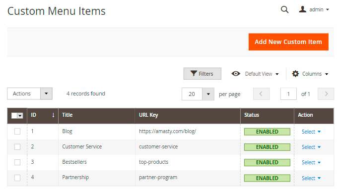
Here you can check the items' Title, URL Key (internal or external) and active Status.
Edit or Delete items in the Action column or perform mass actions via Actions dropdown menu.
To create a new menu item, click Add New Custom Item.
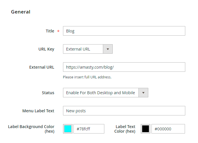
Title - fill in the title that will be displayed in the navigation menu.
URL Key - set the URL to redirect customers after clicking the menu item: Internal URL or External URL.
Internal/External URL - provide the required URL address.
Status - enable an item for mobile devices, desktops or for both. Disable an item if needed.
Menu Label Text - specify a text to highlight a custom item with a label if necessary.
Label Background/Text Color (hex) - adjust label colors to match menu design.
Hit the Save button.
Custom items and labels are displayed as below:
Menu Builder
You can also customize the menu items order.
Navigate to Amasty → Mega Menu Lite → Menu Builder.
Adjust the position of each menu item (both top categories and custom menu items) using handy drag-and-drop functionality.
Mega Menu Pro
The Mega Menu Pro extension is compatible with Hyvä Theme. You can find the 'amasty/module-mega-menu-pro-hyva' package for installing in composer suggest (Note: the compatibility is available as a part of an active product subscription or support subscription).
Using the Pro version, you can add various content types to make your menu more appealing and catchy. Pro version has the following features:
- use 2 extra menu types for mobile display (Accordion and Drill Down);
- add the content to subcategory dropdowns on any levels (images, videos, widgets, etc.);
- make categories intuitive with icons + use ready-made icon packs;
- enable sticky menu.
Configuration
To set the general settings of the extension, go to Stores → Configuration → Amasty Extensions → Mega Menu Configuration.
Expand the General tab.
Enabled - set to 'Yes' to activate Mega Menu.
Enable Sticky Menu - enable to display sticky menu navigation during vertical page scrolling and specify where you want it to be sticky:
- On Mobile
- On Desktop
- On Both Desktop and Mobile
- Disable
How to apply filters on Desktop/Mobile with Varnish
If you need different types of cache for mobile and desktop devices, please, insert this code (line 2-8) into the section vcl_hash in the varnish configuration file (vcl).
sub vcl_hash {
    if (req.http.X-UA-Device ~ "^mobile"
        || req.http.X-UA-device ~ "^tablet"
    ) {
        hash_data("mobile");
    } else {
        hash_data("desktop");
    }
}
For the correct work of this code, please make sure that you have this library installed.
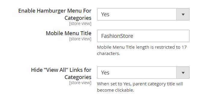
Enable Hamburger Menu For Categories - enable this option if you want to hide the categories into a separate menu type.
Mobile Menu Title - Specify the title for the menu in this setting. Please note that the title length is restricted to 17 characters.
Hide “View All” Links for Categories - When set to 'Yes', parent category title will become clickable.
The setting Hide “View All” Links for Categories is enabled:
 The setting Hide “View All” Links for Categories is disabled:
The setting Hide “View All” Links for Categories is disabled:
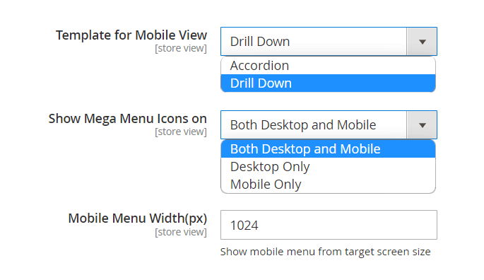
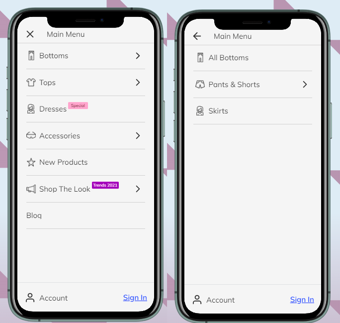
Template for Mobile View - choose the way the categories will be displayed on mobile devices:
- Drill Down
- Accordion
Accordion menu opens subcategories without redirects. Drill Down menu opens each subcategory on a new tab.
Show Mega Menu Icons on - select the views to show category icons. 3 options are available:
- Both Desktop and Mobile
- Desktop Only
- Mobile Only
Mobile Menu Width(px) - Show mobile menu from target screen size.
Icons can be added to the main categories and subcategories. In a hamburger menu it looks like this:
For the horizontal menu the icons will be displayed in the same way:
Color Settings
In the Color Settings tab, you can customize the menu style to match your website design.
For the Mega Menu Pro version color settings are the same as for the Mega Menu Lite version. For more configuration details, please consult this part of the guide.
Visual content is available for desktops only, but in the mobile version, the general submenu dropdowns and color schemes are also displayed.
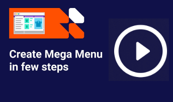
Use the video guide to set up a basic mega menu in a few minutes:
Check the most common use cases configuration:

Menu Items Settings
To adjust the display of default menu items, please go to Catalog → Categories and click the category you need.
Expand the Mega Menu tab.
General Settings

Menu Label Text - specify the text of the label to attract customers’ attention to the necessary block of the menu.
Text/Label Background color - customize label’s style using color picker tool.
Mega Menu Icon - upload or select from the gallery an icon if you want to visualize the menu item. It can be applied to desktop and/or mobile view depending on General Configuration.
Only the JPG and PNG images without the background will be displayed correctly. This format is necessary for the correct hover work (icons copy the hover settings of the items they're assigned to). Also, the maximum file size is 2 MB.
Also, you can create the image and text as a vector graphic, such as an SVG file. This ensures that any text stays crisp and readable when the user zooms in. Text within other rasterised image formats such as PNG, JPEG can become pixellated or unreadable when zoomed in.
Hide Menu Item Content - if set to 'Yes', then category will be displayed without any content, including subcategories

Submenu Width - set the width of the dropdown tab that will fit your website style.
Full Width - submenu will have the same width as the general menu bar.
Auto - the width will be set automatically according to the content options.
Custom - this option allows to set the width manually (in pixels).
Note: the package contains pre-made icons for the following business spheres:
- Clothes & Accessories
- Device
- Food
- Mechanic
- Medicine
To apply them, click the Select from Gallery and proceed to the ammegamenu folder.
The final result with and without the hover looks in the following way:
Submenu Template - two options are available: Column View or Custom View.
- If you choose Column View, you will be also offered to specify the Number of Columns.
- If you choose Custom View, you will be also offered to specify the Subcategories Template - Vertical or Horizontal.
How it works:
For the Women category we set 'Submenu Template' option to 'Custom View', and it becomes possible to configure the content for subcategories of any level. The 'Subcategories Template' is set to Horizontal. In the case below, we've added the product widget to the subcategory of the 2nd level, and the categories of the higher level are displayed at the top of the window.
The example of Vertical Subcategories Template:
Tip for Magento Enterprise users: try not to leave content field for subcategories empty, as the Page Builder can make the window wider than needed.
Content
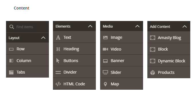
In this tab, you can adjust submenu content. The extension allows you to add images, videos, CMS blocks, banners, widgets, and products. NB: The extension is fully compatible with the Page Builder for Magento Enterprise.
Magento Page Builder Functionality
Page Builder allows creating rich in content pages just in few clicks via the handy drag-and-drop function.
This tool includes various layouts, content and media elements. With the preview mode, you can check the result and make edits if needed. Each element has its own settings so that you can configure it according to your website style and business needs.
Here you can see all available elements:
Check Page Builder User Guide to learn more about the elements and see the variants of Page Builder usage.
Employ Magento 2 Advanced Product Reviews extension to show product reviews right on the navigation menu and engage customers on their first step of the interaction with your store website.
Amasty MegaMenu Products Widget
Add a special MegaMenu widget to the drop-downs to promote your new, featured or best-selling products right in the menu.
Adjust Widget Options according to your business needs.
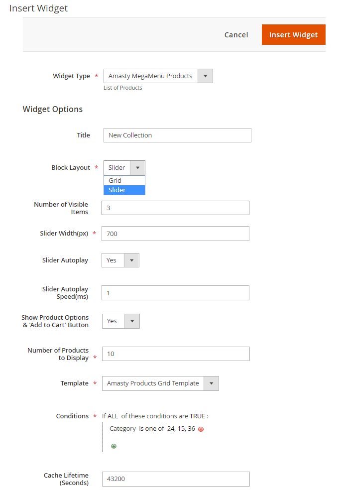
Widget Type - choose Amasty MegaMenu Products widget type.
Title - specify the title of the block that will be displayed to customers.
Block Layout - select the layout for the block: Grid or Slider.
Number of Visible Items - if Slider layout is chosen, set the number of items that will be shown at once.
Slider Width(px) - adjust the width of the slider to match your Mega Menu configuration.
Slider Autoplay - if Yes, the products will be switched automatically. If No, customers will have to switch manually.
Slider Autoplay Speed(ms) - set the particular switching speed if needed.
Show Product Options & 'Add to Cart' Button - if Yes, the customers will see product options and will be able to add a product to cart right from the drop-down.
Number of Products to Display - specify the general number of products you want to be shown in a grid/slider.
Template - Amasty Products Grid Template is chosen by default.
Conditions - set flexible conditions to show the products you need.
To avoid common mistakes while setting the conditions, check this post.
Cache Lifetime (Seconds) - specify the time between the widget updates in seconds. If not set, equals to 86400 seconds (24 hours). To update widget instantly, go to Cache Management and clear Blocks HTML Output cache. The widget will not show products that begin to match the specified conditions until the cache is refreshed.
You can add the widget to any category or custom menu item.
Custom Menu Items Grid
With the Mega Menu extension, you can add custom items to the menu bar. To see all additional items on a separate grid, go to Content → Amasty Mega Menu → Custom Menu Items.
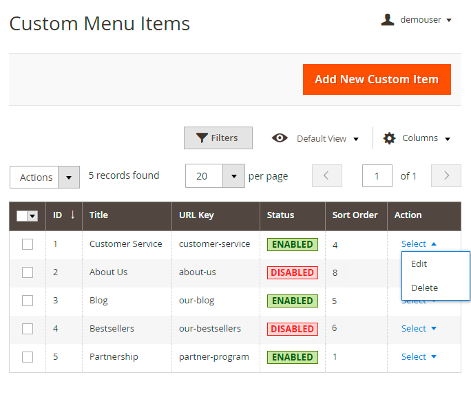
Here you can check the items' Title, URL Key, active Status and Sort Order.
Edit or Delete items in the Action column or perform mass actions via Actions dropdown menu.
To create a new menu item, click Add New Custom Item.
Custom Menu Items
Specify the General Settings and the Content of a new menu tab.
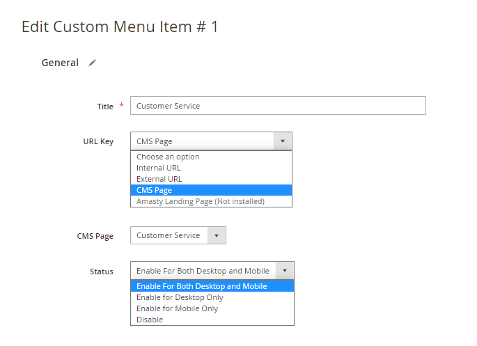
Title - fill in the title that will be displayed in the navigation menu.
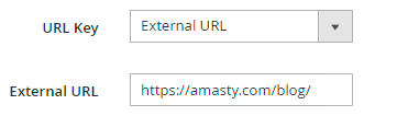
URL Key - set the URL to redirect customers after clicking the menu item: Internal URL, External URL or CMS Page.
Use the Landing Pages for Magento 2 by Amasty to unlock more options for your navigation with Mega Menu.
CMS Page - select the page to direct customers to. If Internal/External URL is specified in the option above, set the particular URL.
Status - enable an item for mobile devices, desktops, or for both. Disable an item if needed.
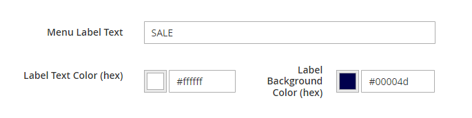
Menu Label Text - please specify text for the label of your custom menu item if needed.
Label Text/Background Color (hex) - here you can set up colors for the custom menu item's label.
Content (For Desktop Only)
Mega Menu Font - 'Bold' or 'Regular'.
Display as Single Menu Item - If set to 'Yes', then the item will be displayed without any content.
Submenu Width - adjust the submenu item's width here by choosing one of the three available mods:
- Custom - please manually specify the required width in pixels in the setting 'Width(px)' below;
- Full Width;
- Auto.
Content (For Mobile)
Mega Menu Font - 'Bold' or 'Regular'.
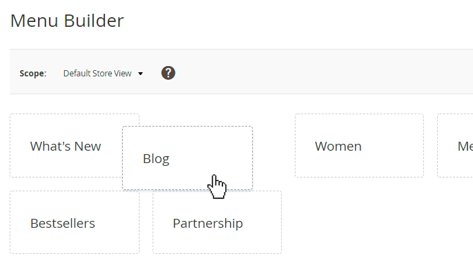
Menu Builder
In order to customize the menu items order, please navigate to Admin Panel → Content → Menu Builder.
Adjust the position of each menu item (both top categories and custom menu items) using handy drag-and-drop functionality.
For the Mega Menu Pro version the 'Menu Builder' settings are the same as for the Mega Menu Lite version.
Mega Menu Premuim
Enhance the mobile experience of your users and add extra content to your menu by using the Mega Menu Premium version:
- upload icons for custom menu items;
- configure content for mobile and desktop separately;
- set up catchy animation for your menu items.
General configuration
To set the general settings of the extension, go to Stores → Configuration → Amasty Extensions → Mega Menu Configuration.
The Premium Plan adds two more settings here:

Animation Time - Enter the default animation time in seconds. Animation type is configured on the top category level. 0 value disables animations.
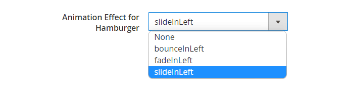
Animation Effect for Hamburger - Choose from the dropdown an animation type for hamburger menu opening (both mobile and desktop).
Color Settings
In the Color Settings tab, you can customize the menu style to match your website design.
For the Mega Menu Premium version color settings are the same as for the Mega Menu Lite version. For more configuration details, please consult this part of the guide.
Custom Menu Items
To configure premium features for custom menu items please navigate to Content → Custom Menu Items.
As for the extra features provided by the premium version, you can configure the following:
- Add menu icons to custom menu items ('Mega Menu Icon');
- Speecify position and sort order of the custom menu item in menu hierarchy ('Menu Position', 'Sort Order');
- Add custom animation for submenu items ('Submenu Animation');
- Apply custom layouts for the submenu items ('Submenu Template', Number of columns'/'Subcategories Template';
- Restrict the display of Custom Menu Items by customer groups.
To configure the basic set of settings of the Custom Menu Item section, please consult this part of the guide this part of the guide.

Customer Groups - with this setting you can restrict the display of Custom Menu Items by customer groups. (Note: this functionality is available as part of an active product subscription or support subscription).
The Status setting continues to globally regulate the display of Custom Menu Items. For example, if it is set to Desktop Only, the items will only be visible on desktop devices and hidden from selected customer groups. If no customer groups are selected, the custom item will be visible to everyone.
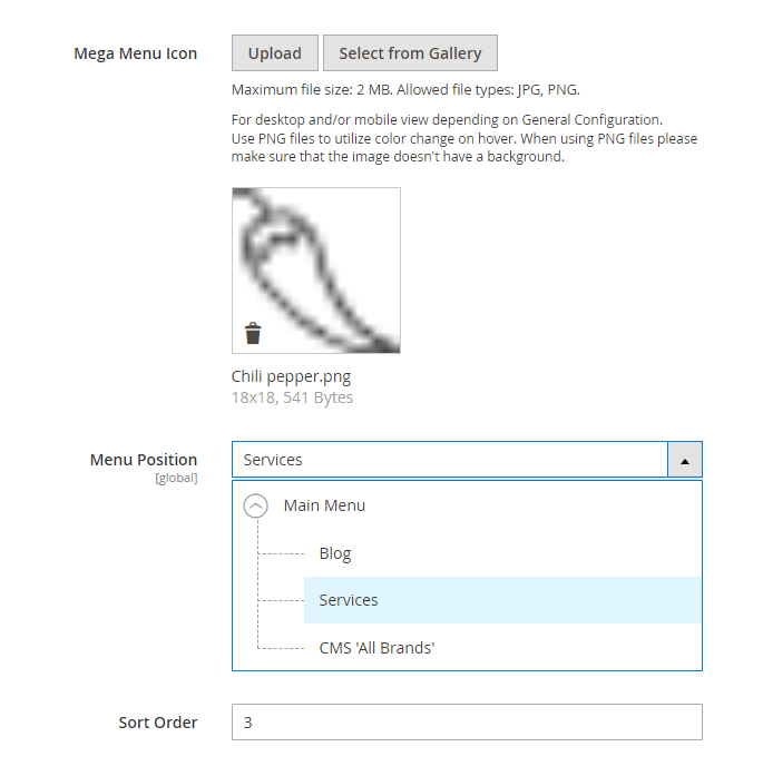
Mega Menu Icon - Upload your icon for the custom menu item from the gallery or from your personal media archive. Maximum file size: 2 MB. Allowed file types: JPG, PNG. For desktop and/or mobile view depending on General Configuration. Use PNG files to utilize color change on hover. When using PNG files please make sure that the image doesn't have a background.
Menu Position, Sort Order - Specify custom position and priority of display of the custom menu item from the category tree.
In order to configure sections Menu Position and Sort Order, please install the extra package from suggested in composer:
"suggest": {
        "amasty/module-mega-menu-items-tree": "Install module-mega-menu-items-tree module to create custom items tree."
    },
Content (For Desktop)
To configure the basic set of settings of the Custom Menu Item section, please consult this part of the guide this part of the guide.
Besides, the Mega Menu Premium allows you to configure content for the custom menu item separately for the desktop and mobile versions.
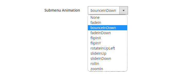
Submenu Animation - choose the animation type for your menu item from the dropdown.
Submenu Template - Choose the submenu template from the dropdown: 'Column View' or a 'Custom View'

Subcategories Template - The two options are available for this setting: 'Horizontal' and 'Vertical'. Please note that this setting will only be visible if you've selected the 'Custom View' option in the setting 'Submenu Template'.
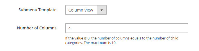
Number of Columns - Specify the number of colunbs for the layout that you need. If the value is 0, the number of columns equals to the number of child categories. The maximum is 10. Please note that this setting will only be visible if you've selected the 'Column View' option in the setting 'Submenu Template'.
In order to configure sections Submenu Template and Number of Columns, please install the extra package from suggested in composer:
"suggest": {
        "amasty/module-mega-menu-items-tree": "Install module-mega-menu-items-tree module to create custom items tree."
    },
How to apply filters on Desktop/Mobile with Varnish
If you need different types of cache for mobile and desktop devices, please, insert this code (line 2-8) into the section vcl_hash in the varnish configuration file (vcl).
sub vcl_hash {
    if (req.http.X-UA-Device ~ "^mobile"
        || req.http.X-UA-device ~ "^tablet"
    ) {
        hash_data("mobile");
    } else {
        hash_data("desktop");
    }
}
For the correct work of this code, please make sure that you have this library installed.
Content (For Mobile)
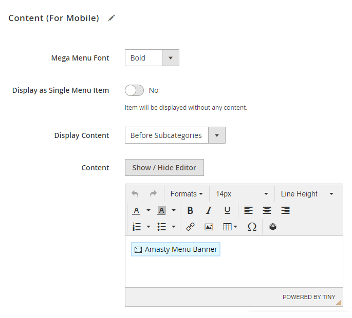
Mega Menu Font - 'Bold' or 'Regular'.
Display as Single Menu Item - Set 'Yes' if you want an item to be displayed without any content.
Display Content - Before or after subcategories.
Content - Use the Magento editor to add custom content to your custom menu item on mobile. Please note: manually added widgets not from the “Insert Widget” list, might not work properly.
Menu Builder
In order to customize the menu items order, please navigate to Admin Panel → Content → Menu Builder.
Adjust the position of each menu item (both top categories and custom menu items) using handy drag-and-drop functionality.
For the Mega Menu Premium version the 'Menu Builder' settings are the same as for the Mega Menu Lite version.
Increase the number of purchases by show reviews in menu with Amasty Advanced Product Reviews for Magento 2.
Add Magento 2 Improved Layered Navigation to equip your website with a highly flexible vertical and horizontal navigation menu.
Additional packages (provided in composer suggestions)
To make additional functionality available, please install the suggested packages you may need.
Available with no additional fees:
For Lite, Pro and Premium versions:
amasty/mega-menu-page-builder- Install mega-menu-page-builder module to activate PageBuilder and Mega Menu integration.
amasty/mega-menu-graphql- Install mega-menu-graphql module to activate GraphQl and Mega Menu integration.
For Premium tariff plan only:
amasty/module-mega-menu-items-tree- Install module-mega-menu-items-tree module to create custom items tree.
amasty/module-mage-2.4.7-fix- Install this module to fix bugs related to UI elements that were added in the release version 2.4.7.
Available as a part of an active product subscription or support subscription:
For Lite, Pro and Premium versions:
amasty/module-mega-menu-lite-hyva- Install this package to ensure Mega Menu Lite extension works with Hyvа.
For Pro and Premium versions:
amasty/module-mega-menu-pro-hyva- Install this package to ensure Mega Menu Pro extension works with Hyvа.
For Premium tariff plan only:
amasty/module-mega-menu-premium-subscription-functionality- This package enables the restriction of Custom Menu Items display by customer groups.
PWA for Mega Menu (Add-On)
With a ready-made PWA solution, you can provide shoppers with an outstanding mobile experience. Customers can surf the store with a stylish and responsive menu.
The feature can be enabled only after purchasing the PWA for Mega Menu Add-On. Also, you need to install PWA Studio first.
In order to correctly install a PWA add-on, please install the corresponding GraphQL system package first. For the correct name of it, please check the composer.json file of the main module. For example, the GraphQL system package name of the PWA add-on for the Blog Pro extension would be the following: amasty/blog-graphql

If the add-on is installed, the Venia theme will display an Accordion Hamburger menu with icons in a dark color scheme in the following way:
A Drill Down menu in a light color theme looks like this:
How it looks on tablets:
The sample of top menu on the Venia theme:
By now, the PWA add-on does not support widgets and CMS blocks in Mega Menu.
Find out more about Magento PWA integration here.
Use Cases
Here, you’ll find a step-by-step guide on configuring some of the most common webstore menu cases. You can explore these cases in more detail in our Demos, while specific setting details are available in the User Guide.
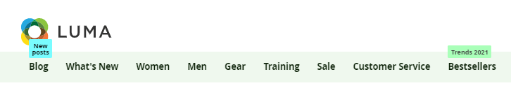
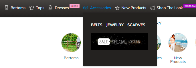
1. Horizontal Menu: different types of categories display
Companies using such menu type: Ebay, Puma, Yamaha, Adidas and many others.

Main steps:
- Step 1: Adjust general settings
- Step 2: Adjust the settings for the main Categories
- Step 3: Adjust the settings for Custom Menu Items
Step 1: Adjust general settings
To use the Horizontal menu, go to the extension's General Settings and set ‘Enable Hamburger Menu For Categories on Desktop’ to No. You may also enable showing Mega Menu icons to make your menu more appealing. The remaining settings in this tab can be configured according to your preferences.

In the Color Settings, select the Color Scheme Template that best matches your website theme. You can choose a custom or pre-built scheme and adjust individual colors. Additionally, you can set a Submenu Background Image to enhance the menu design and align it with your brand.

Step 2: Adjust the settings for the main Categories
We’ll demonstrate the configuration using examples of several categories from our demos.
First of all, please ensure that all the needed categories are enabled and included in menu:

Now let's proceed to the settings of particular categories.
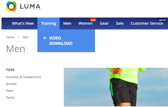
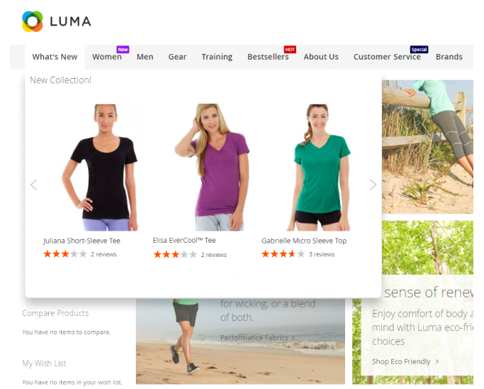
‘What’s New’ category with Product Slider

In the ‘What’s New’ category, we’ve added an icon and a product widget. To configure this, go to Catalog → Categories and select the desired category. Then, in this category, scroll down to the ‘Mega Menu (For Desktop tab)’:

Adjust the values for Mega Menu Font, Menu Label Text, Label Background Color or use the default values for these settings.
Upload an icon.

Adjust the values for Submenu Width and Number of Columns or use the default value for these settings.
Proceed to the Content section and click Edit with Page Builder.

Add an HTML element, if there's no any, and Click the Insert Widget button inside it.

Choose the ‘Amasty MegaMenu Products’ Widget Type.

After choosing the widget type you will be offered to configure its settings such like Block Layout, Number of Products to Display, Conditions and others.
After completing the widget configuration, click the orange Insert Widget button in the top right corner of the page, then save the changes.
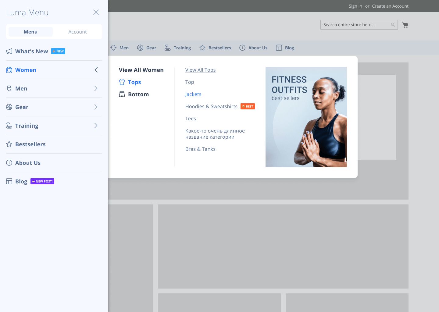
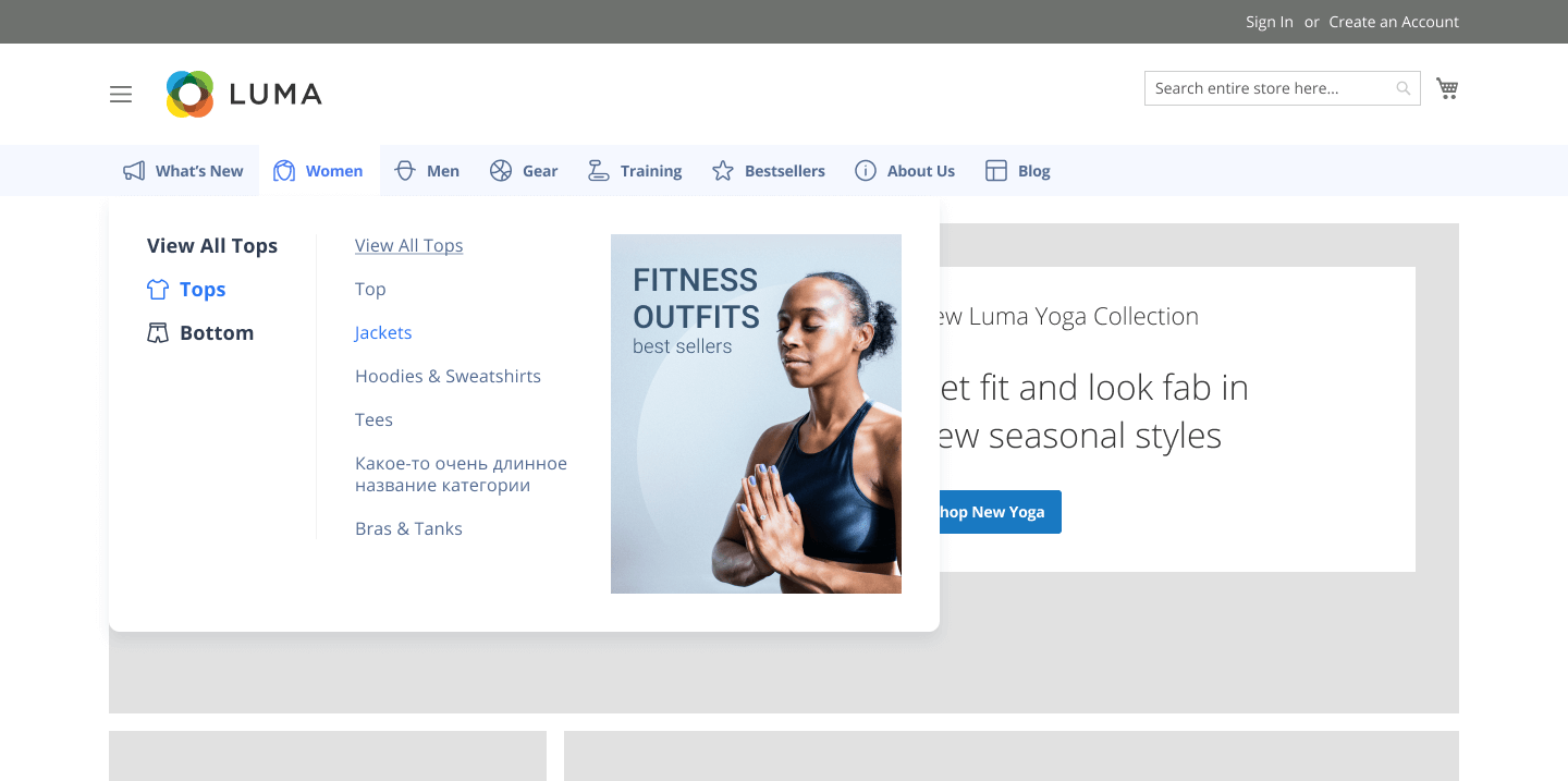
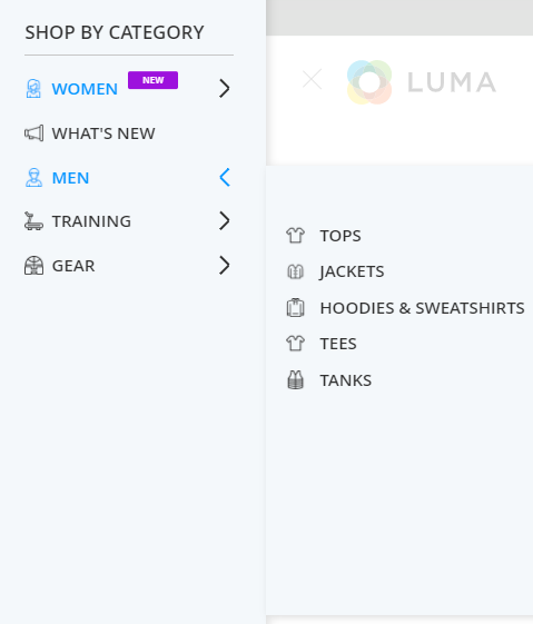
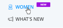
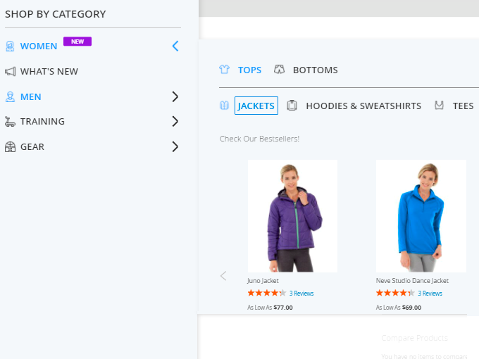
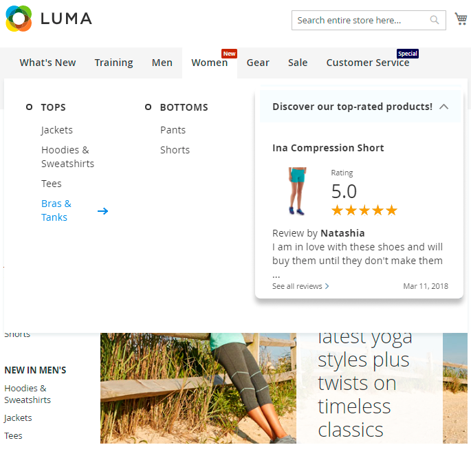
Women Category (Horizontal and vertical submenu templates, added menu label and a slider in the subcategory)

To adjust the next category, in our case, the Women Category, go to Catalog → Categories → Women.
Scroll to the Mega Menu (For Desktop) tab.

In this case, we added a label to the category title. To do this, adjust the Menu Label Text (you can also add an emoji using its decimal code), Label Background Color, and Label Text Color. Additionally, we uploaded an icon and configured the following settings:

- Hide Menu Item Content - No
- Submenu Width - Auto
- Submenu Template - Custom View
- Subcategories Template - Vertical
In the Content section, we keep the default variable child_categories_content to display the subcategory list for customers.
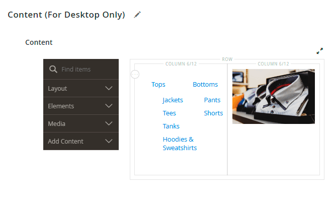
For subcategory display (Tops, Bottoms), we've set the Subcategories Template = Horizontal, and placed the child categories variable in their Content section.
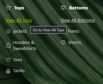
Additionally, we added a Bestsellers widget to the Jackets subcategory. To add this widget: Go to the needed category → Mega Menu (for Desktop) tab → Content section and add the Amasty MegaMenu Products widget as described for the previous (What’s New) category.
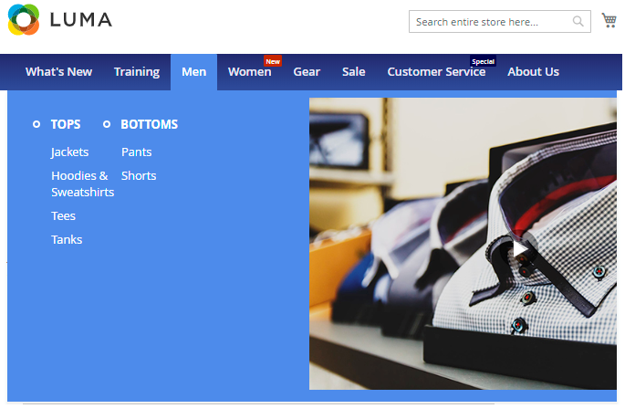
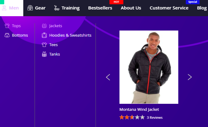
Men Category (submenu column view with a GIF image)

Navigate to the needed category, in this case it is Catalog → Categories → Men and scroll down to the Mega Menu (For Desktop) tab.
Adjust the following settings:

- Hide Menu Item Content - No
- Submenu Width - set to Auto, Full Width or Custom according to your preferences
- Submenu Template - Column View
- Number of Columns - 2
Proceed to the Content section and open its editing in Page Builder.

Using the Page Builder, add a row and two columns inside it. Add the variable child_categories_content in the left column and add the image in the right column.
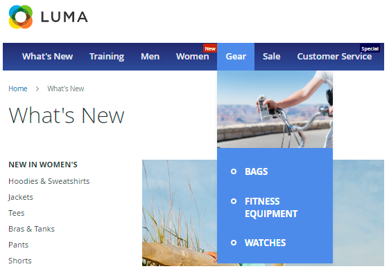
Gear Category (Vertical submenu template, single column with an image at the top)

Go to the needed category settings, and scroll down to the Mega Menu (For Desktop) tab. Configure the following settings this way: Set Submenu Template to Column View and Number of Columns set to 1.

Proceed to the Content section and open its editing in Page Builder.

Add the needed image and then insert the variable with child categories.
For a more advanced menu with numerous child categories, you can configure an alternative variation of the option described above.

For this option, you’ll also need to set the Submenu Template to Column View, but set the Number of Columns to 4.
- You can add the required images by editing the appropriate subcategories or by adding a general image in the parent category settings.
- Also, insert the variable child_categories_content for each subcategory, except for the last one in this case.
Step 3: Adjust the settings for Custom Menu Items
Navigate to the Custom Menu Items grid (Content → Amasty Mega Menu → Custom Menu Items) and add the needed items for your menu.

In our example we’ve added Blog, Featured Products, Customer Service, Bestsellers, About Us.

Check how to configure the Custom Menu Items here. For these items you can also add different types of content (like banners, images, widgets, product sliders, links to Blog or other CMS pages, etc.). Also you can add the catchy labels and emojis to the Custom Menu Items titles.
After the needed items are added, go to Menu Builder (Content → Amasty Mega Menu → Menu Builder) to adjust the order of your Menu Items using drag-and-drop.

Flush Magento cache, and your menu is ready to go!
2. Vertical Amazon-style (hamburger) menu
Companies using such menu type: Amazon, Aliexpress, Wallmart, Olympus and many others.

To use such a menu type, in the extension General Settings adjust the ‘Enable Hamburger Menu For Categories on Desktop’ setting to ‘Yes’. The rest of settings in the tab can be configured the same way as it was described above for the Use Case 1 or in the way that most suits your needs.
In the Color Settings, select the Color Scheme Template that best matches your website theme. You can choose a custom or pre-built scheme and adjust individual colors. Additionally, you can set a Submenu Background Image to enhance the menu design and align it with your brand.
Choosing the Hamburger Menu type allows you to display Catalog Categories in the vertical menu block while showcasing Custom Menu Items in the horizontal menu block. This setup suits good for websites with extensive menus, ensuring improved navigation and organization.
The particular categories and subcategories settings can be configured the same way as it was described above in the Use Case 1.
3. Separate menu tab with Сustom Items, displayed as buttons

This type of menu item is useful for quick access to important pages.
Navigate to Content → Custom Menu Items, and create a parent custom item, such as ‘About Us’, as in our example.
In the Mega Menu Pro version, you can add emojis to Custom Menu Items titles, while in the Mega Menu Premium version, you can also add icons.
When the Custom Menu item is created navigate to its ‘Content’ section, and add buttons using the Page Builder elements.

Adjust the buttons settings according to your needs.

If you need to display links instead of buttons, Set ‘Button Type’ to ‘Link’.
FAQ
In Mega Menu FAQ you can find answers to the most popular questions about the extension functionality.
Find out how to install the Mega Menu for Magento 2 via Composer.
magento_2/mega_menu.txt · Last modified: 2025/05/20 13:52 by asemenova