
Sidebar
magento_2:page_builder
Table of Contents
See the way CMS Page Builder by MageSolution for Magento 2 extension works.
Guide for CMS Page Builder by MageSolution for Magento 2
Create custom pages and content blocks without writing a line of code with Magento CMS Page Builder extension.
- Create and edit CMS, category, and product pages
- Use 30+ building elements to create unique page designs
- Import/export, delete or restore any page version
- Provide mobile-responsive design
- Compatible with Magento 2 themes
Сonfiguration
To install the extension, follow these steps:
STEP 1: Extract Extension Package Right click on the extension package, find and click Extract files to unzip your package extension
STEP 2: Upload folders and files in extension package onto Magento root folder
- Open the extracted Builder package.
- Now you can see 3 smaller folders: app, patches and pub.
- Upload folders app and pub to the folder app and pub of your Magento root folder, respectively. Please note that, uploading means that you merge content of the original folder with the new content from our extension.
- If you are using our MGS Builder Theme, please go to the folder patches → patch_for_mgs_frontend_builder_theme and once more, upload folder app inside it to the folder app of your Magento root folder.
- For the extension we recommend from the third party Mageplaza, please go to patches → patch_for_mageplaza_extensions, upload folder app inside it to the folder app of your Magento root folder.
STEP 3:Refresh and update system by commands
- Go to your Magento root folder and open a terminal window here.
- Should you type php bin/magento module:status , you will see MGS_Fbuilder in the list of disabled modules.
- Now type php bin/magento module:enable MGS_Fbuilder to enable this extension.
- Type php bin/magento setup:upgrade to upgrade the extension to system.
- To make sure everything is up to date: If your Magento version is smaller than 2.1, type php bin/magento setup:static-content:deploy. Otherwise, type php bin/magento setup:static-content:deploy -f.
- Type php bin/magento cache:clean and then php bin/magento cache:flush to refresh system.
- Now our CMS Builder is installed successfully.
STEP 4: Active module in backend
- Log in backend with your admin account.
- Go to MGS → Page Builder Setting → General → Active Front-end Builder.
- Choose Yes to active our extension.
- Click Save Config button to save your change.
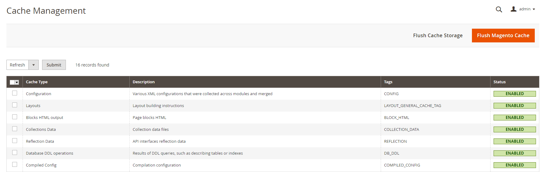
- Now clear cache to refresh system: In backend area, go to System → Cache Management. Click Flush Magento Cache button to clear cache
- Builder extension is now ready to be used.
General Settings
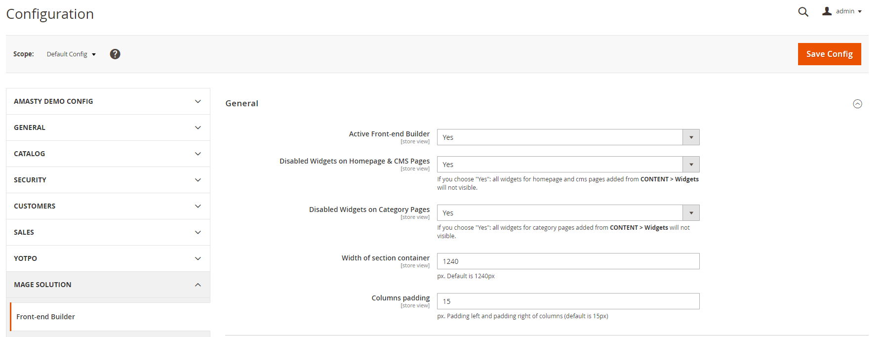
Go to Admin → MGS → Front-end Builder [General]
With General Settings, you can config:
- Active Front-end Builder: Enable or Disable Builder extension
- Disable Widgets on Homepage & CMS Pages: Make widgets for homepage and cms page be invisible in CONTENT > Widgets
- Width of section container: Set default width for the container of section builder.
- Columns padding: Set padding left and right values for columns builder
HTML Structure Settings
Go to Admin → MGS → Front-end Builder [Html Structure]
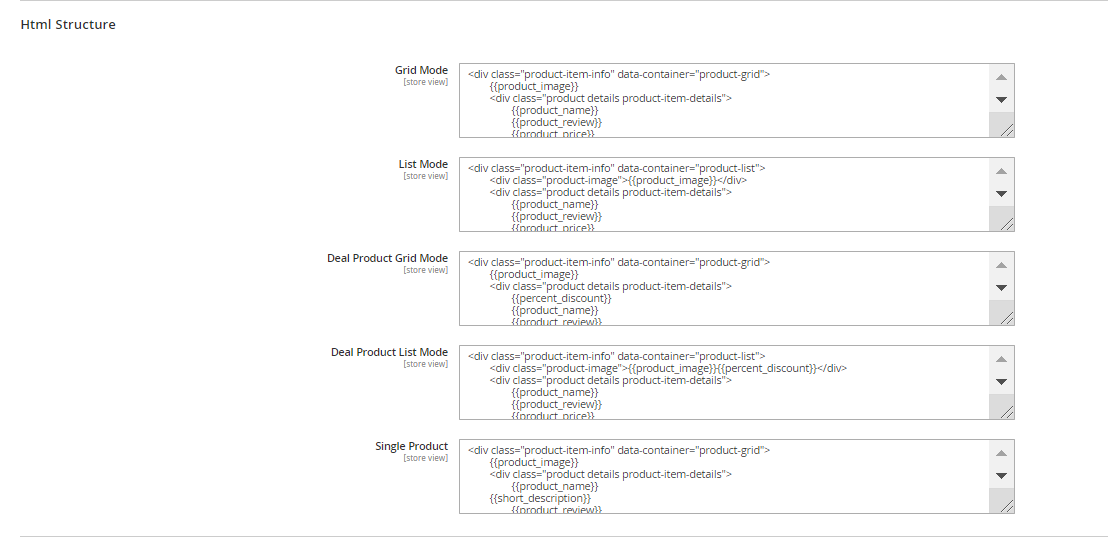 With Html Structure Settings, you can config:
- Grid Mode: Custom Config layout for Grid Mode of catalog elements.
- List Mode: Custom Config layout for List Mode of catalog elements.
- Deal Product Grid Mode: Custom Config layout for Grid Mode of Deal Product elements.
- Deal Product List Mode: Custom Config layout for List Mode of Deal Product elements.
- Single Product: Custom Config layout for Single Product elements.
Social Settings
Go to Admin → MGS → Front-end Builder [Social]
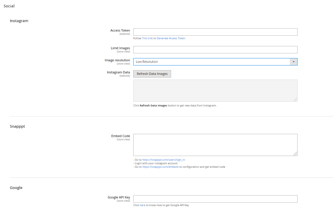 With Social Settings, you can config:
- Instagram [Access Token]: Insert Access Token for your Instagram Shop
- Snapppt [Embed Code]: Insert Embed Code for your Snapppt
- Google [Google API Key]: Insert the Google API Key
OWL Slider (single slide) Settings
Go to Admin → MGS → Front-end Builder [OWL Slider (Single Slide)]
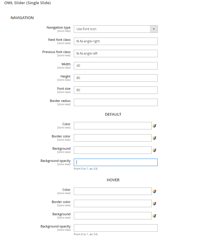 With OWL Slider (Single Slide) Settings, you can config:
- Navigation section: Settings for the navigation.
- Navigation Type: Choose between Use Front Icon or Use Image.
- Next font class and Previous font class: Insert the class CSS for your previous and next icon.
- Width - Height - Font size: Config the width height value of your navigation, and the font size used in it.
- Border radius: Set value for the navigation radius border.
- Default section: Settings for the navigation without any mouse effects.
- Hover section: Settings for the navigation once.
- Pagination section: Settings for the pagination of slider with: Width, Height, Border radius, Background.
OWL Slider (multiple slide) Settings
Go to Admin → MGS → Front-end Builder [OWL Slider (Multiple Slides)]
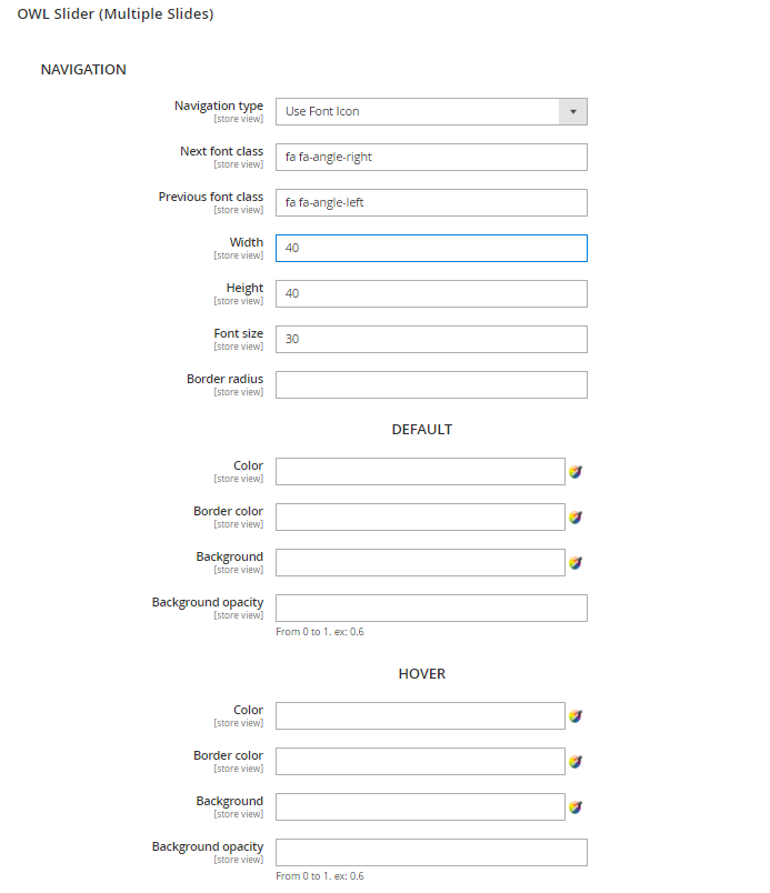 Similar to OWL Slider (Single Slide) Settings, you can config Navigation, Pagination and others detailed settings.
- Navigation section: Settings for the navigation.
- Navigation Type: Choose between Use Front Icon or Use Image
- Next font class and Previous font class: Insert the class CSS for your previous and next icon
- Width - Height - Font size: Config the width height value of your navigation, and the font size used in it
- Border radius: Set value for the navigation radius border
- Default section: Settings for the navigation without any mouse effects
- Hover section: Settings for the navigation once
- Pagination section: Settings for the pagination of slider with: Width, Height, Border radius, Background.
Font & Style Settings
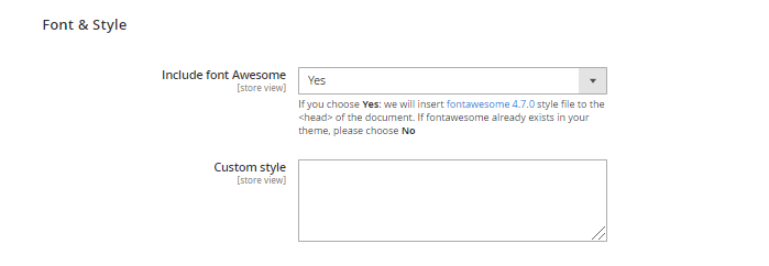 With Font & Style Settings, you can config:
- Include font Awesome: Choose to include font Awesome 4.7.0 style if you have not had font Awesome
- Custom style: Quickly put any additional custom style here.
Export/Import/Restore
Go to Admin → MGS → Front-end Builder [Export - Import - Restore]
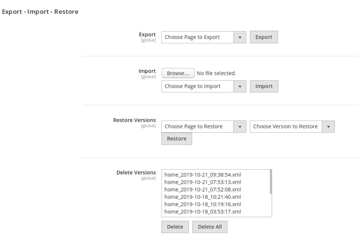
With Export - Import - Restore Settings:
Export: This function helps to immediately download to newest layout XML of any CMS Page.
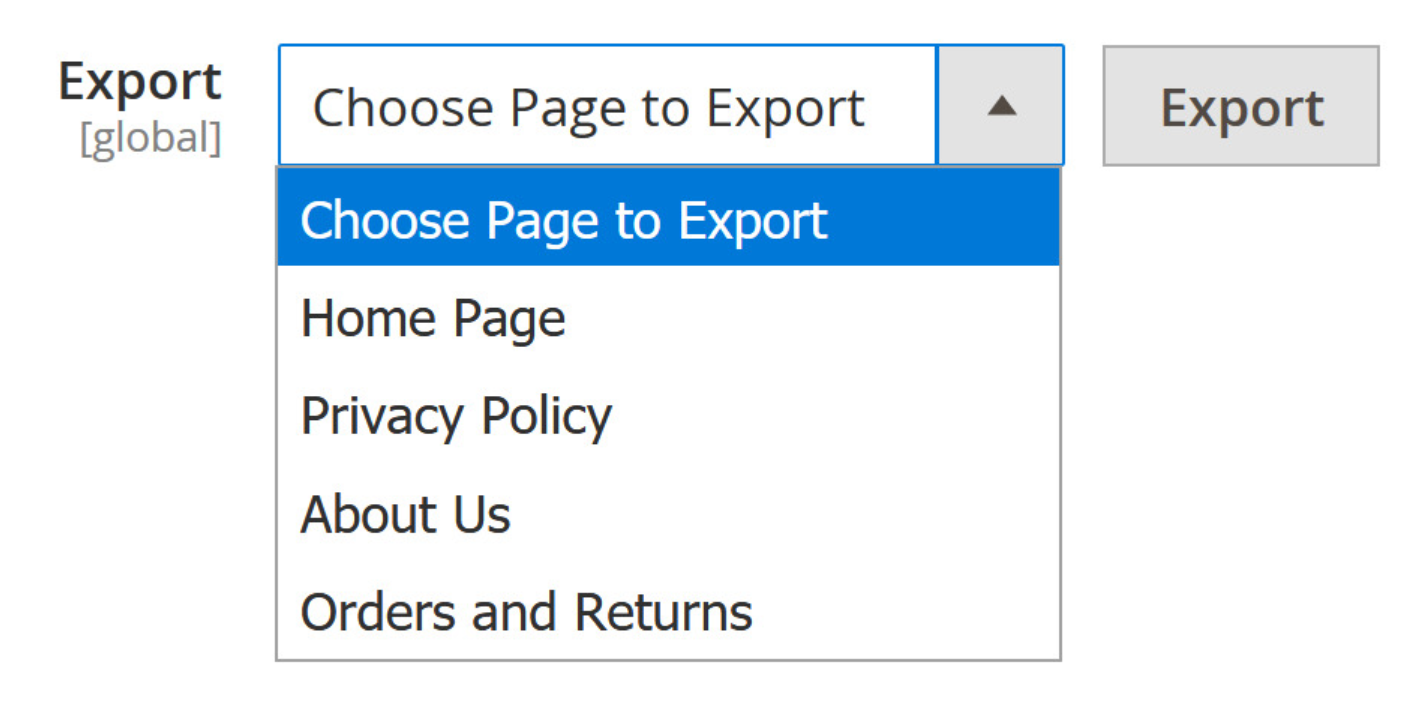
- Click the dropdown list to choose page you want to export its layout.
- You should see an XML file automatically downloaded to your system. It is identified by page name, date amd time created.
Import: This function allows importing any layout XML to CMS Page.
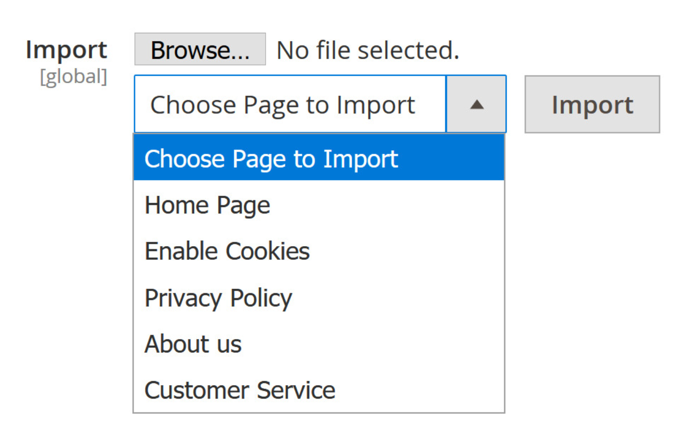
- Click Browse to find the XMl file in your system.
- Choose CMS page that needed to import.
- Should you see the green message “Successfully import the page”, the process is finished.
Restore: This function allows backing up any versions of XML of any page to any another page.
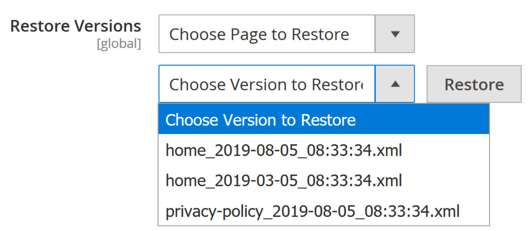
- Choose the destination page that you want to restore.
- Choose the version you want to import. You can see several old versions of cms pages, identified by its page name, date and time created.
- Should you see the green message “Successfully restore the page”, the process is finished.
Delete: This function helps to remove any versions of XML that you don't need.
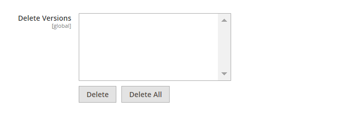
- Choose the version that you want to delete.
- Click the delete button and confirm Yes to finish the process.
- Note that, hold Shift on your keyboard to choose multiple versions.
- Besides, you can press Delete All to remove all of XML files.
Create Panel Account (in front-end)
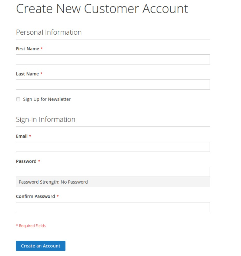
Step 1: Create Customer Account (Frontend)
- At Front-end, go to link yoursite.com/customer/account/create/.
- Create an Customer Account with your information: Full name, email and password. You should use a strong password to improve the security.
If you can't create an account, please try to connect ssh and reindex data again, use this command to reindex data: php bin/magento indexer:reindex
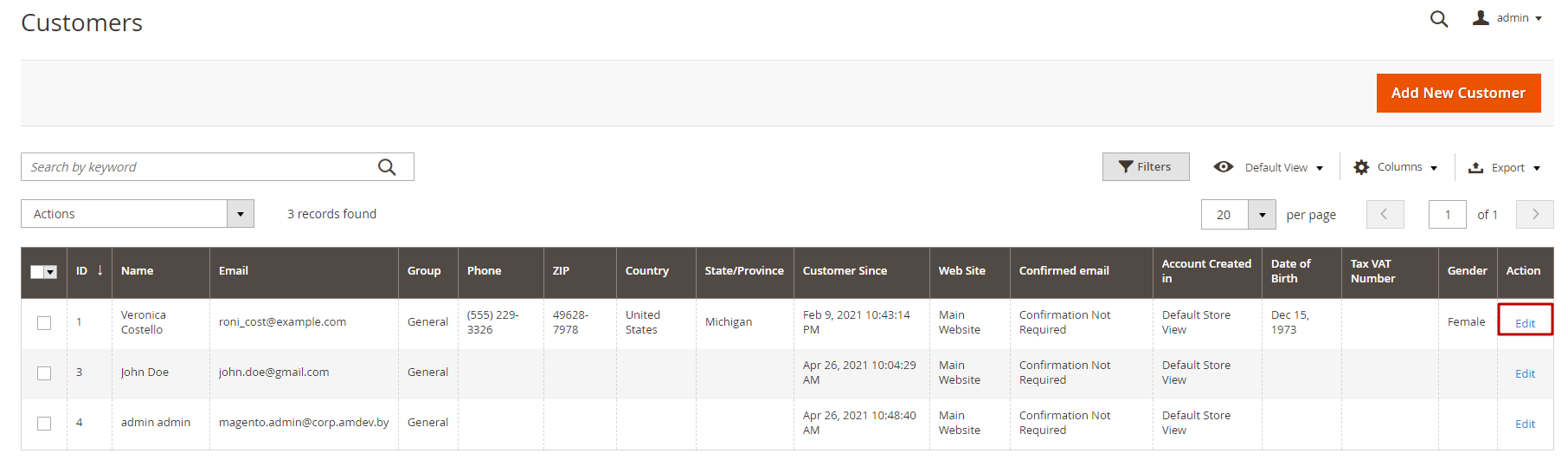
Step 2:Set Customer to Panel Account
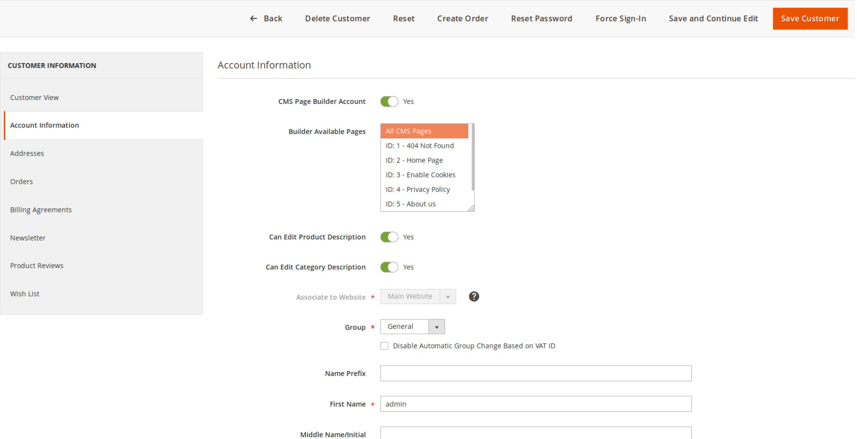
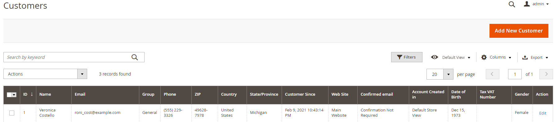
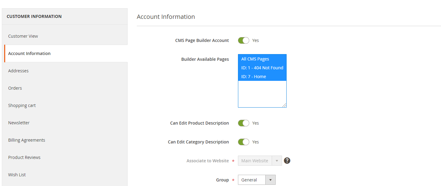
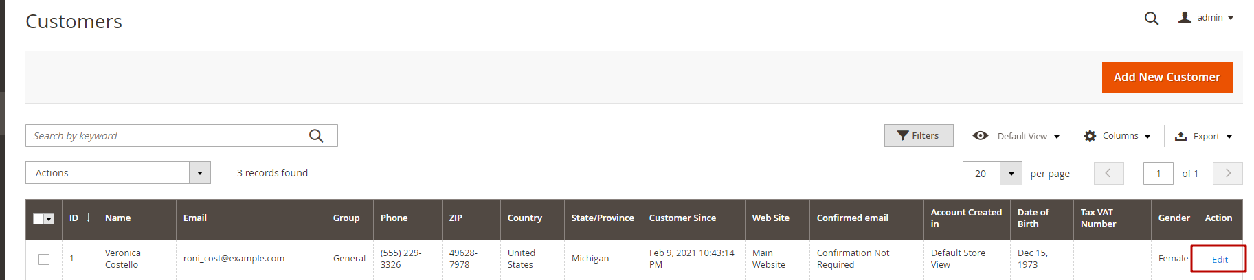
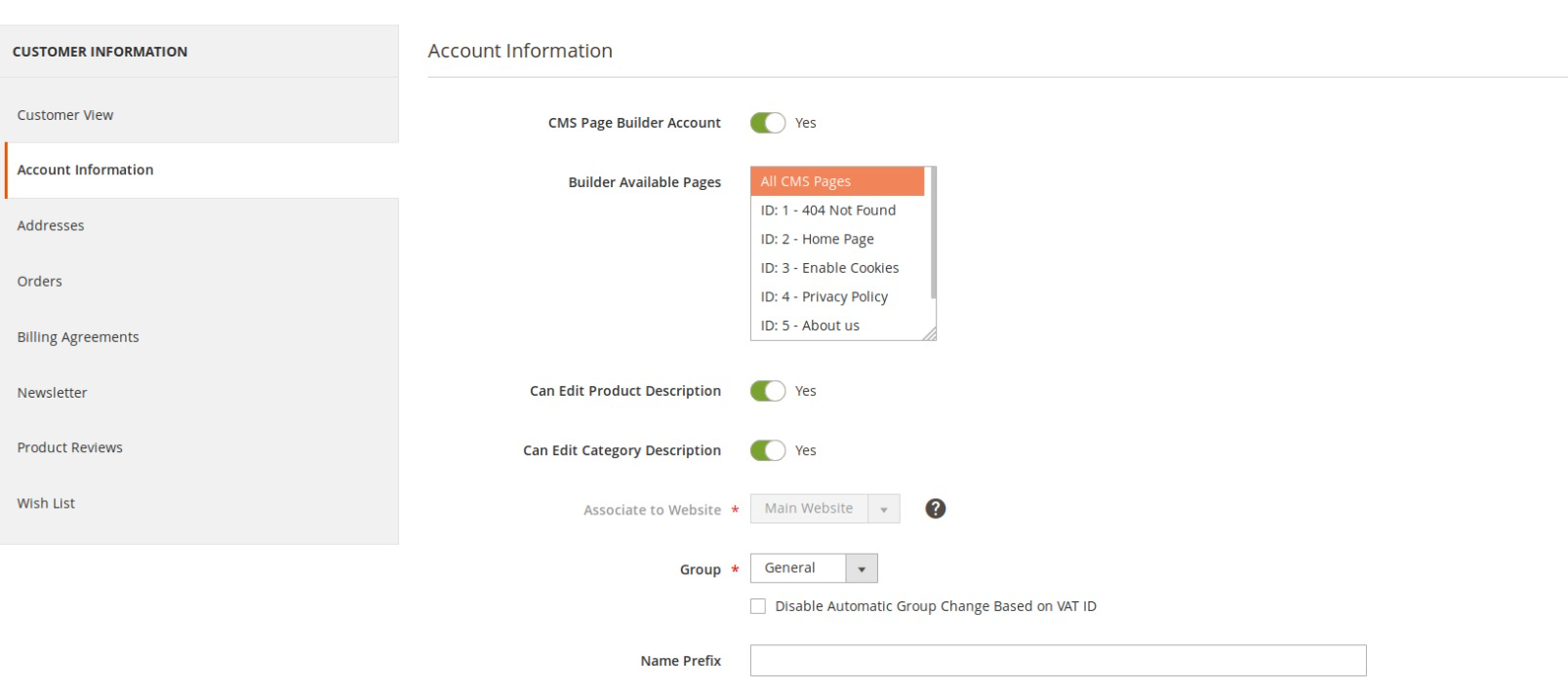
- In Backend, go to Customers → All Customers.Find and click its edit button.
- On Edit Customer Page, choose tab Account Information. Find field Is Front-end Builder Account.
- Here, you can see a switch that you can turn on to enable this customer as builder account.
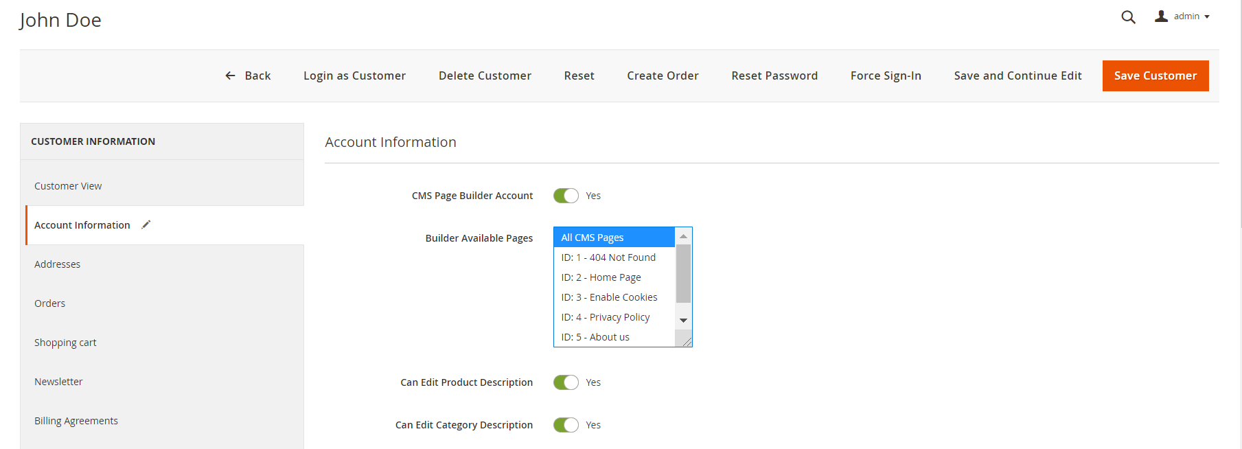
- Click Save Customer button to finish the process.
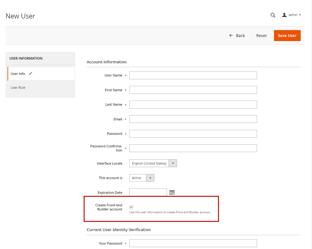
Create Panel Account (in back-end)
Step 1: Create Customer Account (Back-end)
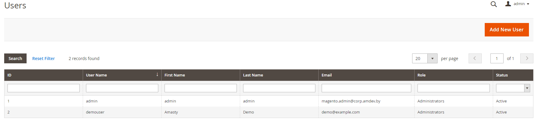
- In Backend, go to System → All Users
- Click Add New User button if you want to add a new account admin. Or you can edit an existing account admin to create a panel account.
Step 2:Set Customer to Panel Account
IF YOU CREATE A NEW ADMIN ACCOUNT:
- On create account admin form, should you can a checkbox Create Front-end Builder account, checked it
- Input for all require field, click Save User button to finish the process.
- A customer account for Front-end Builder has been created with admin account information.
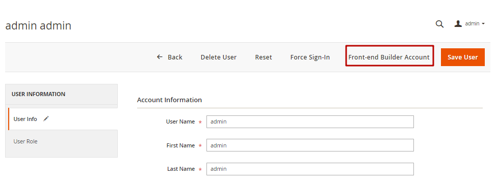
IF YOU EDIT AN ADMIN ACCOUNT:
- On Admin Account Information page, should you click on Front-end Builder Account, you can see a popup. Click OK button
- Confirm OK to accept using this account as front-end builder account.
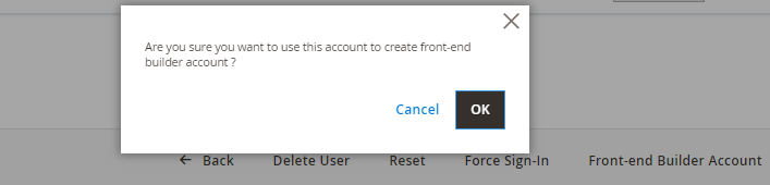
- A successful message displays to inform that a customer account for Front-end Builder has been created with admin account information.
Active MGS Frontend Builder
- In backend, go to MGS → General Settings.
- On General section, you can see field Active Front-end Builder. Change value to Yes.
- You may need to choose allowed pages in the next step, more about it in Builder accounts' page editing permisson settings.
- Click Save Config button. After that, clear cache on System → Cache Management
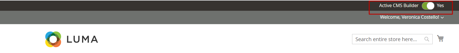
- At Front-end, go to Login page. Login with Panel Account.
- After login, you can see switcher Active Builder on top panel. Click to turn on it and activate Front-end Builder.
 MGS Front-end Builder is Ready to be used!
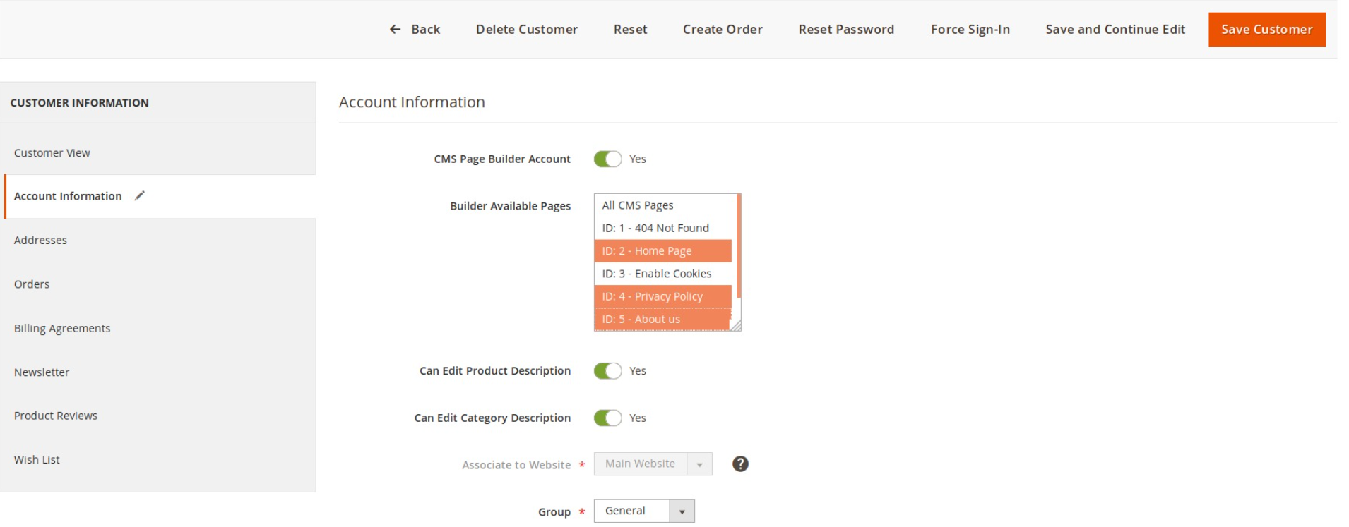
Builder accounts' page editing permisson
This is rule applying for all builder's account. When you active builder account, you can see a list of available CMS pages:
- Click to choose the page you want to apply builder. You can hold Ctrl button on your keyboard to choose multiple items
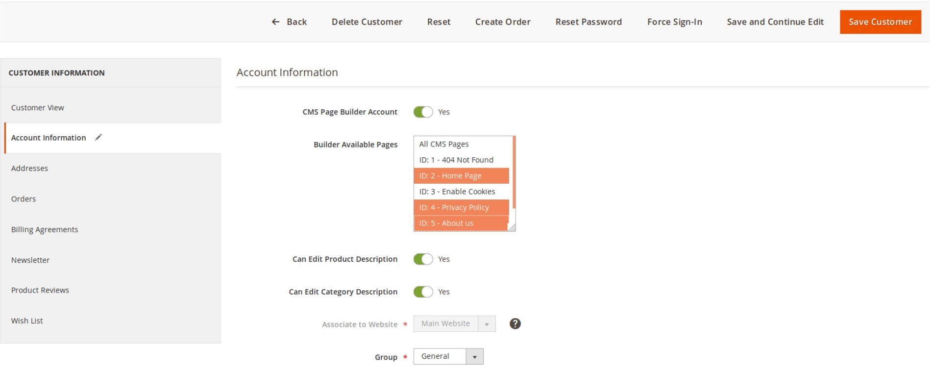
- In case you want apply Builder for all pages, you should choose All CMS Pages option
- Click Save customer to finish the setting.
- Now you can see that only selected page can apply Builder. Others cannot active Builder in any case.
Enable builder
- When builder is active, go to the pages that you apply editing rule.
- Should you see a switcher Active Builder on top panel, click it to enable Builder Frontend Editor.
- Wait for page to reload, You can see Builder frontend editor is ready.
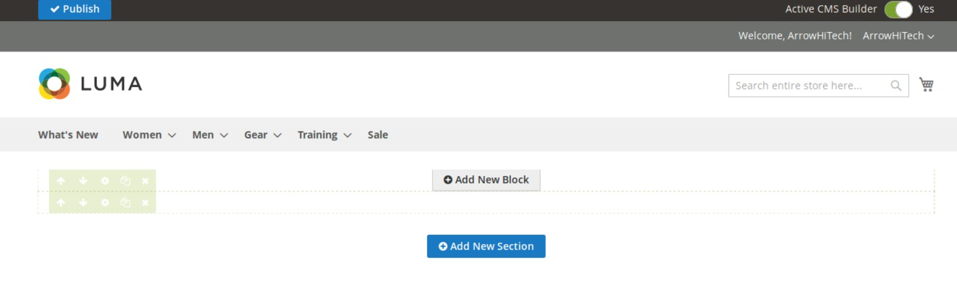
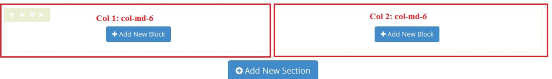
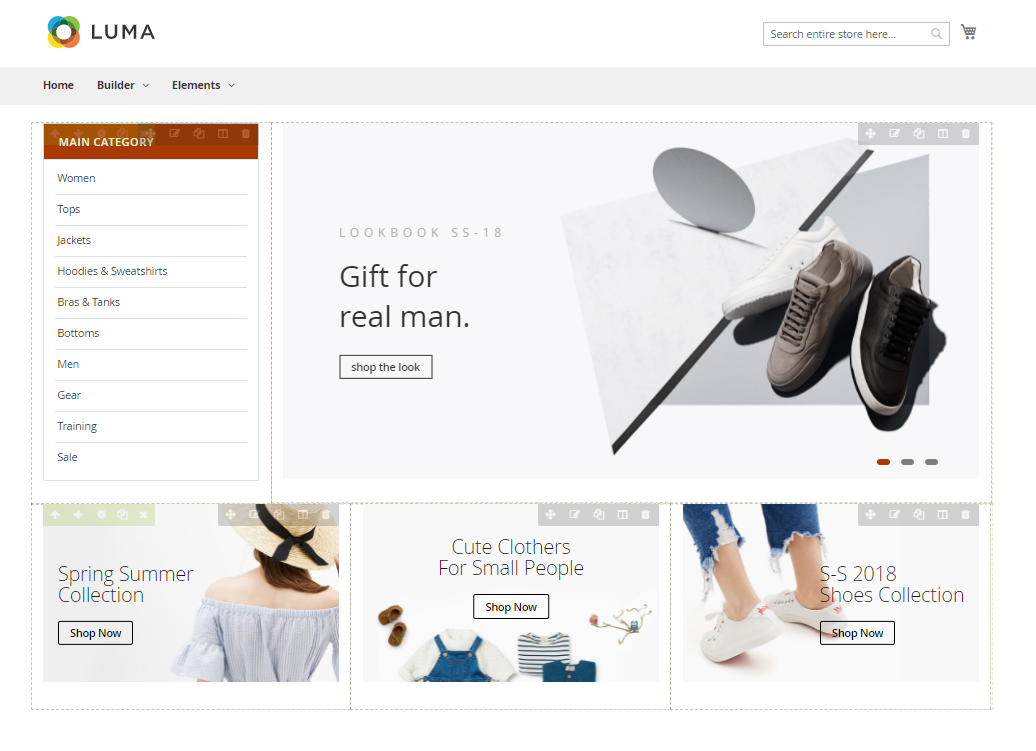
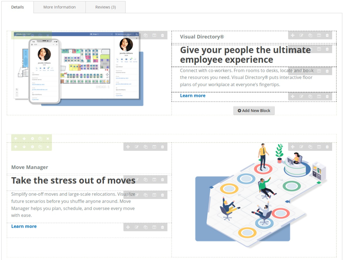
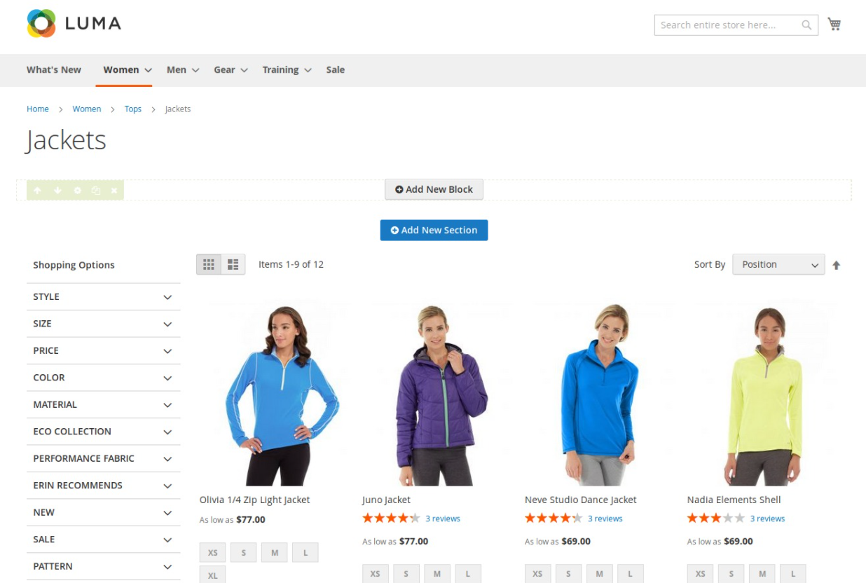
Create new section
The section defines blocks in home page content.
- Right after you enable Builder, you can see the button Add New Section.
- Click this button to create a new section. After waiting for a while, you can see a section with edit group button for it.
- Arrow up button: Move (position) this section up 1 level.
- Arrow down button: Move(position) this section down 1 level.
- Tool button: Show popup config this section.
- Copy button: Duplicate this section.
- Remove button: Remove this section. If section has child blocks, remove section means that you agree to remove all child blocks).
Config Section
After clicking the Config button of section, a popup to config section will be shown:
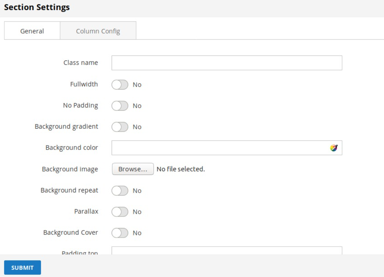 GENERAL TAB
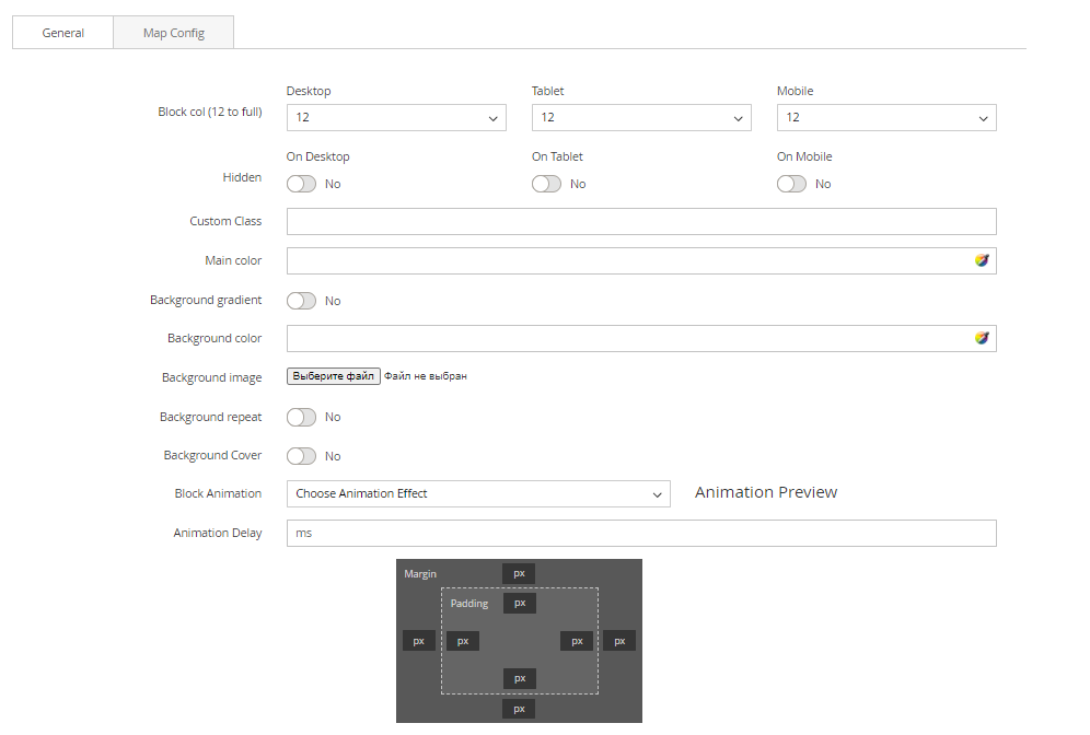
- Class name: Add custom class for section
- Full width: Choose Yes to config width of section to 100%;
- No padding: Choose Yes to remove padding of section
- Background gradient: Choose Yes to config the gradient color effect for background
- Background color: Config background color for section. You can input Hexadecimal color values to field or use Color picker tool on the right.
- Background image: Config background image for section. You can upload an image from your computer.
If you add background image, you can see checkbox Remove background to remove background image next time.
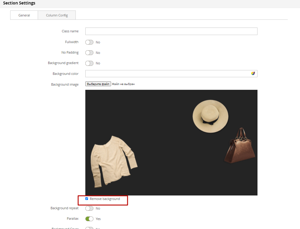
- Background repeat: If you use background image and you want repeat image for background, enable it. This same background-repeat: repeat; on style css.
- Parallax: If you use background image and you want fixed background, enable it. This same background-attachment: fixed; on style css.
- Background Cover: Scale the background image to be as large as possible so that the background area is completely covered by the background image. Some parts of the background image may not be in view within the background positioning area. This same background-size: cover; on style css.
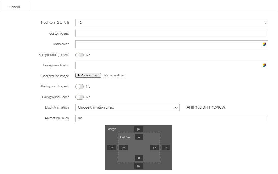
- Padding top: Input number for field. This option to generate space top with your value pixel for section.
- Padding bottom: Input number for field. This option to generate space bottom with your value pixel for section.
COLUMN CONFIG TAB
- On config column, you can see options for layout section (border red on the demo image). This config applies for most desktop resolution.
- Based on the illustration, choose the best division that suitable with your requirement.
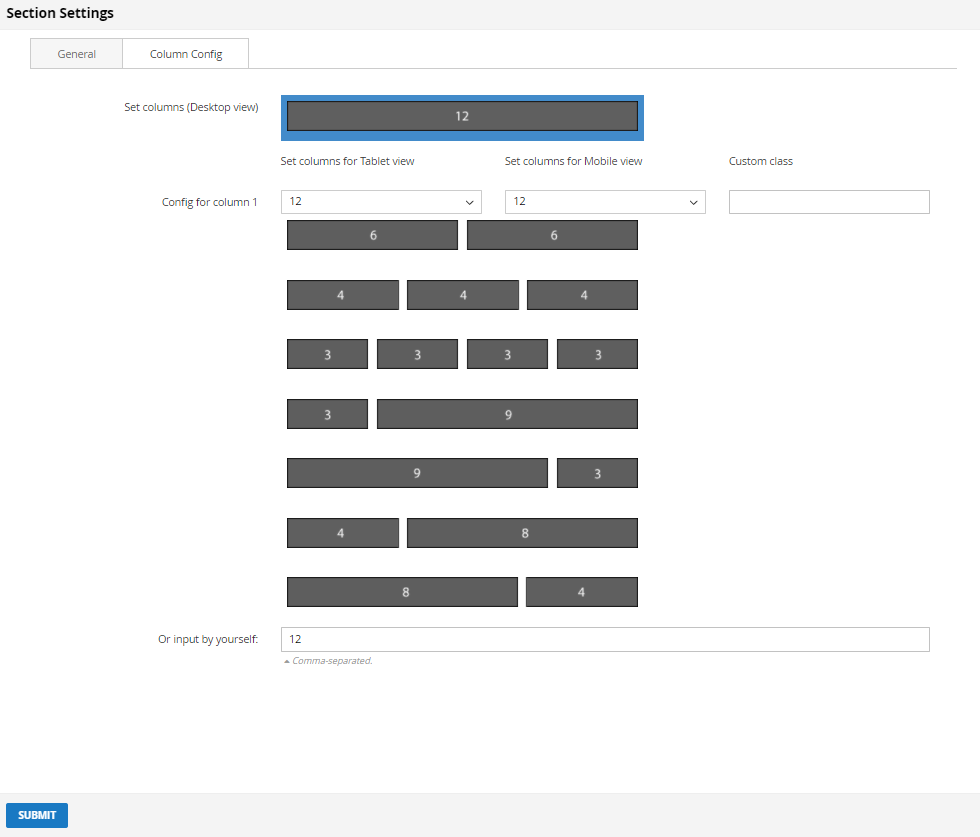
- Or you can input the number by yourself, provide that the sum of 2 columns must equal to 12.
- After choosing config column, there will be a more detailed configuration for tablet and mobile resolution for you to set if you need.
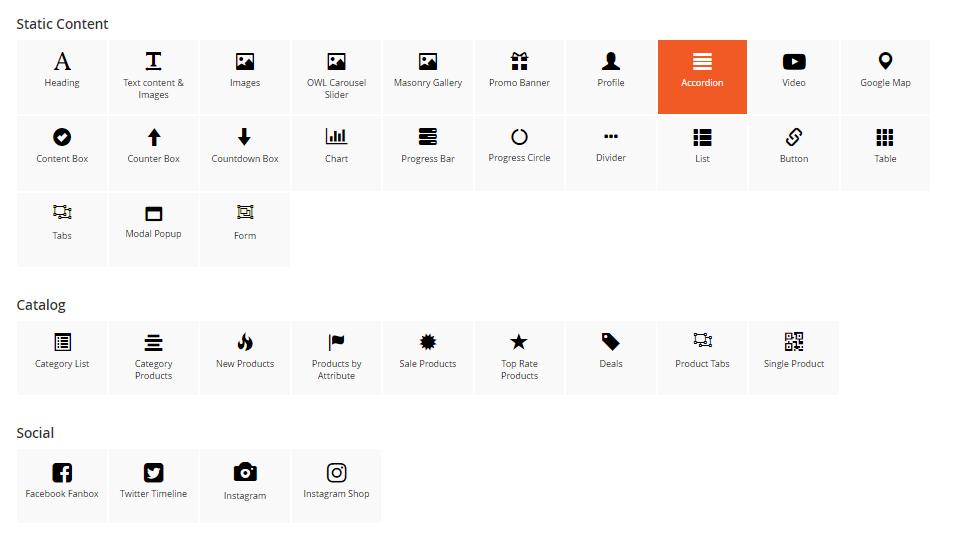
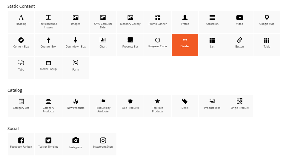
Create new block
On CMS page, for any section, you can see Add New Block button
 Click this button to add new block
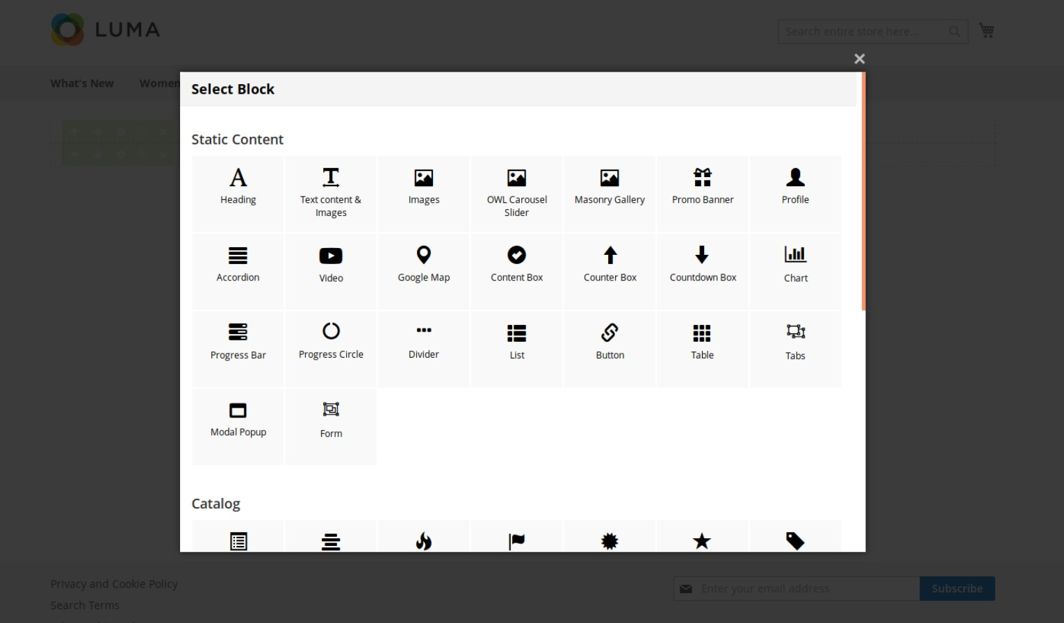
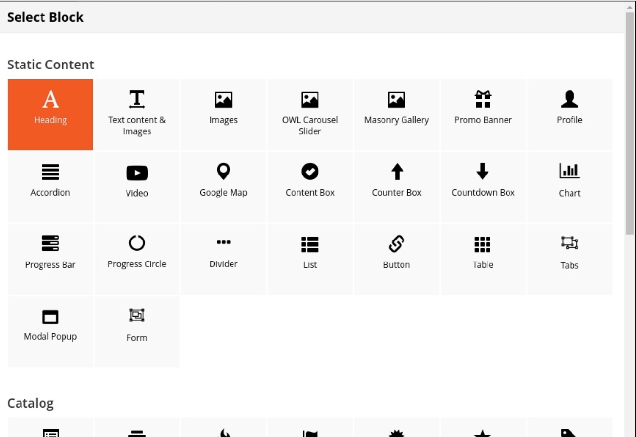
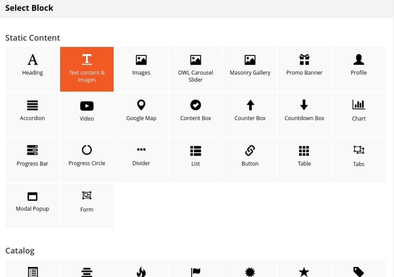
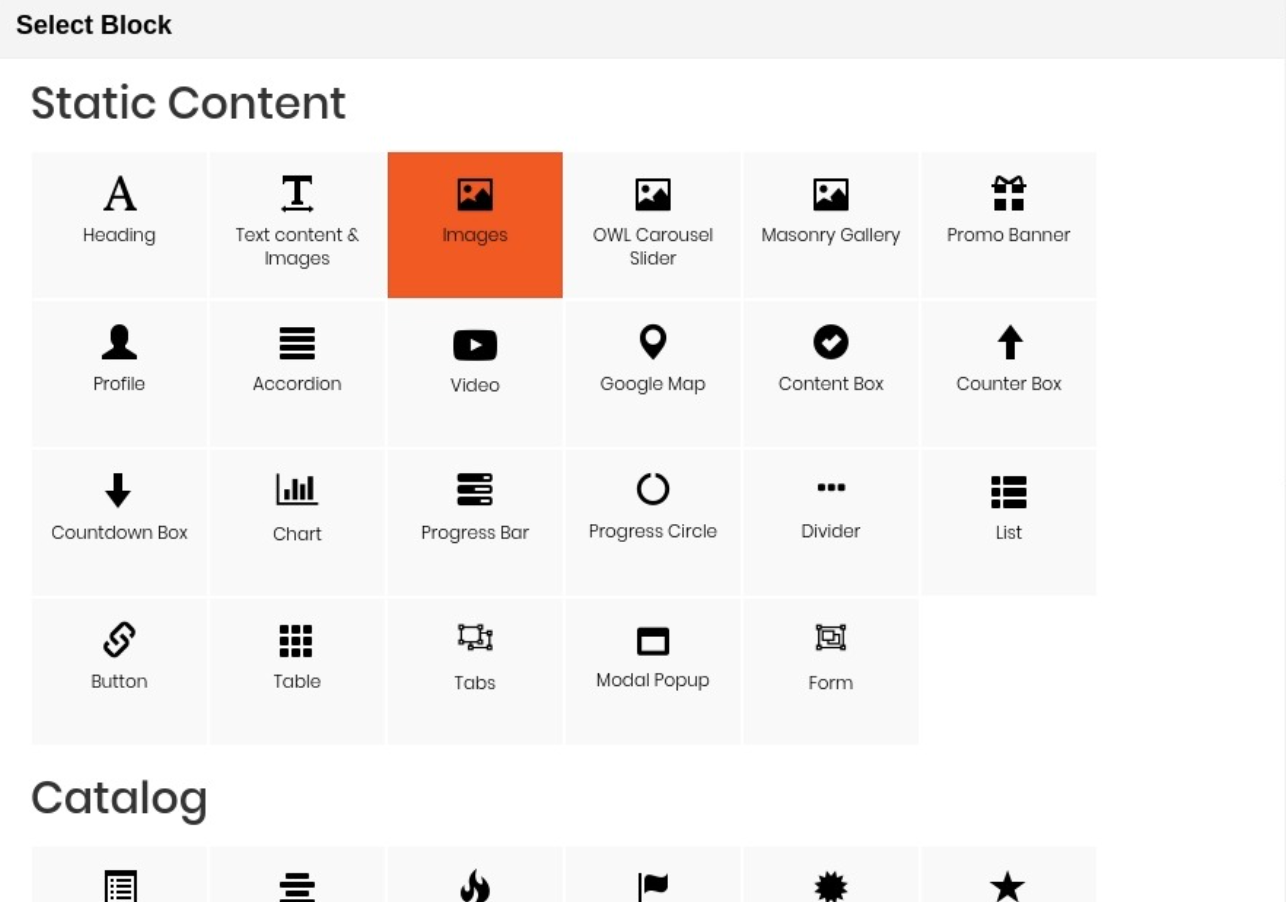
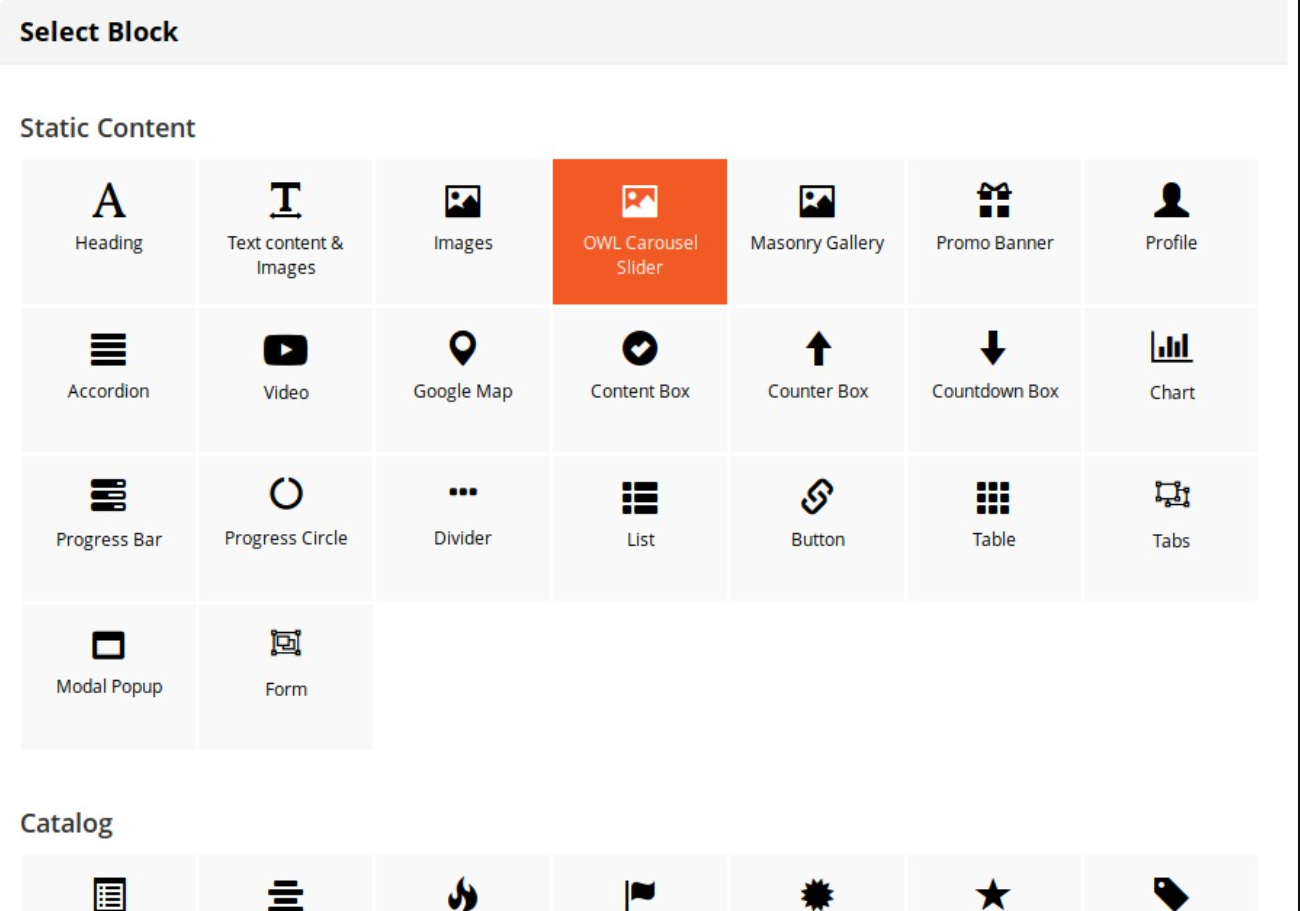
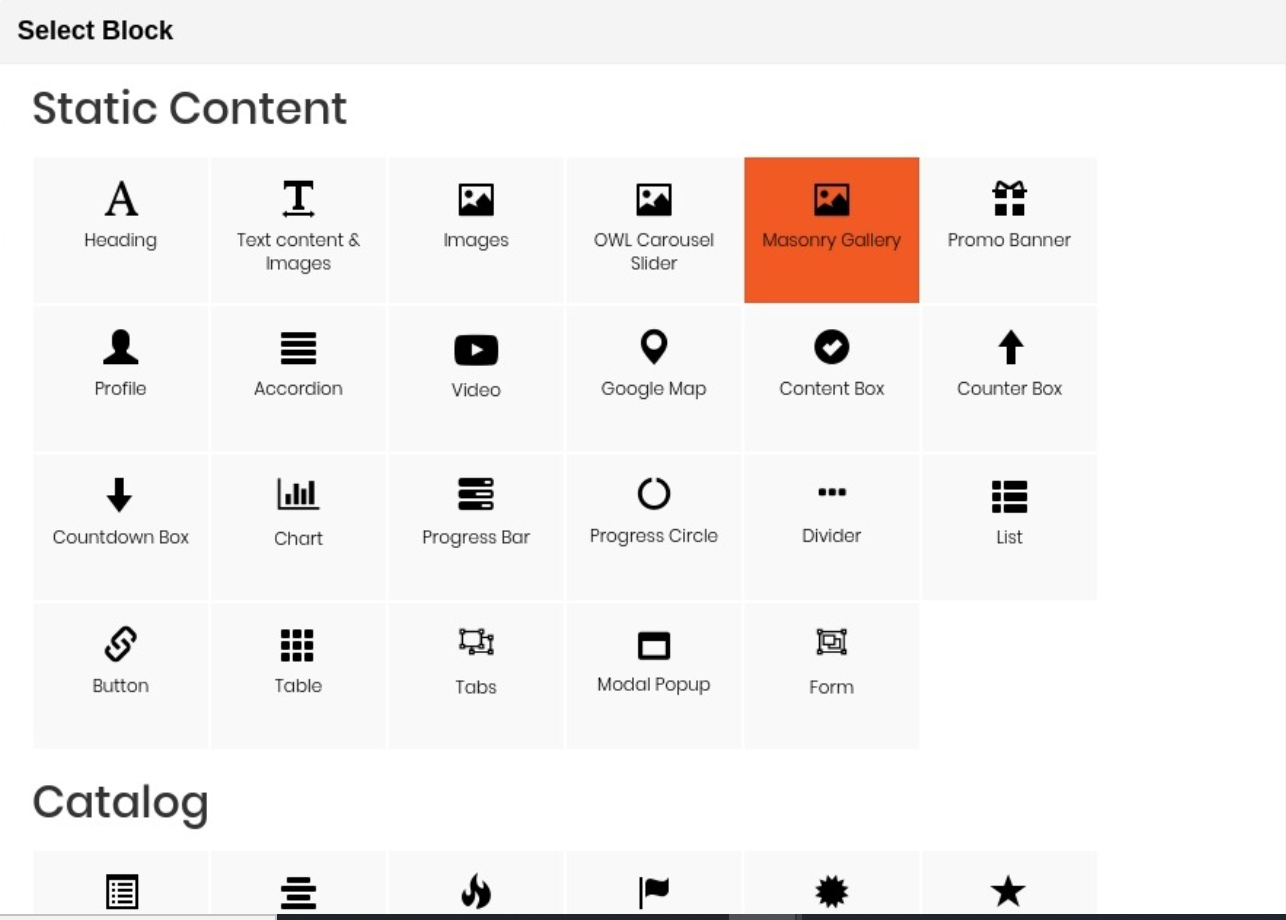
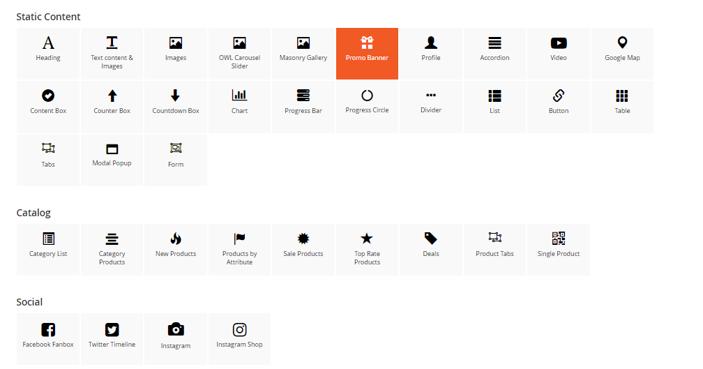
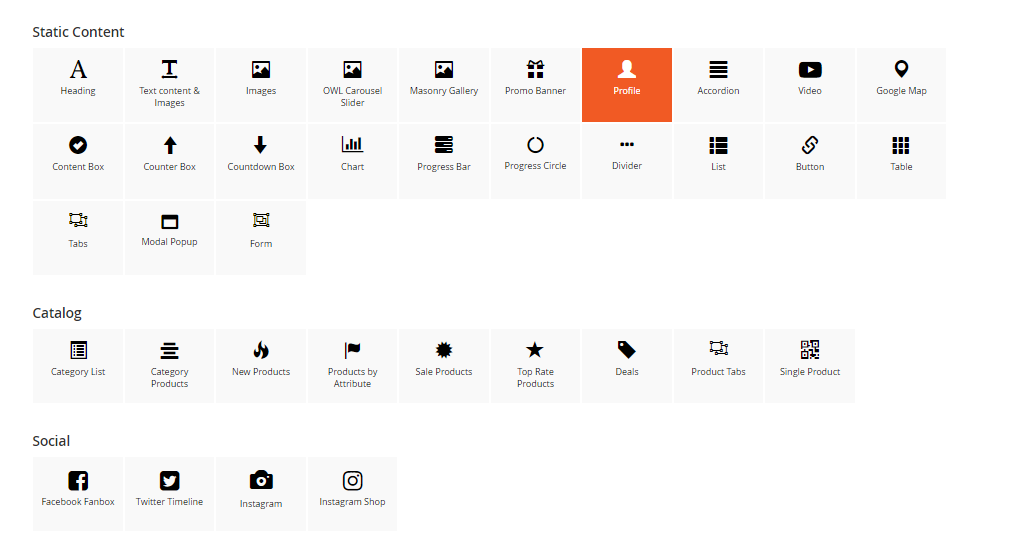
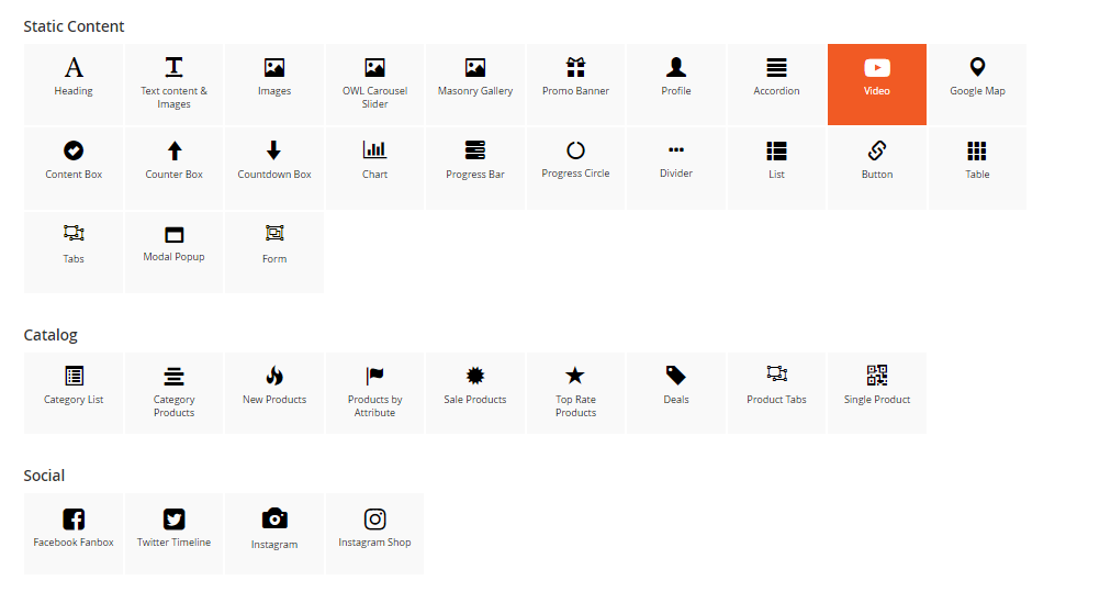
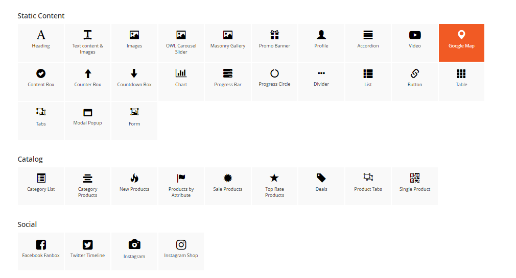
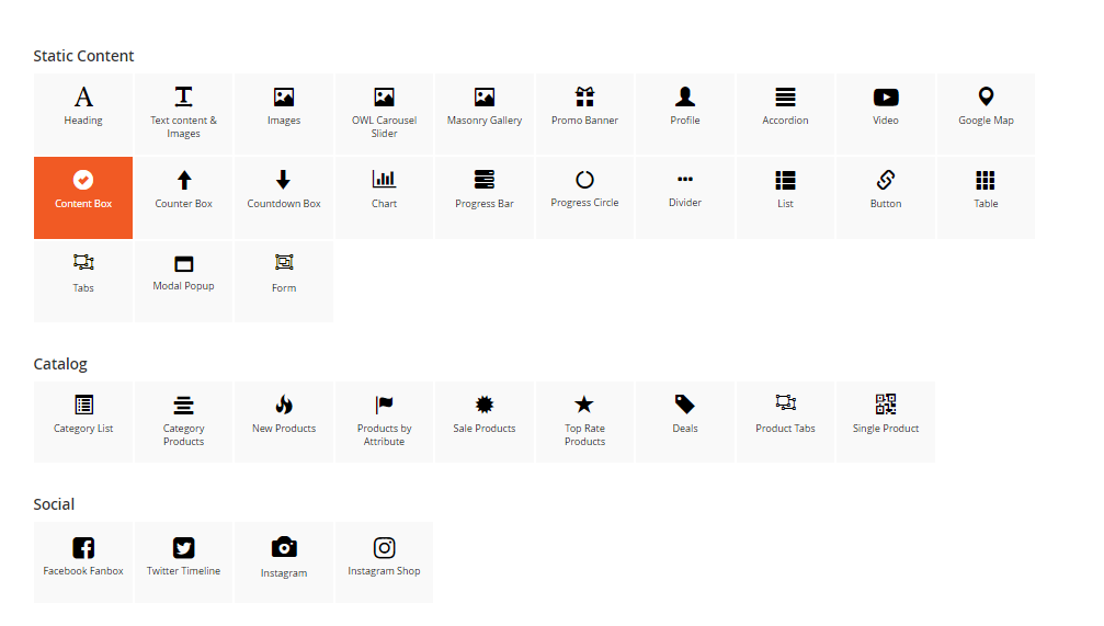
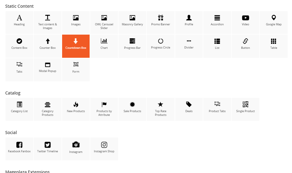
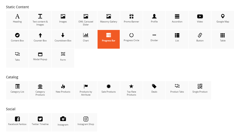
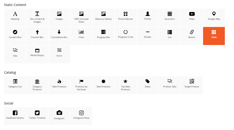
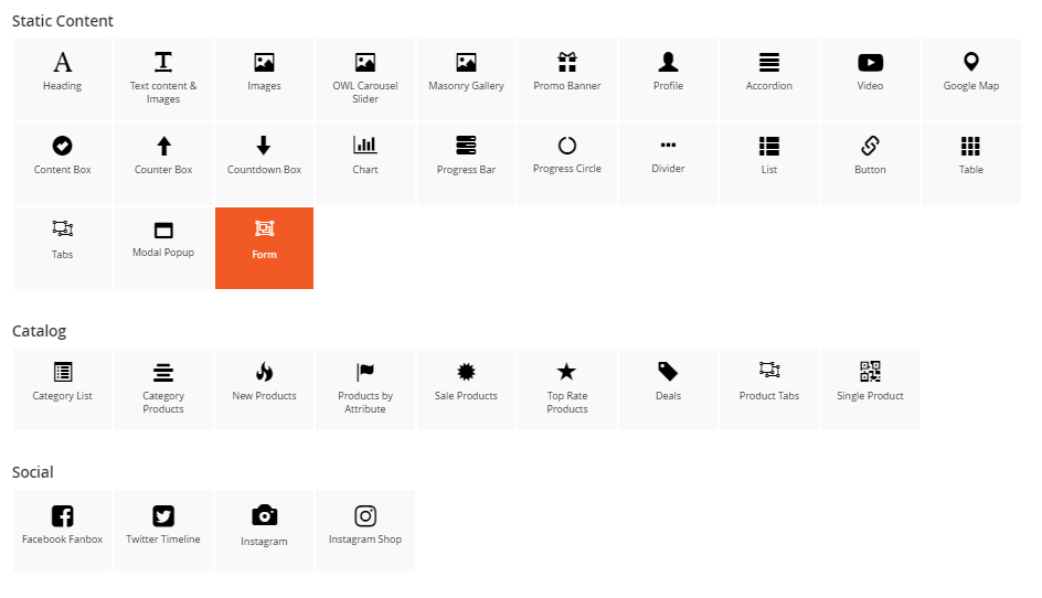
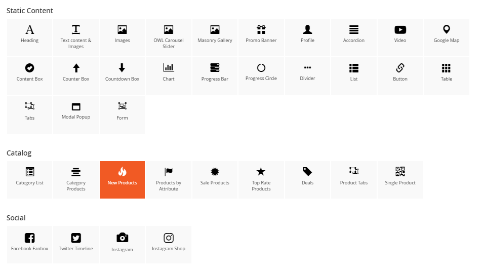
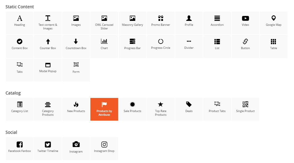
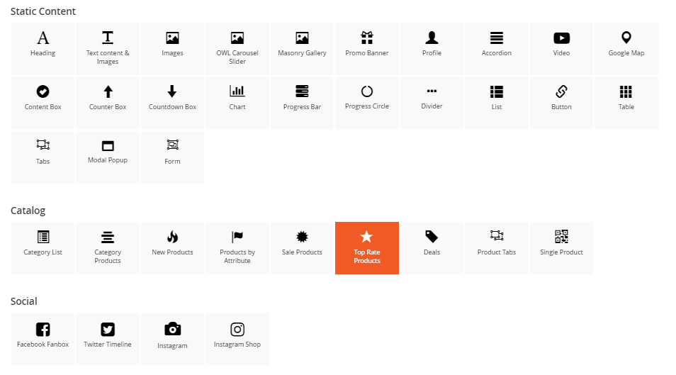
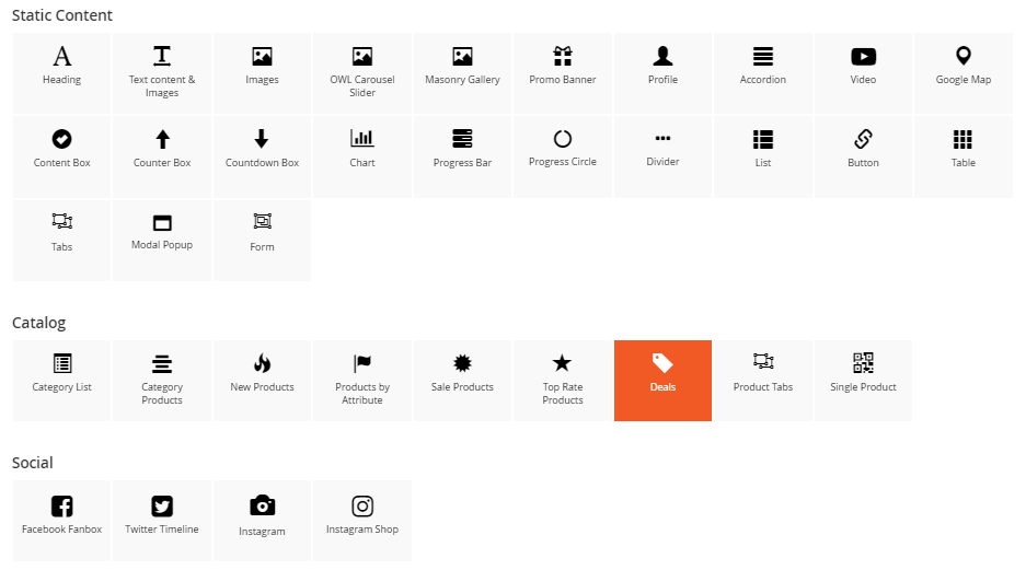
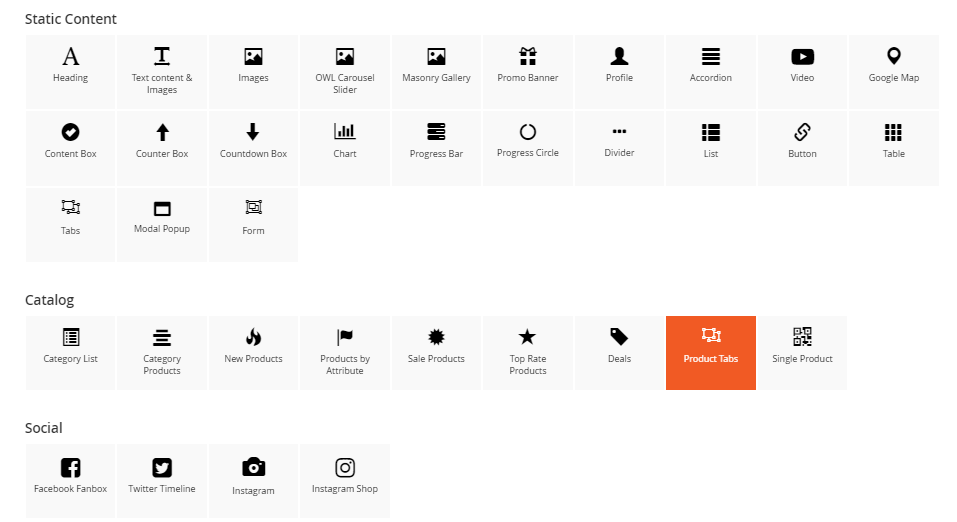
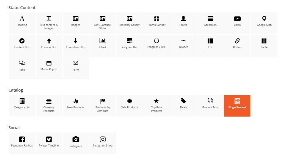
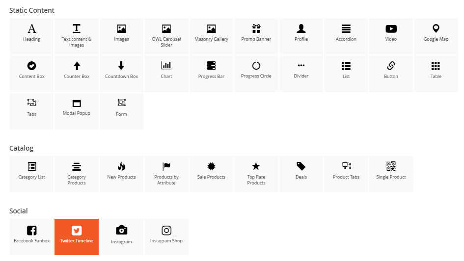
You can see 30+ available elements divided into 4 main groups.
Static Content: General contents which are designed for various different purposes.
- Headings
- Text content & Images
- Images
- Owl Carousel Slider
- Masonry Gallery
- Promo Banner
- Profile
- Accordion
- Video
- Google Map
- Content Box
- Counter Box
- Countdown Box
- Chart
- Progress Bar
- Progress Circle
- Divider
- List
- Button
- Table
- Tabs
- Modal Popup
- Form
Catalog: Elements related to category and products.
- Category List
- Category Products
- New Products
- Products by Attribute
- Sale Products
- Top Rate Products
- Daily Deals
- Product Tabs
- Single Product
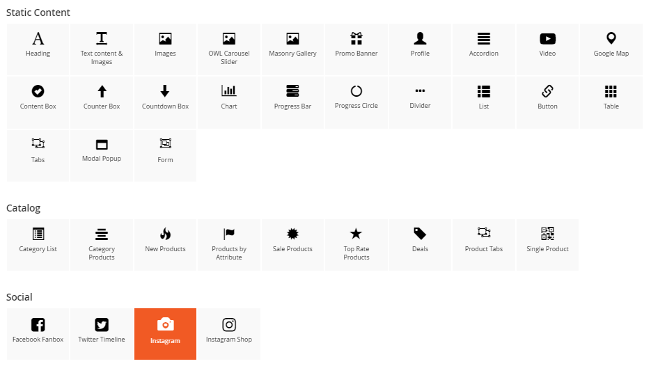
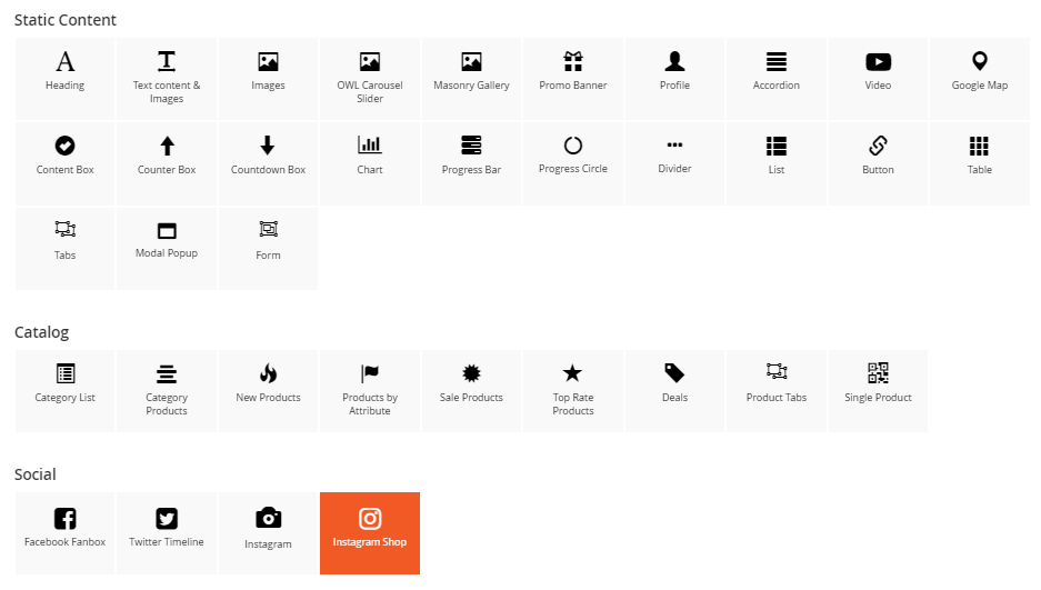
Social: CMS blocks support popular social networks.
- Facebook Fanbox
- Twitter Timeline
- Instagram
- Instagram Shop
Mageplaza Extensions: Extra extensions from Mageplaza that we recommend you to use.
- Banner Slider
- Blog Post
- Countdown Timer
- Daily Deal
- Brands
- Product Slider
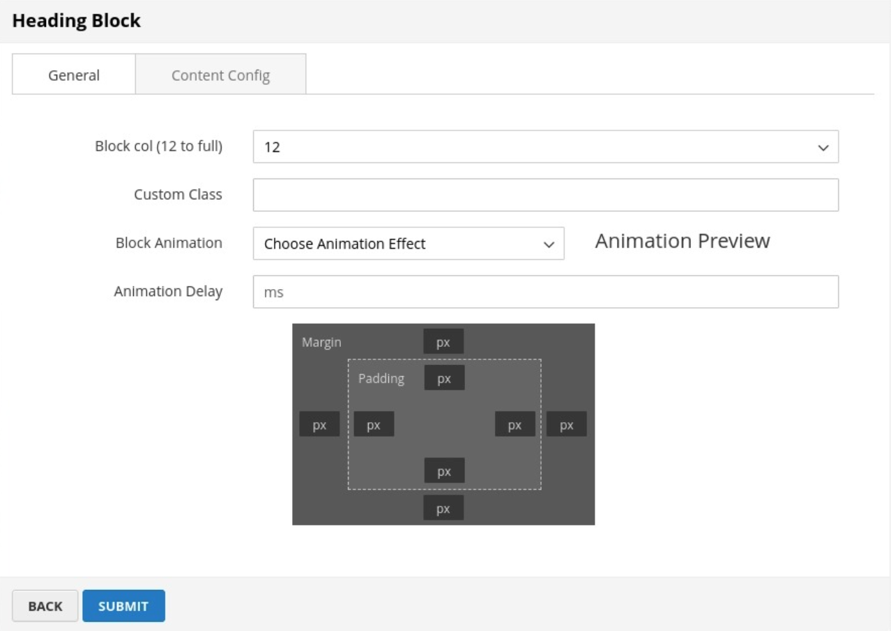
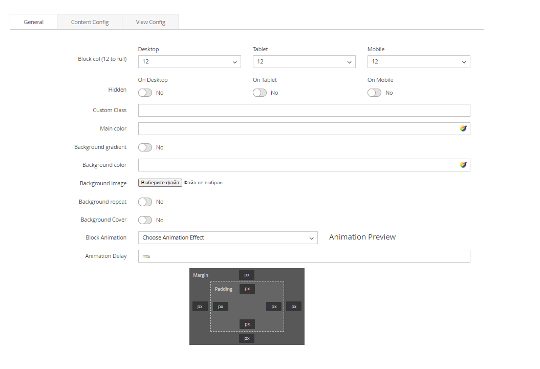
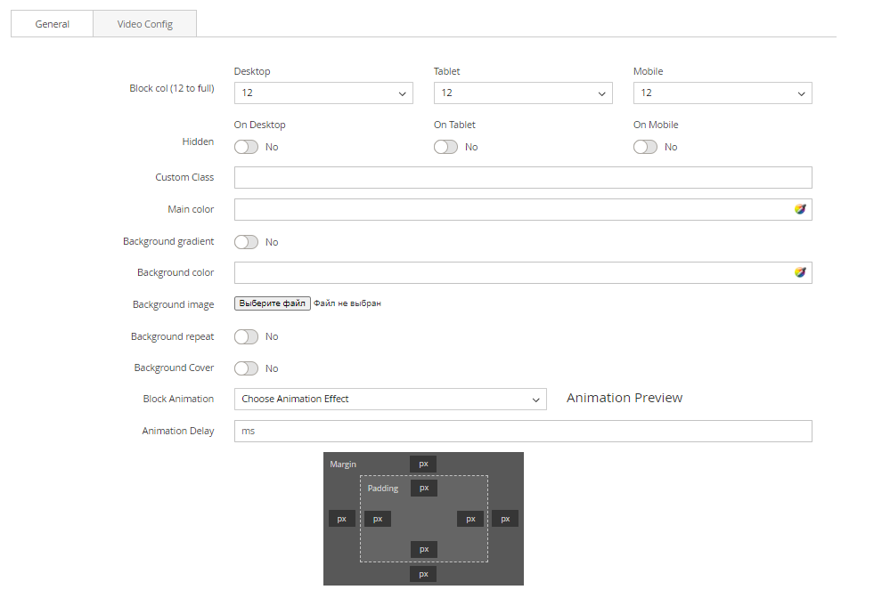
Each block will have different settings, but there are some similar settings on General tab.
- Block col (12 to full): Set width (%) for block on desktop, tablet and mobile screen.
- Hidden: Choose to hide the block on any resolution of desktop, tablet of mobile.
- Custom class: Add CSS class of block for styling.
- Block Animation: Animation effect of the block when page load. Click to choose one in the list.
- Animation Delay: Delay of animation effect
After configuring & saving block, you can see the demonstration of this element, also the group button to edit this block.

- Arrows button: You can drag & drop block to change position. Remember that, the block can't be moved out section or section col.
- Pencil button: Edit settings of that block.
- Copy button: Duplicate that block
- Columns button: Shortcuts to change the Block col
- Trash button: Remove block.
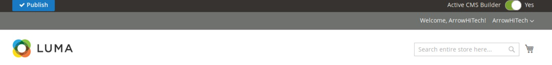
Publish a builder page
After finishing creating and editing your cms page, click Publish button at the top left of the page.
 Wait for the page to reload, now you can see the page is still in editing mode, but it has saved all your data.
 If you want to get out of editing mode, switch off Active Builder button to see your result.
Product description builder
STEP 1: Enable the Product Description for Builder Account
In Backend, go to Customers → All Customers. Find the customer you want to enale rule and click its Edit button.
On Edit Customer Page, choose tab Account Information. Find field Can Edit Product Description
Here, you can see a switch that you can turn on to allow this account to use Product Description.
 Click Save Customer button to finish the process.
STEP 2: Use Builder to build the product description
To see the visual details, click to see the active Builder demo or the deactive Builder demo
- In Frontend, go to any product detail page.
- In the product description section, you can create sections and blocks, similar to the way Builder works in CMS pages.
 After you finish your work, click Publish button to save your page publicly.
Duplicate product description builder template
There are 2 ways to copy product description from a product to another product.
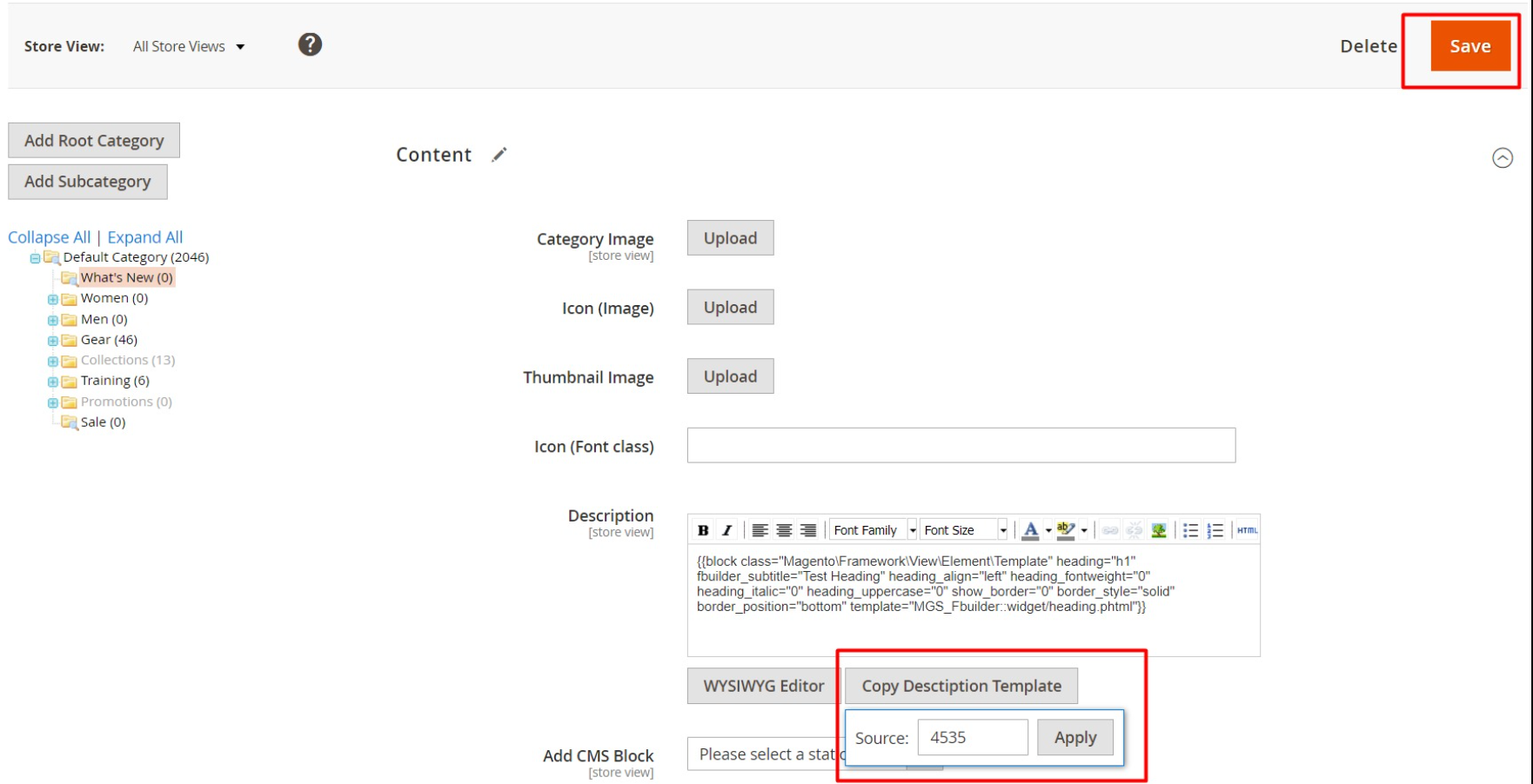
METHOD 1: Edit directly in product detail page (Backend) This way helps to duplicate the Builder's description of a product to a certain product.
- In Backend, go to Catalog → Products. Find the product that you want to paste new template and click its Edit button.
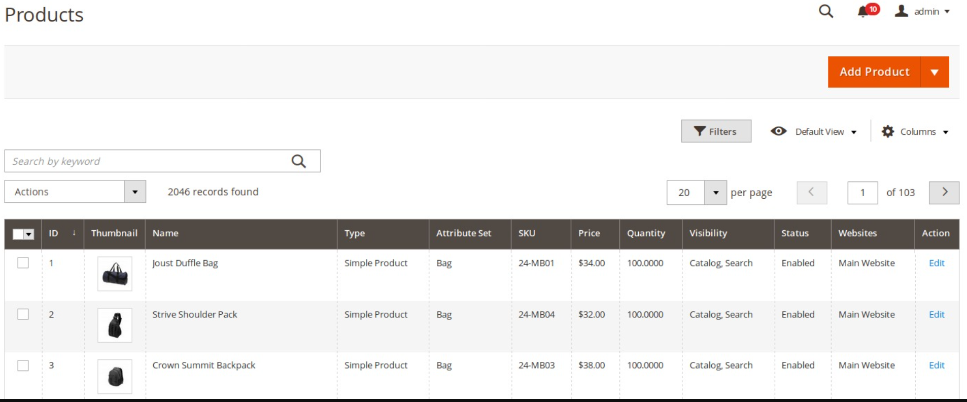
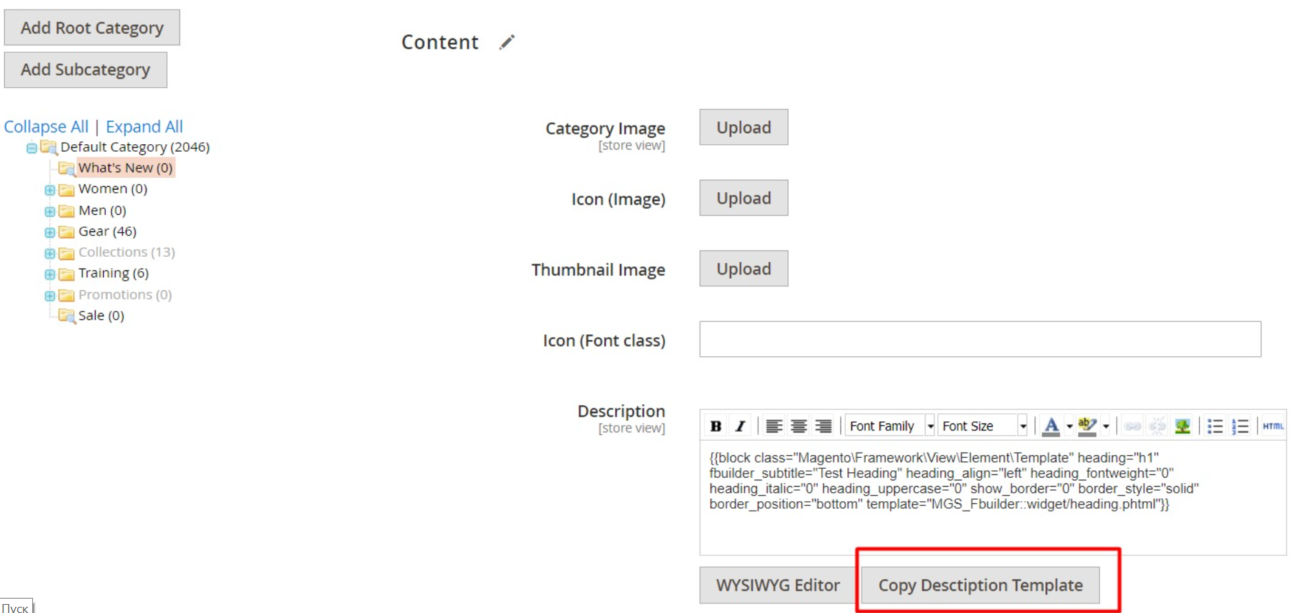
- On Edit Product Page, choose section Content.
- Now you can see field Description with the Copy Description Template button, then click it.
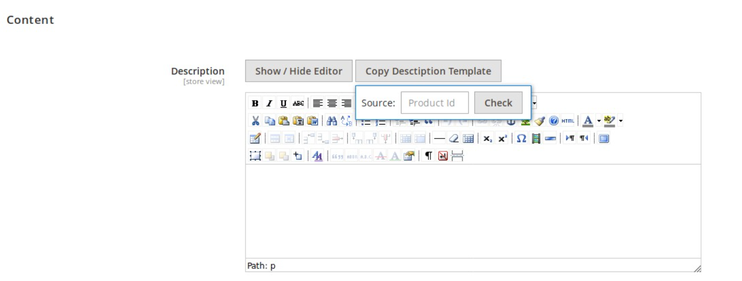
- A box will display and allow you to enter the Product Id of the Source Product. It means that this is the product of which the description (must be built by Builder) you want to duplicate.
If the Product Id you entered exists, a select list will be shown, allow you to choose from which store view to be duplicated.
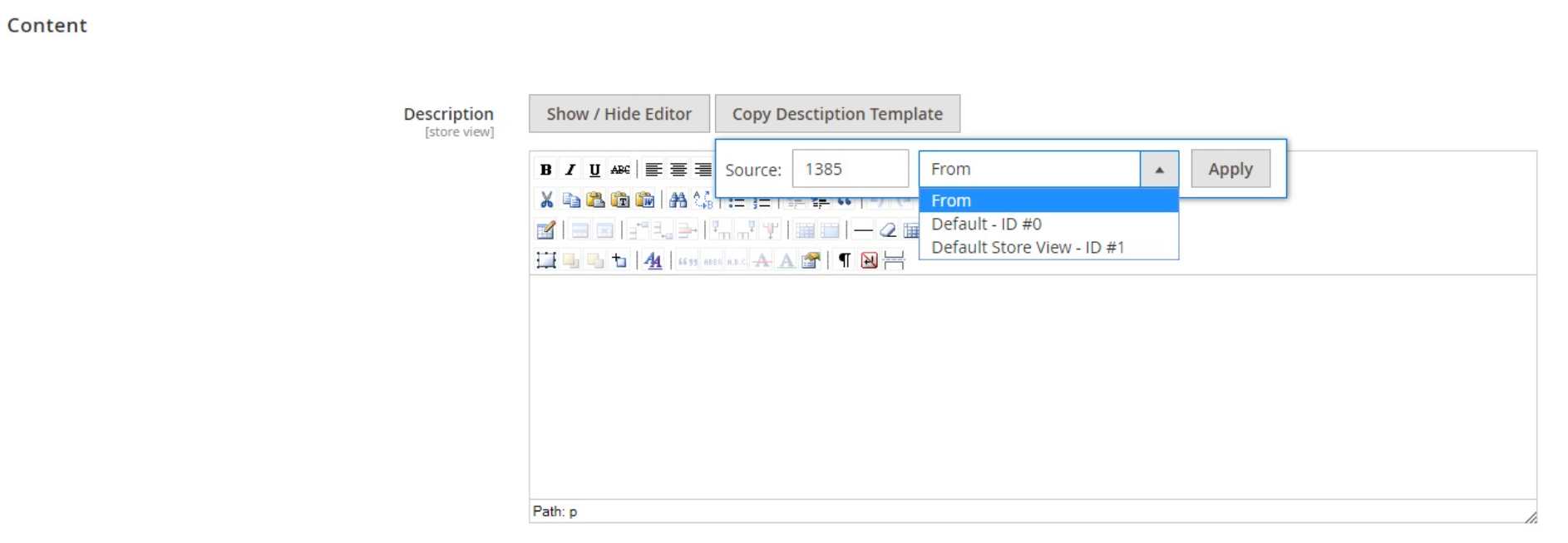
- Choose a store view to duplicate. They are distinguished by store view name and store view id.
- Click Apply button to require duplication.
- Otherwise, there is nothing changed, you should check the Product Id again.
- After you have done, click Save button at the top to finish the process.
METHOD 2: Edit directly in the list of products
This method helps to duplicate a Builder's product description to several products.
- In Backend, go to Catalog → Products. In the left column, you can see a tick box for each product.
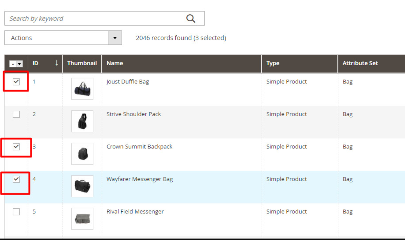
- Tick on the product(s) that you want to be Pasted a new Builder description.
- Right below you can see the dropdown, click it and find Copy Description Template button. Then click it and you can see the pop up box again.
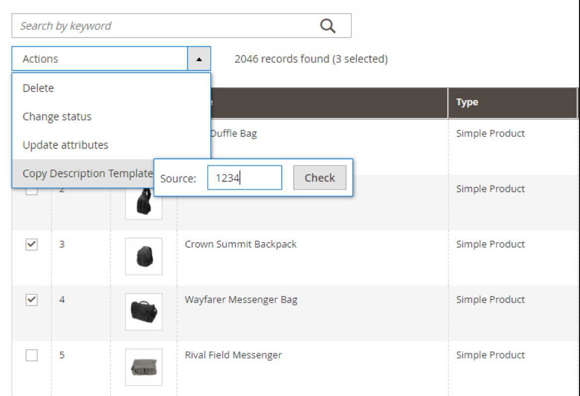 Now, you do the work of entering the Product Id of the Source Product again. Please note once more, this is the product that has the description (built by Builder) you want to duplicate.
- If the Product Id you entered exists, a select list will be shown, allow you to choose from which store view to be duplicated.
- Choose a store view to duplicate. They are distinguished by store view name and store view id.
- Click Apply button to require duplication.
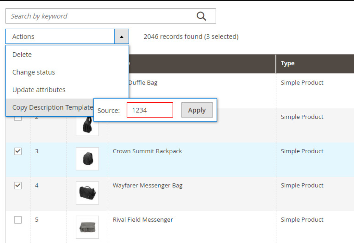 Otherwise, there is nothing changed, you should check the Product Id again.
After you have done, click Save button at the top to finish the process.
Category landing builder
STEP 1: Enable the Category Landing for Builder Account
- In Backend, go to Customers → All Customers.Find and click its Edit button.
- On Edit Customer Page, choose tab Account Information. Find field Can Edit Category Description
- Here, you can see a switch that you can turn on to allow this account to use Category Description.
- Click Save Customer button to finish the process.
STEP 2: Use Builder to build the category landing page
- In Frontend, go to any category landing page.
- In this category page, you can create sections and blocks, similar to the way Builder works in CMS pages.
- After you finish your work, click Publish button to save your page publicly.
Duplicate category landing template
- Go to Catalog → Categories and click the category you want to edit at the left category tree.
- In the tab Content find out Description field.
- Should you see the Copy Description Template button, click it and you will see a pop up box.
- This box allows you to enter the Category Id of the Source Category. It means that this is the category which has the landing page built by Builder that you want to duplicate.
- Click Check button to start searching processs.
- If the Category Id you entered exists, button Apply will be shown. Click it the to let the system know your request.
- Otherwise, there is nothing changed, you should check the Category Id again.
- After you have done, click Save button at the top to finish the process.
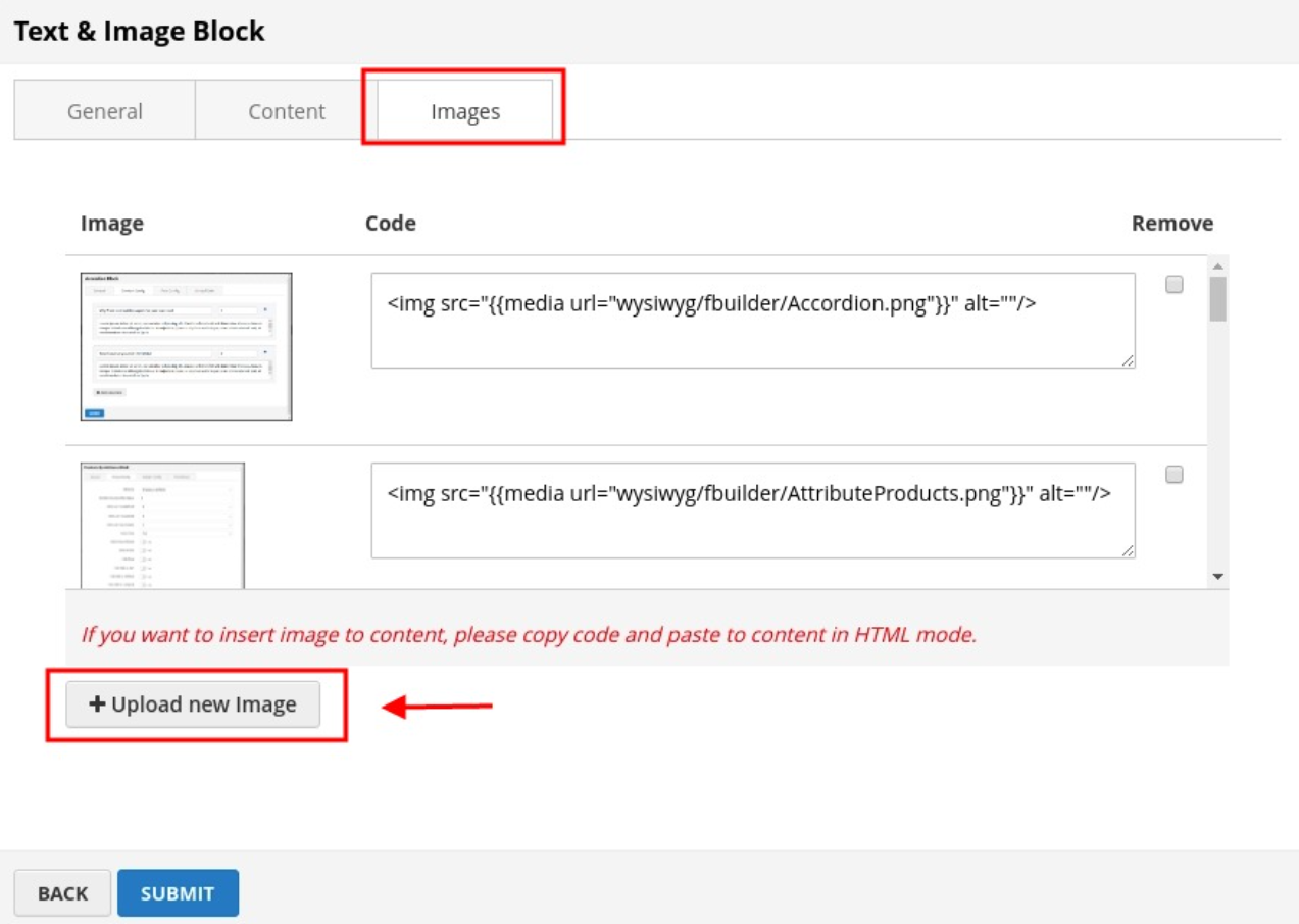
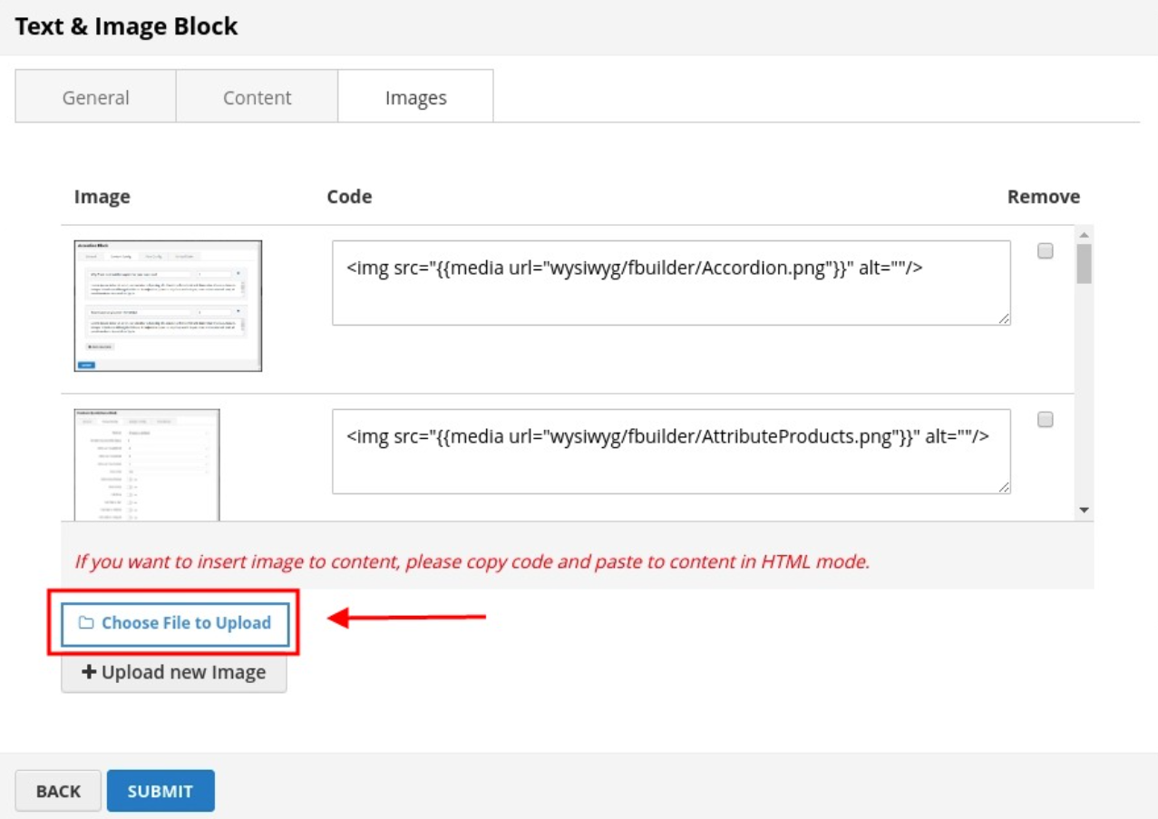
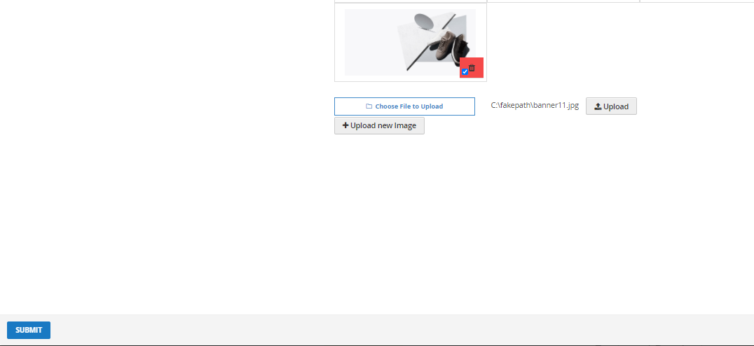
Upload images with builder elements
This way of uploading image can be applied for all Builder elements related to images
IMAGES TAB
- To upload new image, click Upload new Image button
- Click Choose File to Upload button, choose an image from your computer.
- Click Upload button and wait for the system to load.
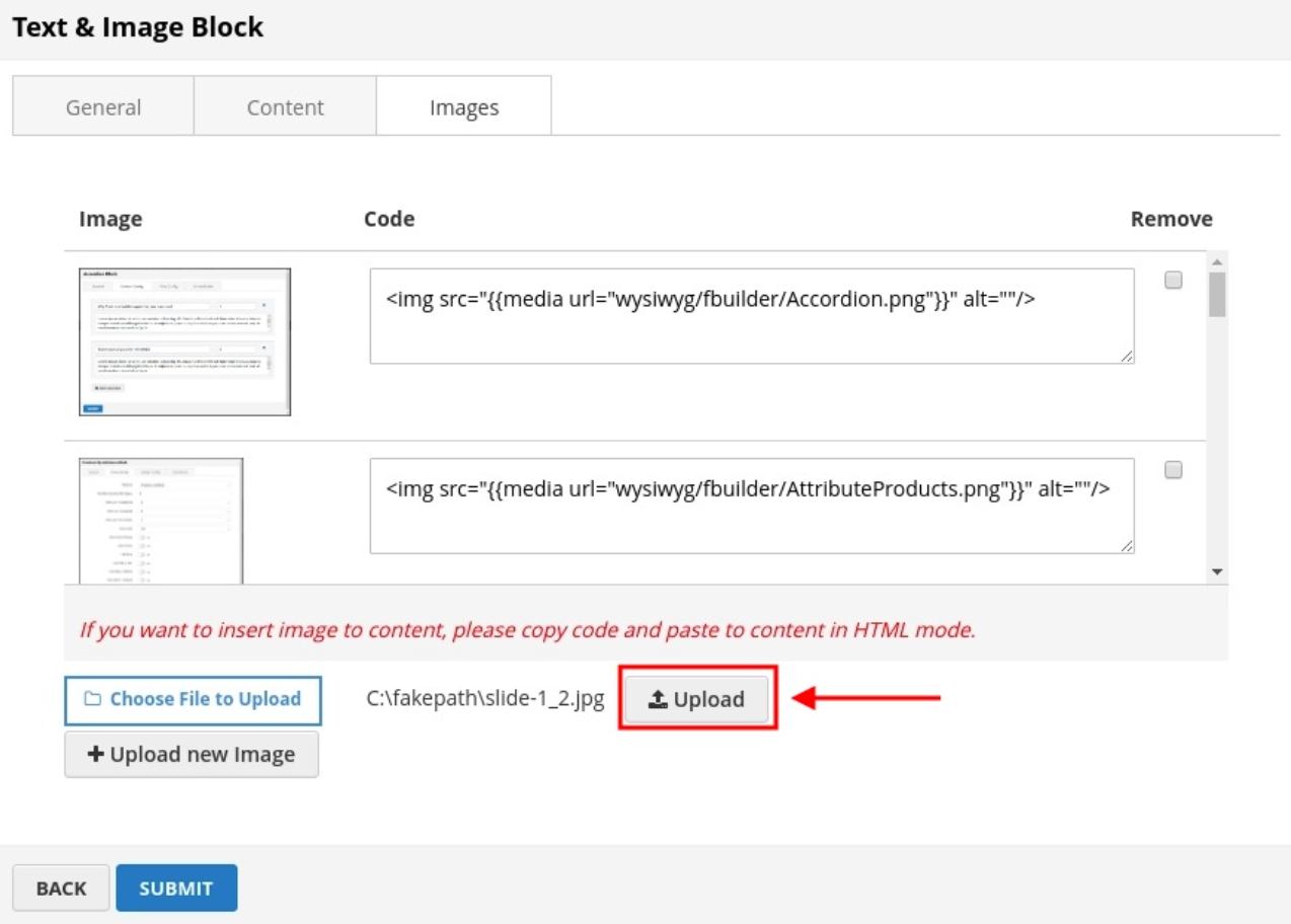 After image uploaded, you can see new row on table image.
- Code: You can copy this code and back to Content tab to insert image.
- Remove: If you want to remove image, tick checkbox on image row.
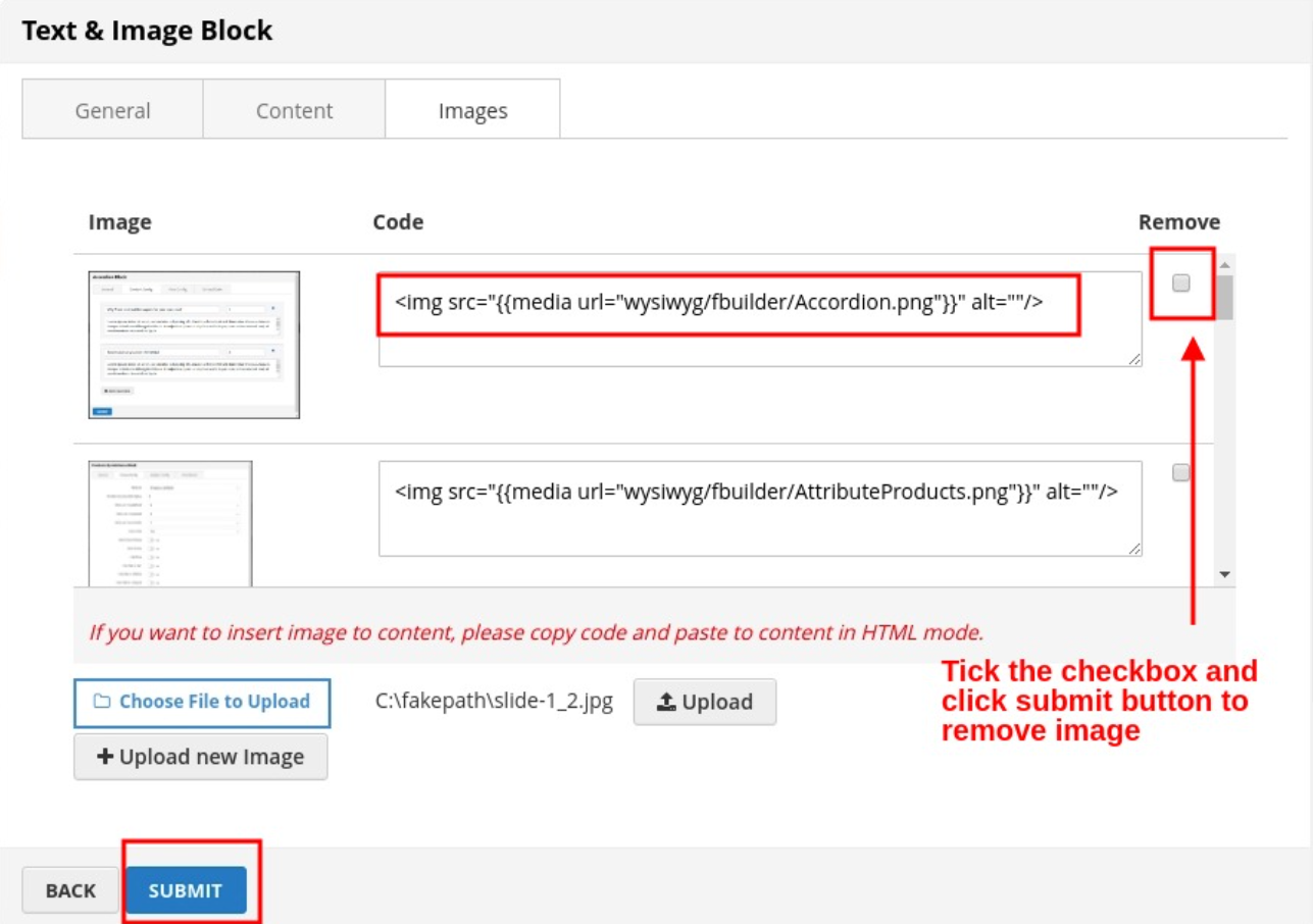 Click Submit button then this image will be successfully removed.
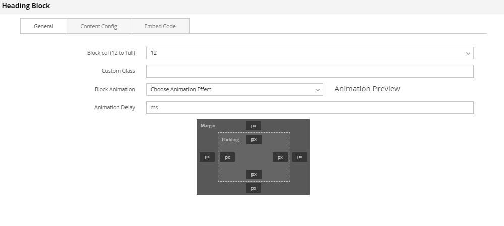
Heading static block
The Heading Element,from h1 to h6 with many options (text align, font, color, border…) helps to make the heading as you want.
To see the visual demonstration, click here.
On Home page builder, click Add New Block button.
 On popup list blocks, click “Heading” item.
Heading config tab
General
 You can setting some general options for your banner as general color, background color or image and some other settings, just select and experience.
Content config
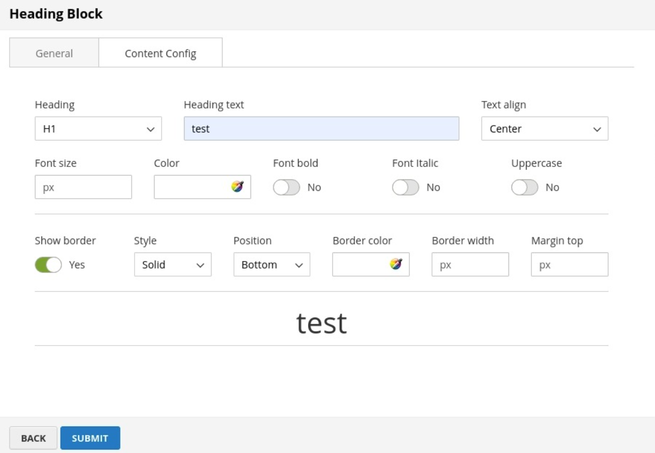 Here you can configure the heading content as follows:
- Heading: Type of heading. H1 is the biggest heading and H6 is the smallest one.
- Heading text: Content of heading.
- Text align: 3 types of align: Left, Center and Right.
- Font Size, Font Color, Font Bold, Font Italic, Uppercase: Configuration to customize the heading.
- Show border: Enable to display a border under heading.
After completing your configuration, just click Submit button to save your block.
Text content and images
If you want to create a new one, please follow below steps:
On home page, after creating new section, you can see button Add new block. Click this button, you can see popup list blocks.
On popup list blocks, click “Text content & Images” item.
Config Block
CONTENT
- Click SHOW / HIDE EDITOR

- Then you can add your content ( text/html ) to it
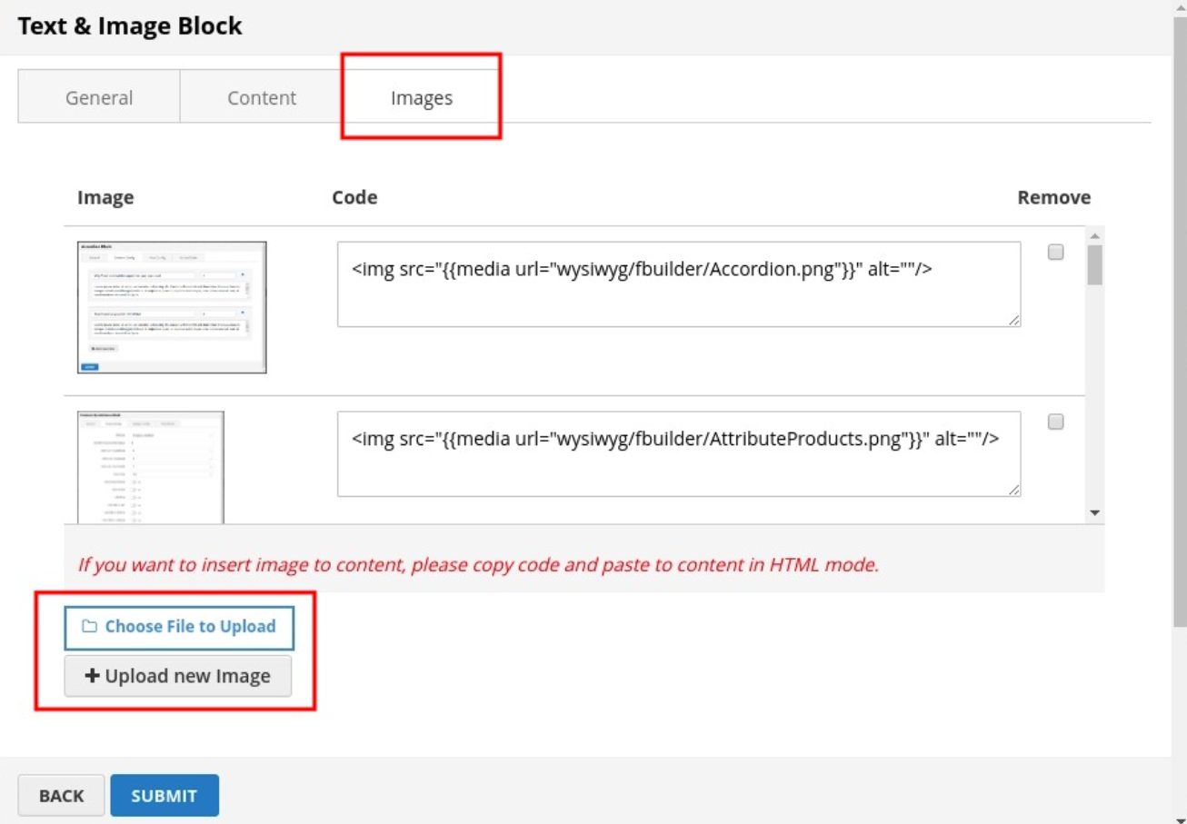 IMAGES
- To upload new image, click Upload new Image button
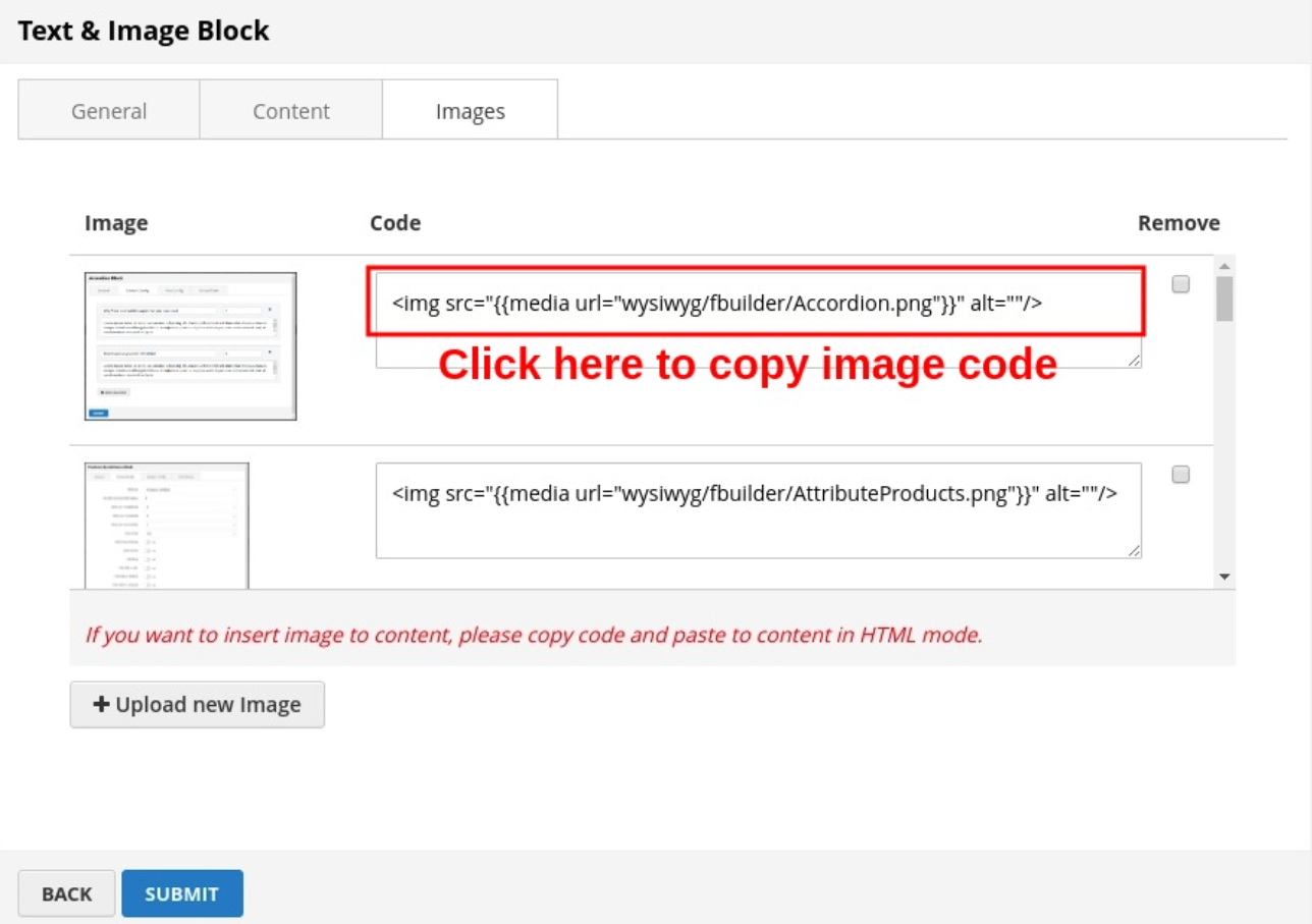
- Then if you want to add an image to the content, click directly on code to copy
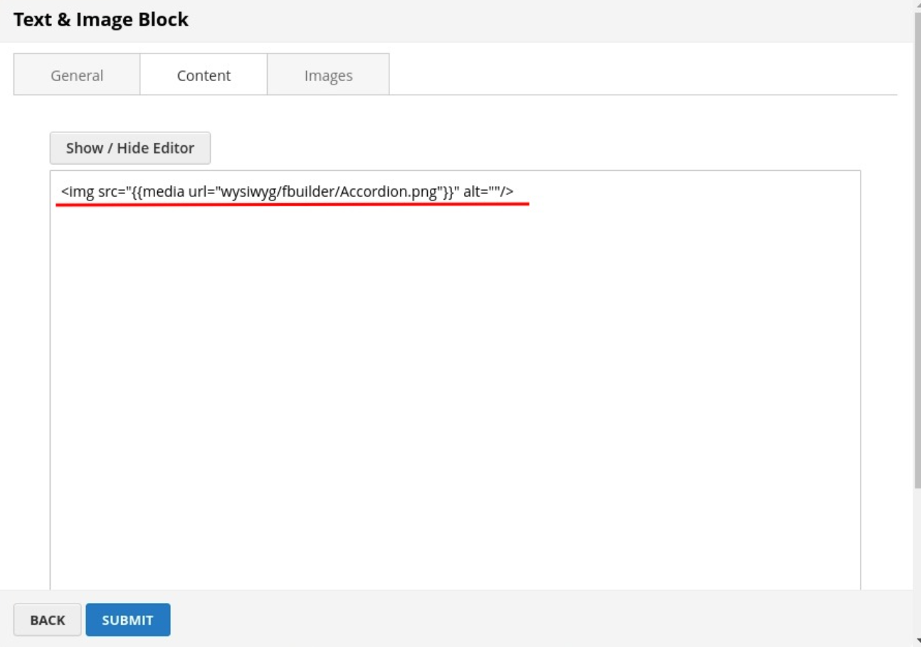
- Then paste to the content in Content tab
- After completing the configuration, click SUBMIT button to create a static block
Images Block
Image element includes 2 types of image frames (“Single Image” and “Before & After”) with 7 hover effects to help your images stand out.
On Home page builder, click Add New Block button.
On popup list blocks, click “Images” button.
Config block
VIEW CONFIG TAB
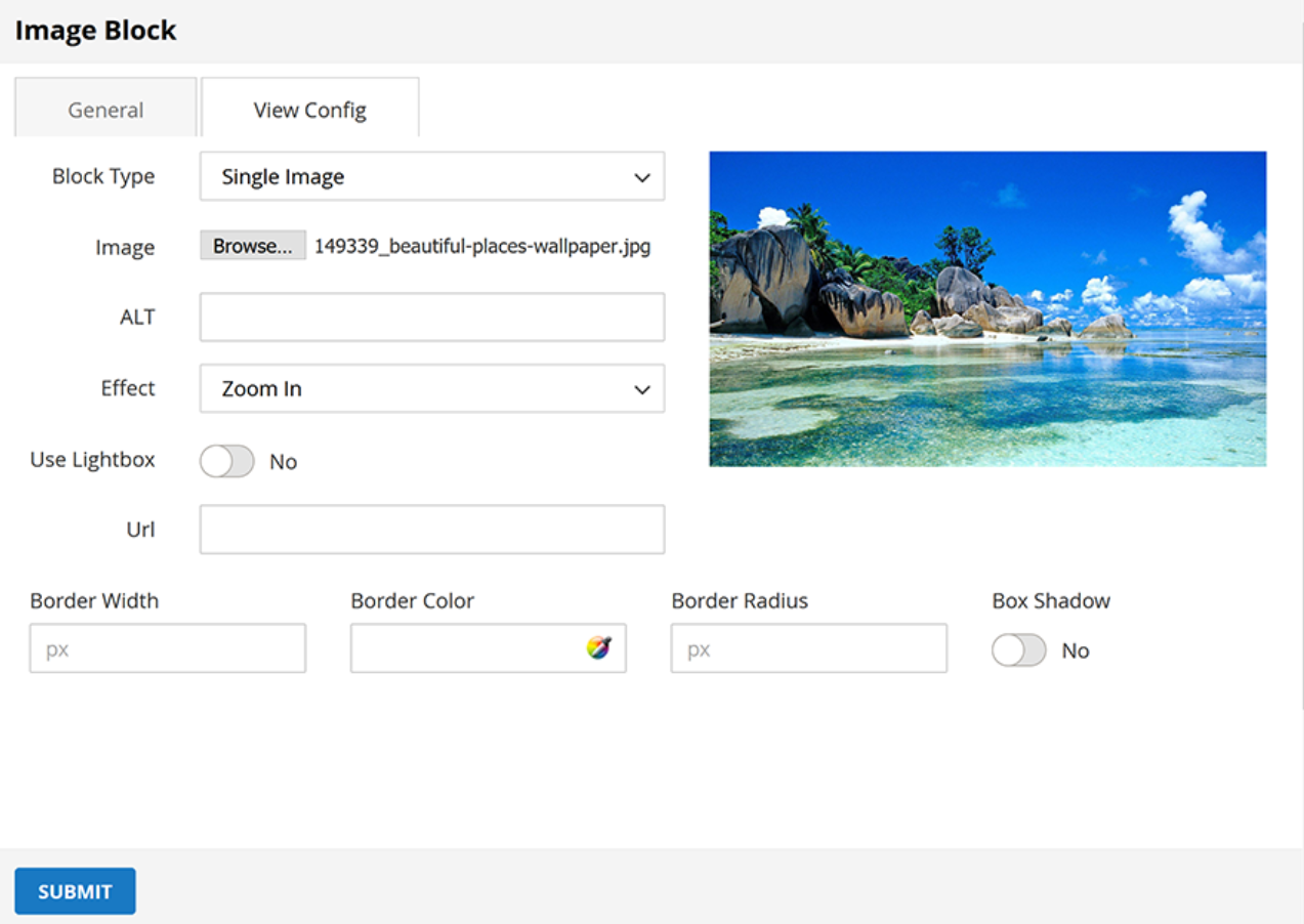
- Block Type: Choose display type for your image.
- Image: Click the button to choose the image file from your computer.
- ALT: It is alt attribute of the image, it support for SEO.
- Effect: Click to choose the effect for your image.
- Use Lightbox: Choose Yes to display the Lightbox.
- Url: Enter the Url that you want your image to be linked to.
- Border Width: Enter the width value you want for your image border. (px unit)
- Border Color: Enter the HEX color value you want for your image border. Or you can choose the color picker tool nearby.
- Border Radius: Enter the radius value you want for your image.
- Box Shadow: Choose Yes to display the shadow of your image.
Click SUBMIT button to save config and create image block.
OWL Carousel Slider
OWL Carousel element helps to create a beautiful, responsive carousel slider for your webpage.
- On Home page builder, click Add New Block button.
- On popup list blocks, click “Owl Carousel Slider” button.
 CONFIG BLOCK
MANAGE IMAGES TAB
Upload New Image
- Click Upload new Image button.
- Click Choose File to Upload button. Select an image from your computer.
- Click Upload button.
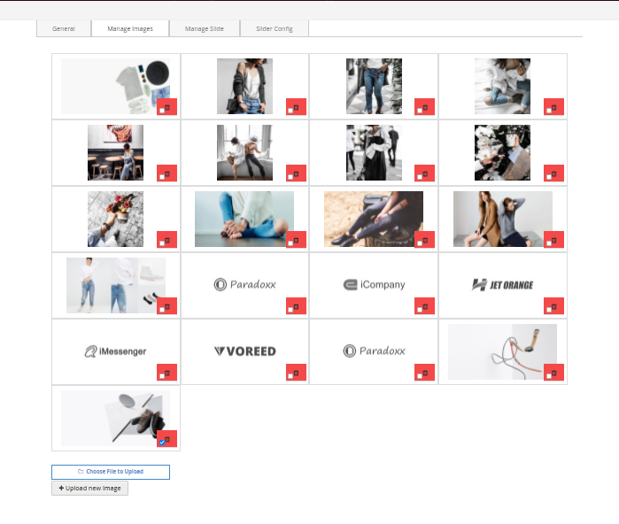 After image uploaded, you can config link for image or remove it.
MANAGE SLIDE TAB
- Click the Add New Slide button to add a new slide for your slider.
- Choose the image you want to add to slide, and then click Submit button.
Do it respectively to add more slides.
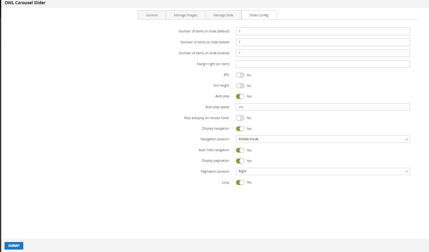
SLIDER CONFIG TAB
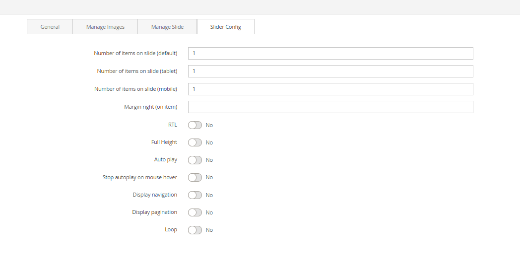
- Number of items on slide (3 resolutions): Default value is 1 image on a slide for correlative resolution.
- Preload: Choose Yes to enable the preload.
- Height Preload: Enter the height value for the preload
- Margin right: The value of the right margin on each item.
- RTL: Choose Yes to enable the Right to Left layout.
- Full Height: Choose Yes to let the slider be full its height.
- Auto play: Choose Yes to let the slider auto play.
- Auto play speed: Display when auto play is Yes. Insert the value of auto play speed among slides.
- Stop auto play on mouse hover: Choose Yes to stop the slider from playing when user hover their mouse.
- Display navigation: Choose Yes to show the navigation icon on slide.
- Navigation position: Choose the place where navigation icons will be displayed.
- Auto hide navigation: Choose Yes to let the navigation disappear while no mouse hover event.
- Display pagination: Choose Yes to display the indicator on slide.
- Loop: Choose Yes to let the slide play in loop among images.
Click SUBMIT button to save config and create owl slider.
Masonry Gallery block
The Masonry Gallery element is perfect way to showcase a set of images.
- On Home page builder, click Add New Block button.
- On popup list blocks, click “Masonry Gallery” button.
 CONFIG BLOCK
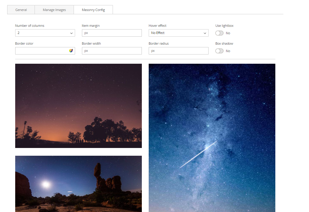 MASONRY CONFIG TAB
- Number of columns: Number of columns displayed in Gallery.
- Item margin: Enter the margin value among images.
- Hover effect: Choose the effect when hover on image.
- Use LightBox: Choose Yes to use lightbox for the Gallery.
- Border Width: Enter the width value you want for your image border. (px unit)
- Border Color: Enter the HEX color value you want for your image border. Or you can choose the color picker tool nearby.
- Border Radius: Enter the radius value you want for your image.
- Box Shadow: Choose Yes to display the shadow of your image.
Click SUBMIT button to save config and create Masonry Gallery.
Promobanner Block
The Promo Banner element helps to create catchy banners with 11+ nicer effects.
- On Home page builder, click Add New Block button.
- On popup list blocks, click “Promo Banner” item.
 BANNER CONFIG TAB
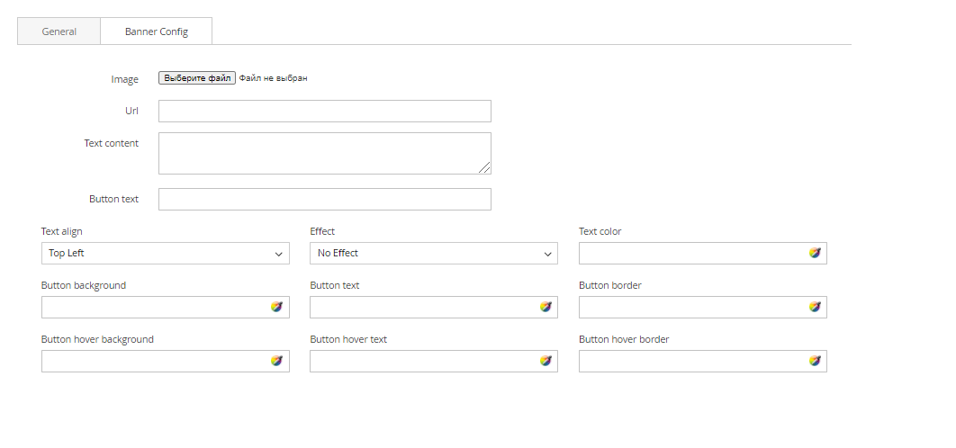 You can upload banner image, set url when you click on the banner, add text to banner, add button, adjust text's position, color of button,….
After completing your banner, just click Submit button to save your banner.
Profile Block
The Profile element with several customization options to utilise you have the power to display your staff, team or favourite people with style and ease.
- On Home page builder, click Add New Block button.
- On popup list blocks, click “Profile” button.
 CONFIG BLOCK
PROFILE CONFIG TAB.
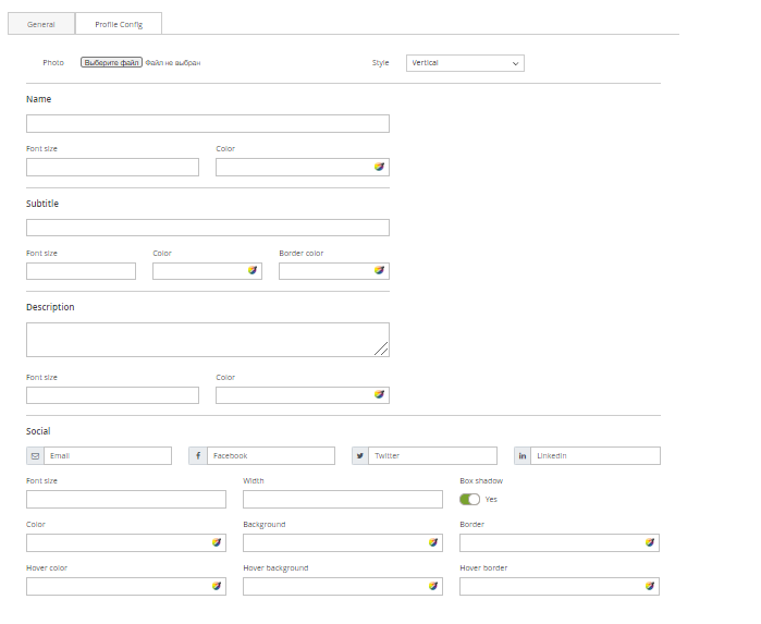
- You can make some configurations related to Name, Subtitle, Color… to customize your block.
- Click SUBMIT button to save config and create Profile block.
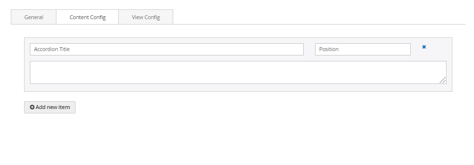
Accordion Block
The Accordion element is perfect for adding multiple sections of varied content to your website, and actively selecting which to show or hide at any time.
- On Home page builder, click Add New Block button.
- On popup list blocks, click “Accordion” button.
 CONFIG BLOCK
CONTENT CONFIG TAB
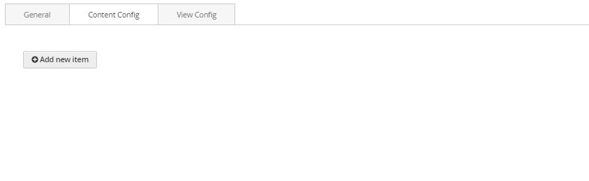
- Click Add New Item button to add a new accordion item.
- Insert the title, position and content of accordion in the blanks
- Do it similarly to add more accordion items.
VIEW CONFIG TAB
- Enter values that you want to set for the accordion style, about color, title, icon, font style…
- Click SUBMIT button to save config and create Masonry Gallery.
Video Banner Block
The Video element helps to embed Youtube and Vimeo videos to your webpage with many options.
- On Home page builder, click Add New Block button.
- On popup list blocks, click “Video” item.
 BANNER CONFIG TAB
 GENERAL
 You can setting some general options for your banner as general color, background color or image and some other settings, just select and experience.
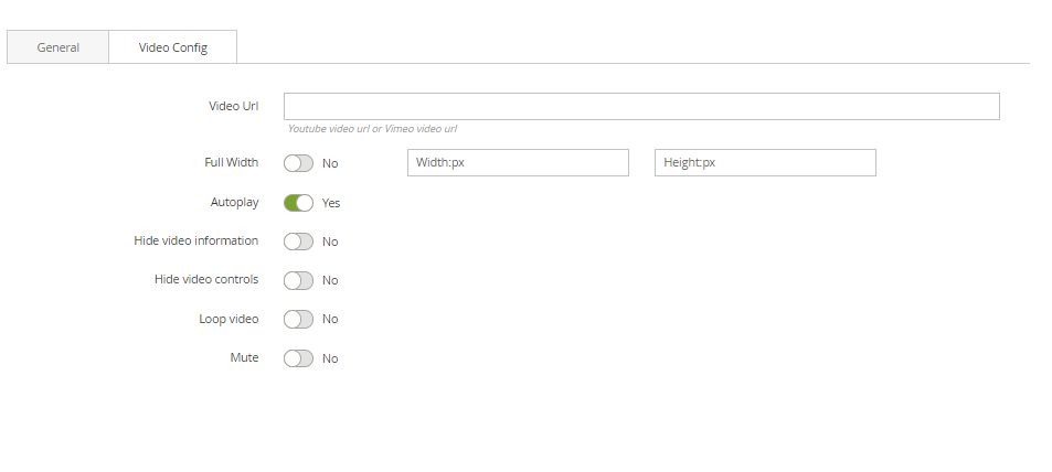
VIDEO CONFIG
- Video URL: Paste Youtube video URL or Vimeo video URL.
- Full Width: Enable to set your video as full screen width. If not, you can enter the fixed width and height value in px unit
- Autoplay: Enable to let the video play automatically.
- Hide video information: Enable to the video information be hidden.
- Hide video controls: Enable to the video control panel be hidden.
- Loop video: Enable to the video repeat.
- Mute: Enable to mute the video.
After completing your configuration, just click Submit button to save your block.
Google Map Block
The Map element helps to add Google map to your webpage.
- On Home page builder, click Add New Block button.
- On popup list blocks, click “Google Map” button.
 CONFIG BLOCK
MAP CONFIG TAB
- Enter values also needed settings that you want to set for the Google Map style.
- Click Submit button to save your data.
Content Box Block
The Content Box element helps to create content box with many options for your webpage.
- To see the visual demonstration, click here.
- On Home page builder, click Add New Block button.
- On popup list blocks, click “Content Box” button.
CONTENT CONFIG TAB
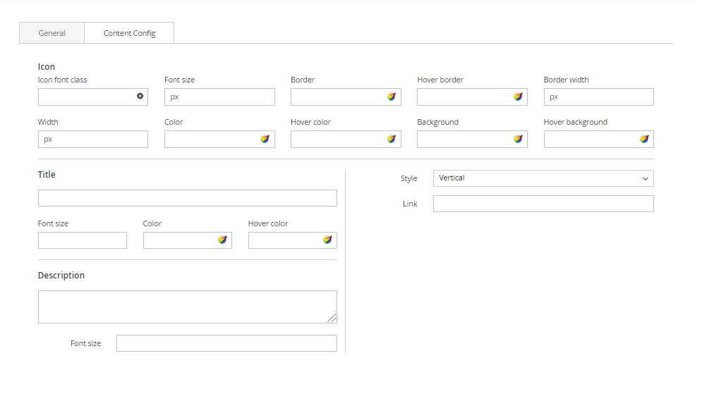 Enter values also needed settings that you want to set for the Content Box style, about the icon, title, description…
Click Submit button to save your data.
Counter Box Block
The Counter Box element helps to create animated counter elements for your webpage with many options.
- On Home page builder, click Add New Block button.
- On popup list blocks, click “Counter Box” button.
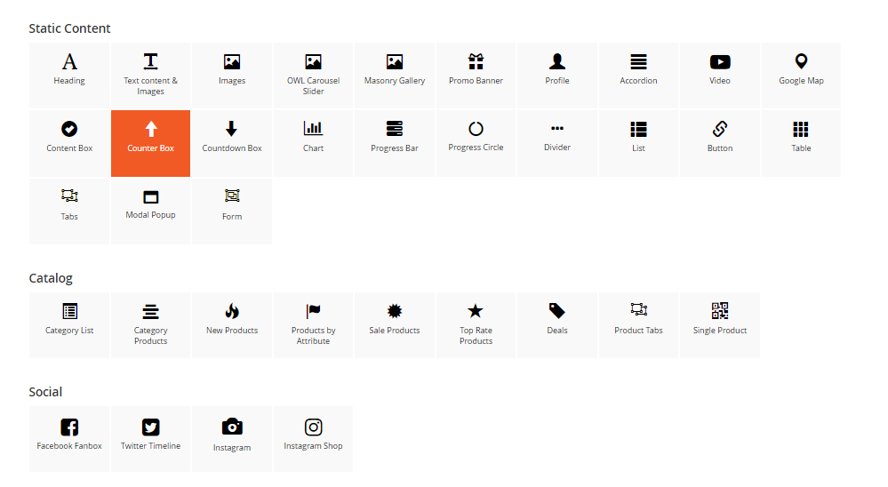
CONTENT CONFIG TAB
- Enter values also needed settings that you want to set for the Counter Box style, about the icon, title, description…
- Click Submit button to save your data.
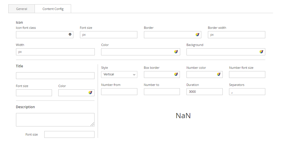
Countdown Box Block
The Countdown Box element helps to show your visitors a countdown to a special event, sale, anniversary.
- On Home page builder, click Add New Block button.
- On popup list blocks, click “Countdown Box” button.
 CONFIG BLOCK
CONTENT CONFIG TAB
- Enter values also needed settings that you want to set for the Countdown Box style, about the date and text.
- Click Submit button to save your data.
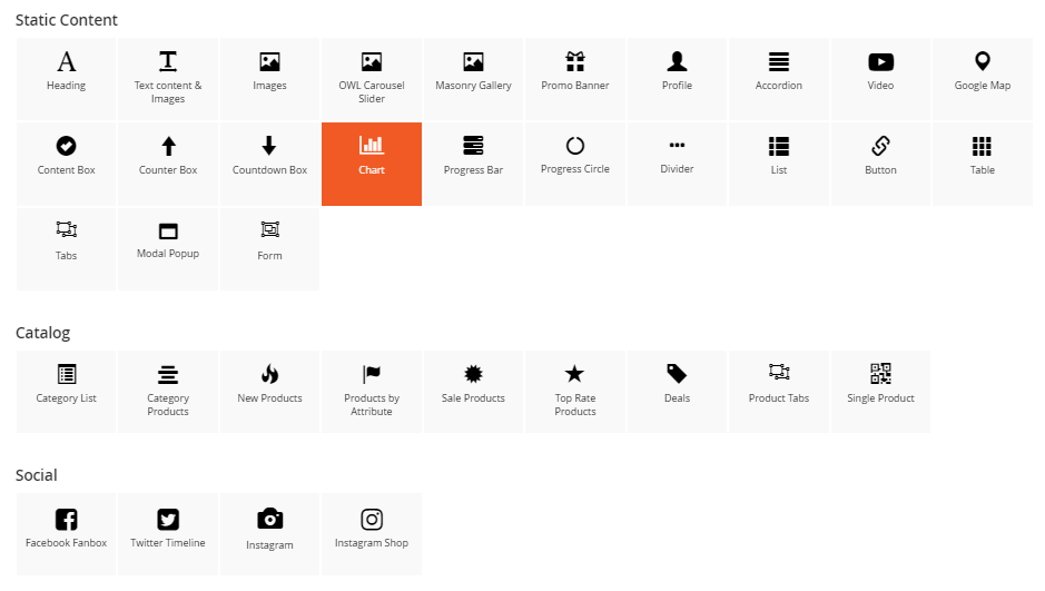
Chart Block
The Chart element is an elegant, powerful and beautiful tool that allows you to publish gorgeous charts.
- On Home page builder, click Add New Block button.
- On popup list blocks, click “Chart” button.
 CONFIG BLOCK
CONTENT CONFIG TAB
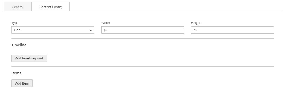
- Type: Choose type of chart.
- Width and Height: Set width and height for the chart.
- Timeline: Click Add timeline point button to add a new timeline point to the chart. Enter its label above.
- Items: Click Add item button to add a new item to the chart. Enter its information above.
Progress Bar Block
The Progress Bar element is a graphical control element used to visualize the progression of an extended operation such as a download, file transfer, or installation.
- On Home page builder, click Add New Block button.
- On popup list blocks, click “Progress Bar” button.
CONFIG BLOCK
CONTENT CONFIG TAB
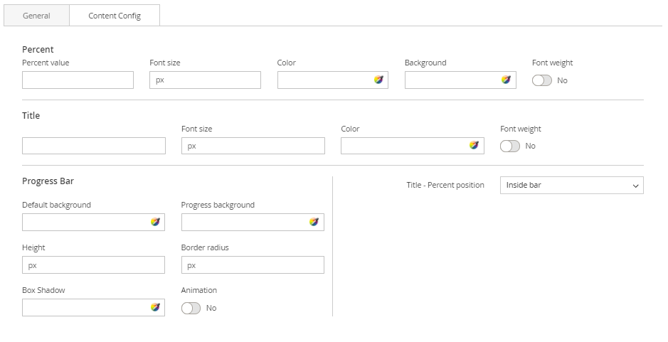
- Enter values also needed settings that you want to set for the Progress Bar style, about the percent, title…
- Click Submit button to save your data.
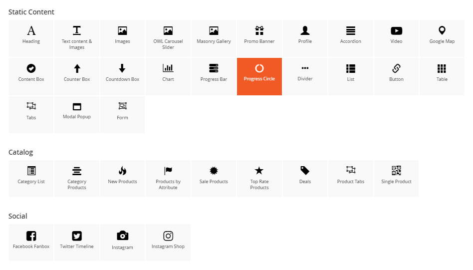
Progress Circle Block
The Progress Circle element is a great way to visually attract the viewer and display content eg: sales percentages, skill levels, promotional levels.
- On Home page builder, click Add New Block button.
- On popup list blocks, click “Progress Circle” button.
 CONFIG BLOCK
CONTENT CONFIG TAB
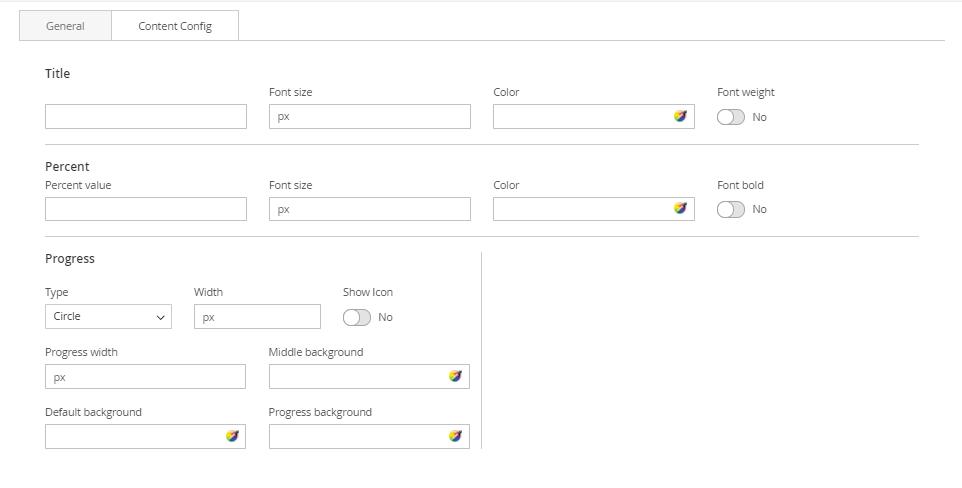
- Enter values also needed settings that you want to set for the Progress Circle style, about the percent, title, progress…
- Click Submit button to save your data.
Divider Block
The Divider element are perfect to use to break up content and draw the users eye to the next section.
- On Home page builder, click Add New Block button.
- On popup list blocks, click “Divider” button.
 CONFIG BLOCK
CONTENT CONFIG TAB
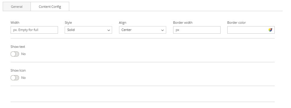
- Enter values also needed settings that you want to set for the Divider style.
- Click Submit button to save your data.
List Block
The Checklist element allows you to easily add beautifully styled lists anywhere to your site.
- On Home page builder, click Add New Block button.
- On popup list blocks, click “List” button.
 CONFIG BLOCK
CONTENT CONFIG TAB
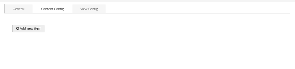
- Click Add new item button to add a new list item. Enter its content in the blank above.
VIEW CONFIG TAB
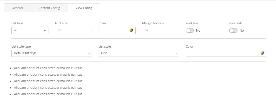
- Enter values also needed settings that you want to set for the List style.
- Click Submit button to save your data.
Button Block
The Button element are an integral part of your site, and we’ve made sure you have the options you need to add beautiful buttons to any page.
- On Home page builder, click Add New Block button.
- On popup list blocks, click “Button” button.
 CONFIG BLOCK
CONTENT CONFIG TAB
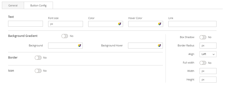
- Enter values also needed settings that you want to set for the Button style.
- Click Submit button to save your data.
Table Block
The Table element helps to create eye-catching tables to display various kinds of content with unlimited columns.
- On Home page builder, click Add New Block button.
- On popup list blocks, click “Table” button.
 CONFIG BLOCK
TABLE CONFIG TAB
- Click the table button to add a new table, or edit an existed one
- Insert the table information in the box. Click Insert button to confirm.
VIEW CONFIG TAB
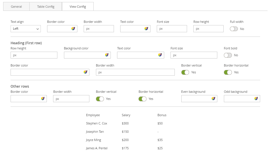
- Enter values also needed settings that you want to set for the Table style.
- Click Submit button to save your data.
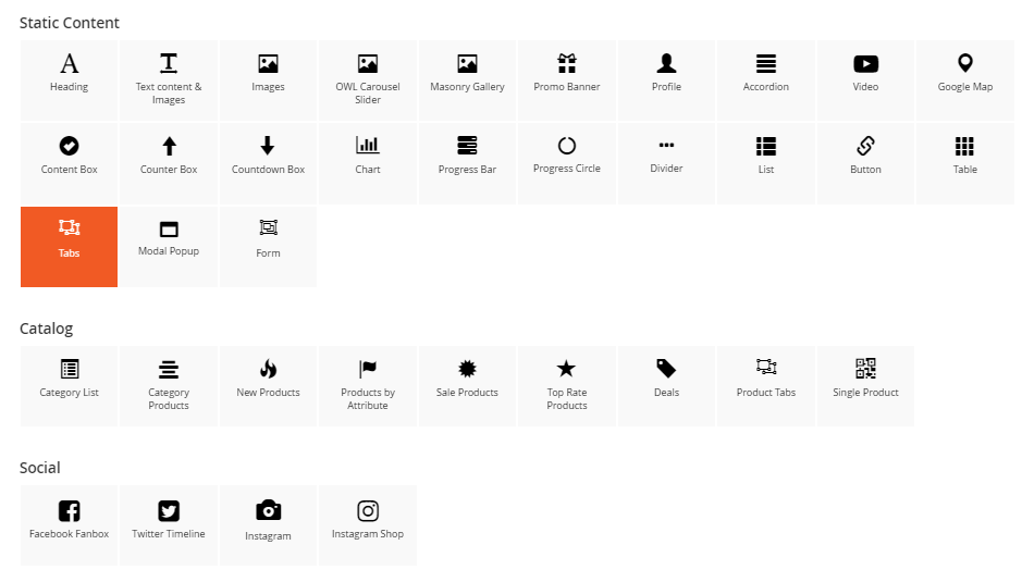
Tab Block
The Tabs element are perfect for displaying a bunch of organized information in a small area.
- On Home page builder, click Add New Block button.
- On popup list blocks, click “Tab” button.
 CONFIG BLOCK
CONTENT CONFIG TAB
- Click Add new item button to add a new tab. Enter its content in the blank above.
VIEW CONFIG TAB
- Enter values also needed settings that you want to set for the Tab style.
- Click Submit button to save your data.
Modal Popup Block
The Modal Popup element are perfect for displaying a bunch of organized information in a small area.
- On Home page builder, click Add New Block button.
- On popup list blocks, click “Modal Popup” button.
 CONFIG BLOCK
POPUP CONTENT TAB
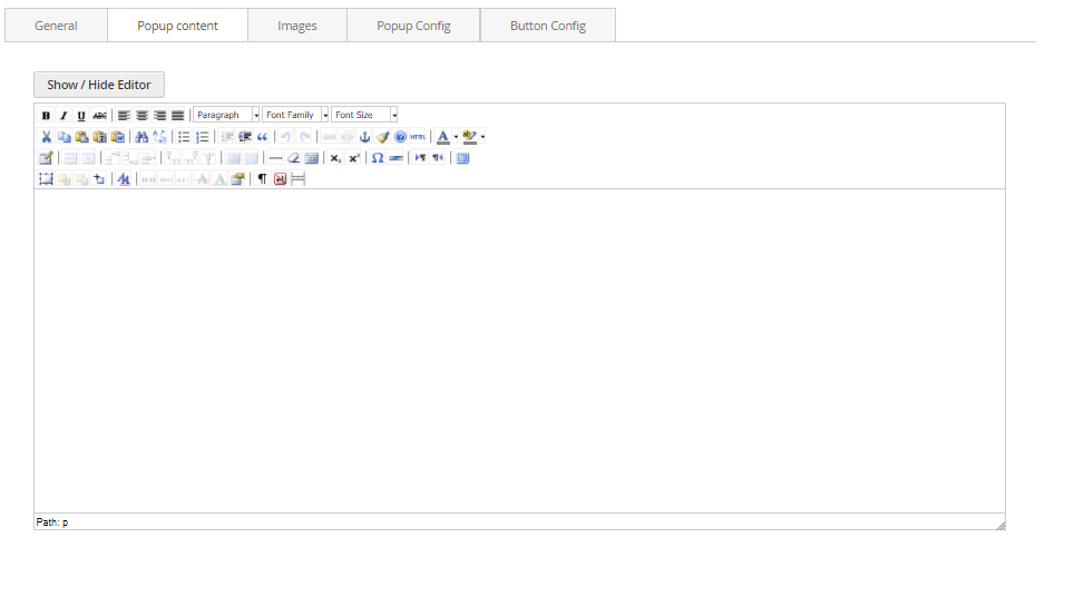
- Using the editor, you can directly insert the content you want for your popup.
- Otherwise, you can click Show/Hide Editor button to enter the content in HTML context.
POPUP CONFIG TAB
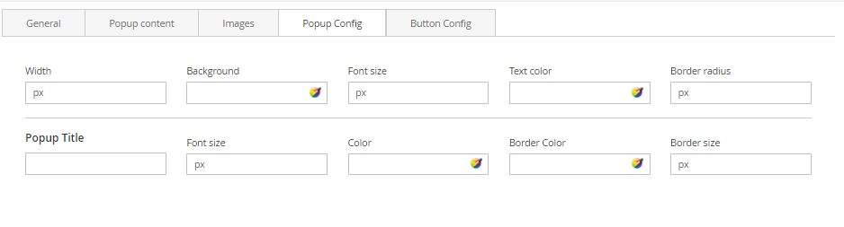
- Enter values also needed settings that you want to set for the Popup style.
BUTTON CONFIG TAB
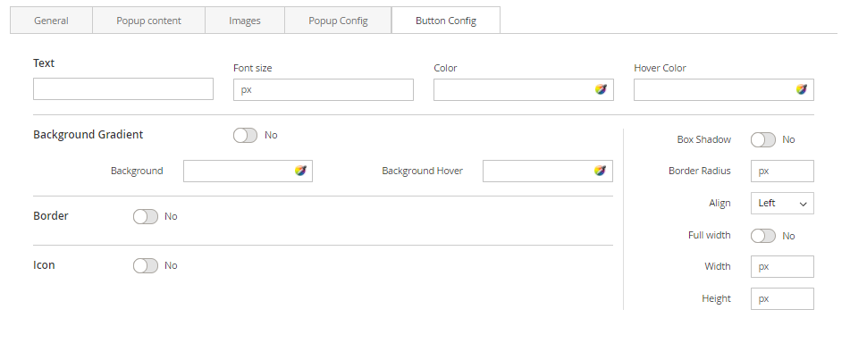
- Enter values also needed settings that you want to set for the button style. You can see the preview directly after you change values.
- Finally, click Submit button to save your data.
Form Block
The Form element helps to create send mail form with 8 different input types: text field, textarea, file, dropdown, radios, checkbox, multiple select, date.
- On Home page builder, click Add New Block button.
- On popup list blocks, click “Form” button.
 CONFIG BLOCK
FIELDS CONFIG TAB
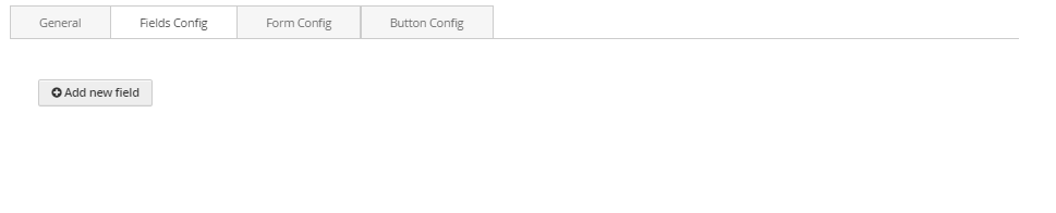
- Click Add new field button to add a new field to form. Enter its information in the blanks above.
FORM CONFIG TAB
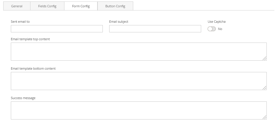 Enter needed settings for your form:
- Send email to: Enter the email address of the recipient.
- Email subject: Enter the email subject for the mail.
- Use Captcha: Click to enable the captcha in the form.Email template top content: Enter the content for the top of the response email.
- Email template bottom content: Enter the content for the bottom of the response email.
- Success message: Enter the success message you want to show.
BUTTON CONFIG TAB
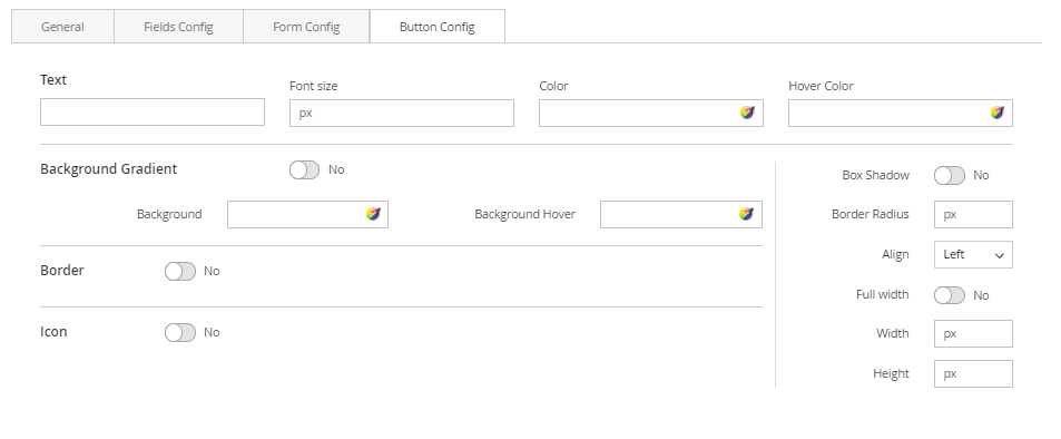
- Enter values also needed settings that you want to set for the button style. You can see the preview directly after you change values.
- Finally, click Submit button to save your data.
Category List Block
The Category List element helps to create list of categories with a lot of configurations.
- On Builder editor, click Add New Block button.
- On popup list blocks, click “Category Products” item.
 CONFIG BLOCK
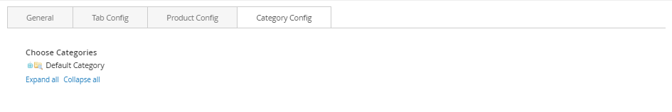
Category Config Tab
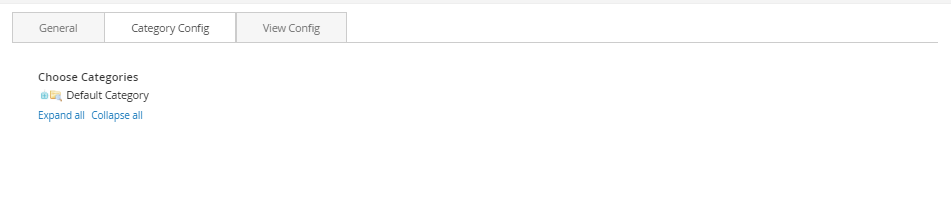
- Click plus icon button to show sub categories.
- Choose categories to filter product by selecting categories.
View Config Tab
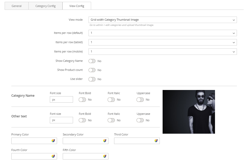
- View Mode: Choose the way to display your category list. There are 2 kinds of style:
Grid with Category Thumbnail Image:
- Items per Row: Number of categories in a row.
- Show Category Name: Choose Yes to show category name in the category list block.
- Show Product Count: Choose Yes to show the number of products belonging to category.
- Use Slider: Choose Yes to show list of category in a slider.
- Category Name: Settings for category name including font size, font bold, font italic or uppercase.
- Other text: Settings for other text appeared including font size, font bold, font italic or uppercase.
- Colors: Set 5 color values used in category list.
List:
- Items per Row: Number of categories in a row.
- Title: Set the top title for category list.
- Show Icon: Choose Yes to show the icon of category.
- Category Name: Settings for category name including font size, font bold, font italic or uppercase.
- Other text: Settings for other text appeared including font size, font bold, font italic or uppercase.
- Colors: Set 5 color values used in category list.
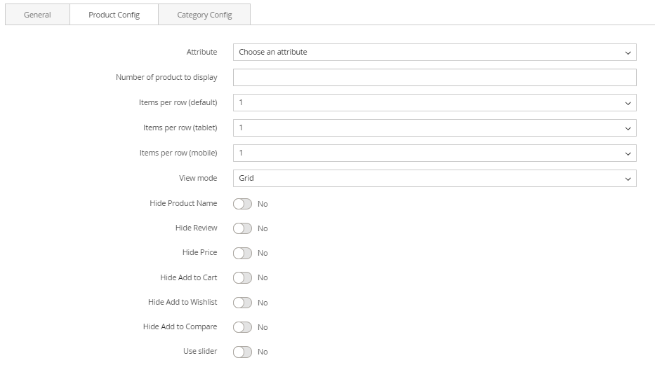
Category Products Block
The Category Products element helps to show products by category with different view options (grid, list, slider, category tabs).
- On Builder editor, click Add New Block button.
- On popup list blocks, click “Category Products” item.
 CONFIG BLOCK
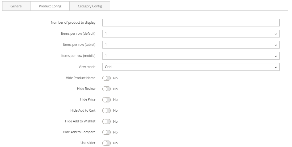
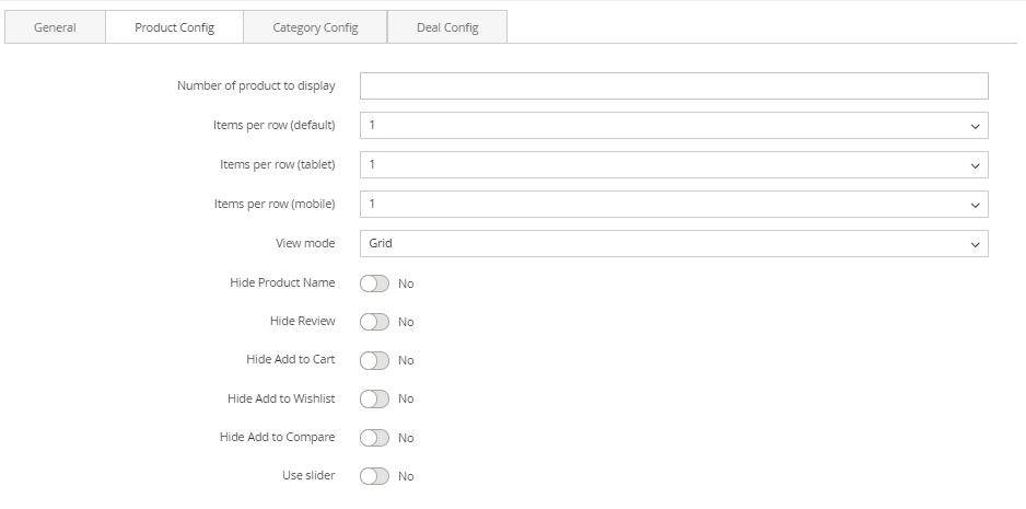
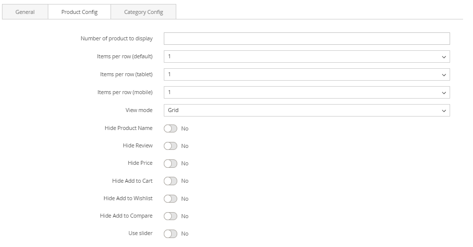 Product Config Tab
- Number of product to display: Limit the number of products shown.
- Item per row: Limit the number of items in a row on default resolution.
- Item per row (tablet): Limit the number of items in a row on tablet.
- Item per row (mobile): Limit the number of items in a row on mobile.
List Mode

- Hide Product Name: Choose Yes to let the product name disappear.
- Hide Review: Choose Yes to let the product review disappear.
- Hide Price: Choose Yes to hide the product price.
- Hide Add to Cart: Choose Yes to hide the Add to Cart button.
- Hide Add to Wishlist: Choose Yes to hide the Add to Wishlist button.
- Hide Add to Compare:Choose Yes to hide the Add to Compare button.
- Use Slider: Choose Yes to add Carousel Slider for block product.
If you use slider, you can see more config to Owl slider:
- RTL: Choose Yes to enable the Right to Left layout.
- Number of row: The number of rows displayed in slider.
- Auto play: Choose Yes to let the slide play automatically.
- Stop autoplay on mouse hover: Choose Yes to stop the slide from playing when hover mouse.
- Loop: Choose Yes to let the slide play in loop.
- Display navigation: Choose Yes to display the navigation icons on the slide.
- Display pagination: Choose Yes to display the pagination indicator on the slide.
- Navigation slide by: Limit the number of items will be shown after each time you click on the navigation.
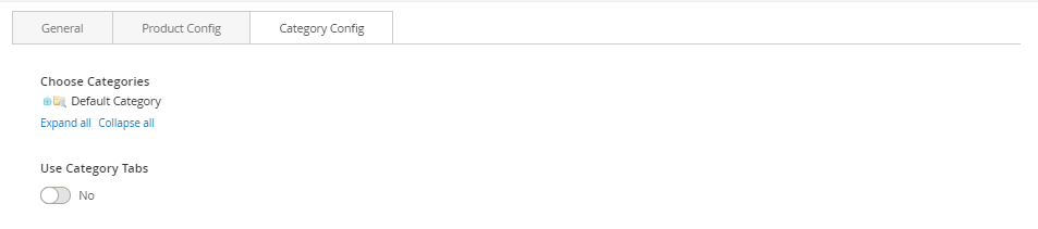
Category Config Tab
- Click plus icon button to show sub categories.
- Choose categories to filter product by selecting categories.
- If you want show product with tab. Change Use Category Tabs to Yes
There you can see more settings for tab slide:
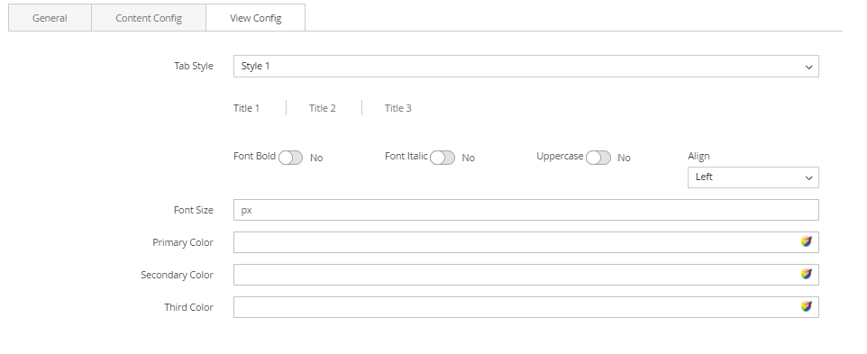
- Tab Style: Choose one of the 7+ style in the list. You can see the demo below.
- Font Bold, font Italic, Uppercase: Choose Yes to let the text in bold, in italic or in uppercase.
- Align: Choose among Left, Center or Right for text align.
- Font Size: Enter the value of font size (in px unit).
- Primary Color, Secondary Color and Third Color: Choose the 3 main color for your category tab. You can enter the hex code color directly in the blank or use color picker tool at the right.
New Product Block
The New Products element helps to show new products, new product by categories with different view options (grid, list, slider, category tabs).
CONFIG NEW PRODUCT
- In backend, go to PRODUCTS → Catalog. Edit product you want to set as new product.
- On product edit page, find field Set Product as New From. Choose date for this field. Product as New from this date.
- On next field To, you can set day to product end new.
- Click Save button to save config.
CREATE NEW PRODUCT BLOCK
- On Builder editor, click Add New Block button.
- On popup list blocks, click “New Products” button.
 CONFIG BLOCK
Product Config Tab
CONFIG BLOCK
Product Config Tab
- Number of product to display: Limit the number of products shown.
- Item per row: Limit the number of items in a row on default resolution.
- Item per row (tablet): Limit the number of items in a row on tablet.
- Item per row (mobile): Limit the number of items in a row on mobile.
- Hide Product Name: Choose Yes to let the product name disappear.
- Hide Review: Choose Yes to let the product review disappear.
- Hide Price: Choose Yes to hide the product price.
- Hide Add to Cart: Choose Yes to hide the Add to Cart button.
- Hide Add to Wishlist: Choose Yes to hide the Add to Wishlist button.
- Hide Add to Compare: Choose Yes to hide the Add to Compare button.
- Use Slider: Choose Yes to add Carousel Slider for block product.
If you use slider, you can see more config to Owl slider:
- RTL: Choose Yes to enable the Right to Left layout.
- Number of row: The number of rows displayed in slider.
- Auto play: Choose Yes to let the slide play automatically.
- Stop autoplay on mouse hover: Choose Yes to stop the slide from playing when hover mouse.
- Loop: Choose Yes to let the slide play in loop.
- Display navigation: Choose Yes to display the navigation icons on the slide.
- Display pagination: Choose Yes to display the pagination indicator on the slide.
- Navigation slide by: Limit the number of items will be shown after each time you click on the navigation.
Category Config Tab
- Click plus icon button to show sub categories.
- Choose categories to filter product by selecting categories.
If you want show product with tab. Change *Use Category Tabs* to *Yes*
There you can see more settings for tab slide:
- Tab Style: Choose one of the 7+ style in the list. You can see the demo below.
- Font Bold, font Italic, Uppercase: Choose Yes to let the text in bold, in italic or in uppercase.
- Align: Choose among Left, Center or Right for text-align.
- Font Size: Enter the value of font size (in px unit).
- Primary Color, Secondary Color and Third Color: Choose the 3 main color for your category tab. You can enter the hex code color directly in the blank or use color picker tool at the right.
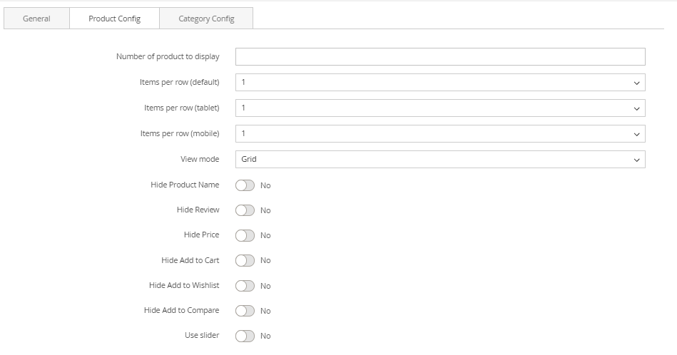
Product by Attribute Block
The Products By Attribute element helps to show products by attribute (Yes/No) with different view options (grid, list, slider, category tabs).
Create (Yes/No) Attribute Product
In backend, go to STORES → [Attributes] Product. Click Add New Attribute button.
Complete the Basic Properties
The Basic Properties is required for an product attribute.
- Insert the Default Label to describe the attribute.
- In the Catalog Input Type for Store Owner, choose Yes/No of the input from a list.
- Choose Yes for the Value Required to ask customers to select the options before purchasing.
Complete the Advanced Properties (Optional)
- Insert the Attribute Code that is less than 30 characters and excluded spaces.
- The Scope includes Store View, Website, and Global.You will choose one of three places in your store system where the appearance of attribute is approved.
- Apply the Unique Value if you not want to share it with other products.
Insert the Field Label
- Open the Manage Title section.
- Insert the Title that is shown for the field label. In case of multiple languages supported on your store, insert the translation of the title for each view.
Complete the Storefront Properties
- Choose Yes for the Use in Search to be ready for searching the attribute.
- Allow comparing the product attributes in Product Compare if you choose Yes in the Comparable on Storefront field.
- Choose Yes in the Use for Promo Rule Conditions field to apply the product attribute for the price rules.
To make the attribute visible in catalog page listing, choose Yes in the Visible on Catalog Pages on Storefront field.
If Product Listing is supported at your store, the attribute can be appeared and used as sort parameter. Configuring that from the Used in Product Listing and Used for Sorting in Product Listing field. Save Attribute to finish all.
Reindex Data
- Login to your server with your SSH account
- Switch to apache user
- Change to magento root directory
- Run command line: php bin/magento indexer:reindex
- Run command line: php bin/magento cache:clean (if your site enable cache).
Create Product Attribute Builder
- On Builder Editor, click Add New Block button.
- On popup list blocks, click “New Products” item.
CONFIG BLOCK
Product Config Tab
- Attribute: Choose attribute of product to filter.
- Number of product to display: Limit the number of products shown.
- Item per row: Limit the number of items in a row on default resolution.
- Item per row (tablet): Limit the number of items in a row on tablet.
- Item per row (mobile): Limit the number of items in a row on mobile.
- Hide Product Name: Choose Yes to let the product name disappear.
- Hide Review: Choose Yes to let the product review disappear.
- Hide Price: Choose Yes to hide the product price.
- Hide Add to Cart: Choose Yes to hide the Add to Cart button.
- Hide Add to Wishlist: Choose Yes to hide the Add to Wishlist button.
- Hide Add to Compare: Choose Yes to hide the Add to Compare button.
- Use Slider: Choose Yes to add Carousel Slider for block product.
- RTL: Choose Yes to enable the Right to Left layout.
- Number of row: The number of rows displayed in slider.
- Auto play: Choose Yes to let the slide play automatically.
- Stop autoplay on mouse hover: Choose Yes to stop the slide from playing when hover mouse.
- Loop: Choose Yes to let the slide play in loop.
- Display navigation: Choose Yes to display the navigation icons on the slide.
- Display pagination: Choose Yes to display the pagination indicator on the slide.
- Navigation slide by: Limit the number of items will be shown after each time you click on the navigation.
Category Config Tab

- Click plus icon button to show sub categories.
- Choose categories to filter product by selecting categories.
- If you want show product with tab. Change Use Category Tabs to Yes
There you can see more settings for tab slide:
- Tab Style: Choose one of the 7+ style in the list. You can see the demo below.
- Font Bold, font Italic, Uppercase: Choose Yes to let the text in bold, in italic or in uppercase.
- Align: Choose among Left, Center or Right for text align.
- Font Size: Enter the value of font size (in px unit).
- Primary Color, Secondary Color and Third Color: Choose the 3 main color for your category tab. You can enter the hex code color directly in the blank or use color picker tool at the right.
Sale Products Block
The Sale Products element helps to show sale products, new product by categories with different view options (grid, list, slider, category tabs).
- In backend, go to PRODUCTS → Catalog. Edit product you want set is new product.
- In the basic settings panel, Click Advanced Pricing link
In the Advanced Pricing panel:
- Enter the number of the Special Price.
- Assign the active time including Special Price From Date and Special Price To Date. You can type manually or click on Calendar icon to choose the relevant date.
- Click Done button to close panel.
- Click Save button to save product.
Create Sales Product Block
- On builder editor, click Add New Block button.
- On popup list blocks, click “Sale Products” item.
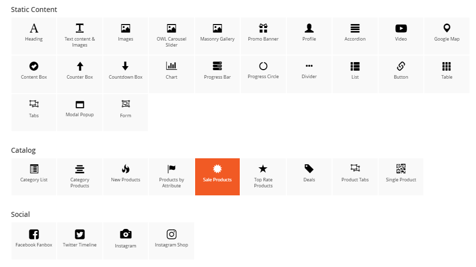
CONFIG BLOCK
Product Config Tab
- Number of product to display: Limit the number of products shown.
- Item per row: Limit the number of items in a row on default resolution.
- Item per row (tablet): Limit the number of items in a row on tablet.
- Item per row (mobile): Limit the number of items in a row on mobile.
- Hide Product Name: Choose Yes to let the product name disappear.
- Hide Review: Choose Yes to let the product review disappear.
- Hide Price: Choose Yes to hide the product price. * Hide Add to Cart: Choose Yes to hide the Add to Cart button.
- Hide Add to Wishlist: Choose Yes to hide the Add to Wishlist button.
- Hide Add to Compare: Choose Yes to hide the Add to Compare button.
- Use Slider: Choose Yes to add Carousel Slider for block product.
If you use slider, you can see more config to owl slider:
- RTL: Choose Yes to enable the Right to Left layout.
- Number of row: The number of rows displayed in slider.
- Auto play: Choose Yes to let the slide play automatically.
- Stop autoplay on mouse hover: Choose Yes to stop the slide from playing when hover mouse.
- Loop: Choose Yes to let the slide play in loop.
- Display navigation: Choose Yes to display the navigation icons on the slide.
- Display pagination: Choose Yes to display the pagination indicator on the slide.
- Navigation slide by: Limit the number of items will be shown after each time you click on the navigation.
Category Config Tab
- Click plus icon button to show sub categories.
- Choose categories to filter product by selecting categories.
- If you want show product with tab. Change Use Category Tabs to Yes
There you can see more settings for tab slide:
- Tab Style: Choose one of the 7+ style in the list. You can see the demo below.
- Font Bold, font Italic, Uppercase: Choose Yes to let the text in bold, in italic or in uppercase.
- Align: Choose among Left, Center or Right for text align.
- Font Size: Enter the value of font size (in px unit).
- Primary Color, Secondary Color and Third Color: Choose the 3 main color for your category tab. You can enter the hex code color directly in the blank or use color picker tool at the right.
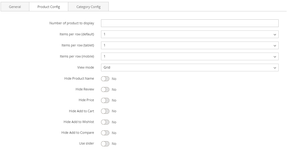
Top Rate Products Block
The Top Rate Products element helps to show top rate products with different view options (grid, list, slider, category tabs).
- On Builder editor, click Add New Block button.
- On popup list blocks, click “Top Rate Products” item.
CONFIG BLOCK
Product Config Tab
- Number of product to display: Limit the number of products shown.
- Item per row: Limit the number of items in a row on default resolution.
- Item per row (tablet): Limit the number of items in a row on tablet.
- Item per row (mobile): Limit the number of items in a row on mobile.
- Hide Product Name: Choose Yes to let the product name disappear.
- Hide Review: Choose Yes to let the product review disappear.
- Hide Price: Choose Yes to hide the product price.
- Hide Add to Cart: Choose Yes to hide the Add to Cart button.
- Hide Add to Wishlist: Choose Yes to hide the Add to Wishlist button.
- Hide Add to Compare: Choose Yes to hide the Add to Compare button.
- Use Slider: Choose Yes to add Carousel Slider for block product.
If you use slider, you can see more config to owl slider:
- RTL: Choose Yes to enable the Right to Left layout.
- Number of row: The number of rows displayed in slider.
- Auto play: Choose Yes to let the slide play automatically.
- Loop: Choose Yes to let the slide play in loop.
- Display navigation: Choose Yes to display the navigation icons on the slide.
- Display pagination: Choose Yes to display the pagination indicator on the slide.
- Navigation slide by: Limit the number of items will be shown after each time you click on the navigation.
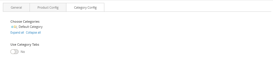
Category Config Tab
- Click plus icon button to show sub categories.
- Choose categories to filter product by selecting categories.
If you want show product with tab. Change *Use Category Tabs* to *Yes*.
There you can see more settings for tab slide:
- Tab Style: Choose one of the 7+ style in the list. You can see the demo below.
- Font Bold, font Italic, Uppercase: Choose Yes to let the text in bold, in italic or in uppercase.
- Align: Choose among Left, Center or Right for text align.
- Font Size: Enter the value of font size (in px unit).
- Primary Color, Secondary Color and Third Color: Choose the 3 main color for your category tab. You can enter the hex code color directly in the blank or use color picker tool at the right.
Deals Block
The Deal Products element helps to show deal products with different view options (grid, list, slider, category tabs)
CONFIG DEAL PRODUCT
- In backend, go to PRODUCTS → Catalog. Edit product you want to set as deal product.
- In the basic settings panel, Click Advanced Pricing.
In Advanced Pricing panel:
- Enter the number of the Special Price.
- You must assign the active time including Special Price From Date and Special Price To Date. You can type manually or click on Calendar icon to choose the relevant date.
- Click Done button to close panel.
- Click Save button to save product.
Deals Product
- On Builder editor, click Add New Block button.
- On popup list blocks, click “Deals” item.
 CONFIG BLOCK
Product Config Tab
- Number of product to display: Limit the number of products shown.
- Item per row: Limit the number of items in a row on default resolution.
- Item per row (tablet): Limit the number of items in a row on tablet.
- Item per row (mobile): Limit the number of items in a row on mobile.
- Hide Product Name: Choose Yes to let the product name disappear.
- Hide Review: Choose Yes to let the product review disappear.
- Hide Price: Choose Yes to hide the product price.
- Hide Add to Cart: Choose Yes to hide the Add to Cart button.
- Hide Add to Wishlist: Choose Yes to hide the Add to Wishlist button.
- Hide Add to Compare: Choose Yes to hide the Add to Compare button.
- Use Slider: Choose Yes to add Carousel Slider for block product.
If you use slider, you can see more config to owl slider:
- RTL: Choose Yes to enable the Right to Left layout.
- Number of row: The number of rows displayed in slider.
- Auto play: Choose Yes to let the slide play automatically.
- Stop autoplay on mouse hover: Choose Yes to stop the slide from playing when hover mouse.
- Loop: Choose Yes to let the slide play in loop.
- Display navigation: Choose Yes to display the navigation icons on the slide.
- Display pagination: Choose Yes to display the pagination indicator on the slide.
- Navigation slide by: Limit the number of items will be shown after each time you click on the navigation.
Product Slider
Category Config Tab
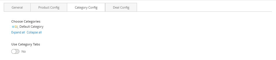
- Click plus icon button to show sub categories.
- Choose categories to filter product by selecting categories.
If you want show product with tab. Change Use Category Tabs to Yes
There you can see more settings for tab slide:
- Tab Style: Choose one of the 7+ style in the list. You can see the demo below.
- Font Bold, font Italic, Uppercase: Choose Yes to let the text in bold, in italic or in uppercase.
- Align: Choose among Left, Center or Right for text align.
- Font Size: Enter the value of font size (in px unit).
- Primary Color, Secondary Color and Third Color: Choose the 3 main color for your category tab. You can enter the hex code color directly in the blank or use color picker tool at the right.
New Product With Tab
 Deal Config Tab
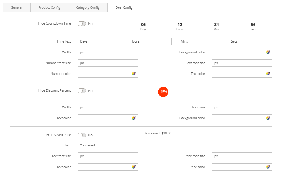
Hide Countdown Time: Choose Yes to hide the countdown timer. Otherwise, some related settings will be shown:
- Time Text: Default values are Days, Hours, Mins and Secs.
- Width: Set width value for timer countdown block.
- Background color: Set background for timer countdown block.
- Number font size and Text font size: Set font size value for number and text in timer countdown block.
- Number font color and Text font color: Set font color value for number and text in timer countdown block.
- Hide Discount Percent: Choose Yes to hide the discount percent. Otherwise, some related settings will be shown:
- Width: Set width value for discount percent element.
- Font size: Set font size value for number and percent.
- Text color: Set color value for number and percent in timer countdown block.
- Background color: Set background for discount percent element.
- Hide Saved Price: Choose Yes to hide the saved price. Otherwise, some related settings will be shown:
- Text: Insert the text for discount percent element.
- Text font size and Price font size: Set font size value for text and price.
- Text color and Price color: Set color value for text and price.
Special Deal
If you imported a demo homepage, you only need to enable the builder and edit it.
- In backend, go to PRODUCTS → Catalog. Edit product you want set is new product.
- In the basic settings panel, Click Advanced Pricing.
In Advanced Pricing panel:
- Enter the number of the Special Price.
- You must assign the active time including Special Price From Date and Special Price To Date. You can type manually or click on Calendar icon to choose the relevant date.
- Click Done button to close panel.
- Click Save button to save product.
Special Deals Product
First, you have to set the product to be in deal as instruction here.
- On Builder editor, click Add New Block button.
- On popup list blocks, click “Special Deal” item.
CONFIG BLOCK
Product Config Tab
- Sub Title: Insert the sub title you want to display together with the deal product.
- Product: Enter product name and wait for the system to search the product.
- Choose product on suggested search results.
- Time Text: Enter the text you want to use to display the deal time.
- Template style: Choose between the two template style to display your deal.
- Hide Product Name: Choose Yes to let the product name disappear.
- Hide Review: Choose Yes to let the product review disappear.
- Hide Price: Choose Yes to hide the product price.
- Hide Add to Cart: Choose Yes to hide the Add to Cart button.
- Hide Add to Wishlist: Choose Yes to hide the Add to Wishlist button.
- Hide Add to Compare: Choose Yes to hide the Add to Compare button.
- Hide Short Description: Choose Yes to hide the short description of product.
- Truncate short description: Insert directly the short description you want.
Product Tabs Block
The Product Tabs element helps to Display products as tabs with many options.
If you imported a demo homepage, you only need to enable the builder and edit it.
- On Builder, click Add New Block button.
- On popup list blocks, click “Product Tabs” item.
 CONFIG BLOCK
Tab Config Tab
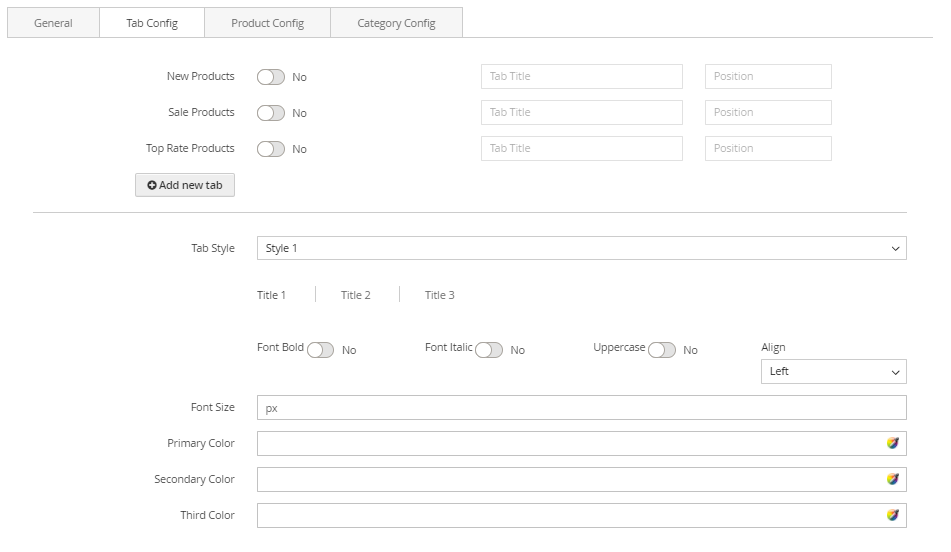 New Products, Sale Products, Top Rate Products : Enable and Config Title & Position
- Click Add new tab button to add new tab.
- Choose an attribute to tab.
Product Config Tab
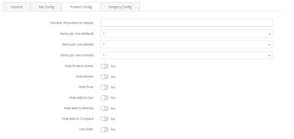 Number of product to display: Limit the number of products shown.
Item per row: Limit the number of items in a row on default resolution.
Item per row (tablet): Limit the number of items in a row on tablet.
Item per row (mobile): Limit the number of items in a row on mobile.
Number of product to display: Limit the number of products shown.
Item per row: Limit the number of items in a row on default resolution.
Item per row (tablet): Limit the number of items in a row on tablet.
Item per row (mobile): Limit the number of items in a row on mobile.
- Hide Product Name: Choose Yes to let the product name disappear.
- Hide Review: Choose Yes to let the product review disappear.
- Hide Price: Choose Yes to hide the product price.
- Hide Add to Cart: Choose Yes to hide the Add to Cart button.
- Hide Add to Wishlist: Choose Yes to hide the Add to Wishlist button.
- Hide Add to Compare: Choose Yes to hide the Add to Compare button.
- Use Slider: Choose Yes to add Carousel Slider for block product.
If you use slider, you can see more config to owl slider:
- RTL: Choose Yes to enable the Right to Left layout.
- Number of row: The number of rows displayed in slider.
- Auto play: Choose Yes to let the slide play automatically.
- Stop autoplay on mouse hover: Choose Yes to stop the slide from playing when hover mouse.
- Loop: Choose Yes to let the slide play in loop.
- Display navigation: Choose Yes to display the navigation icons on the slide.
- Navigation slide by: Limit the number of items will be shown after each time you click on the navigation.
- Click plus icon button to show sub categories.
- Choose categories to filter product by select categories.
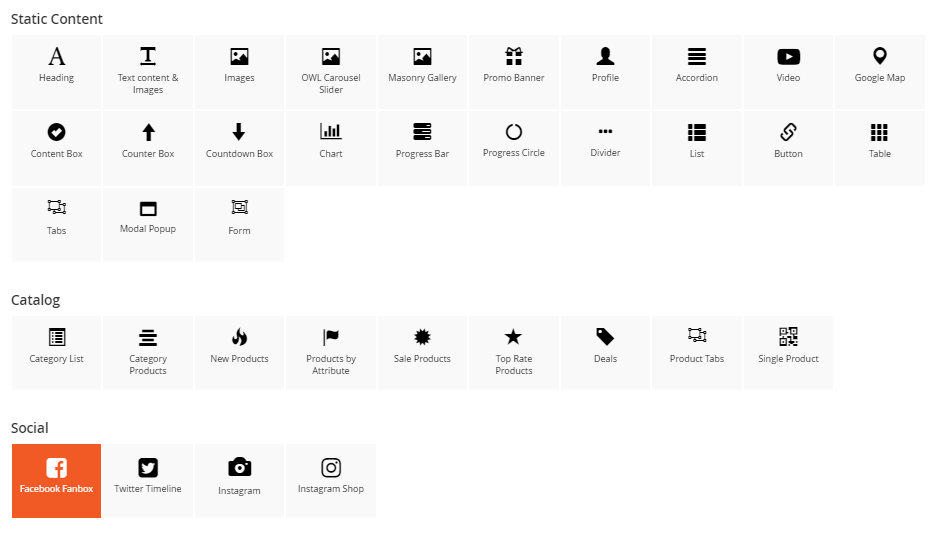
Single Product Block
- On Builder editor, click Add New Block button.
- On popup list blocks, click “Single Product” item.
CONFIG BLOCK
Product Config Tab
 Product:
- Enter product name and wait for the system to search the product.
- Choose product on suggested search results.
- Hide Product Name: Choose Yes to let the product name disappear.
- Hide Review: Choose Yes to let the product review disappear.
- Hide Price: Choose Yes to hide the product price.
- Hide Add to Cart: Choose Yes to hide the Add to Cart button.
- Hide Add to Wishlist: Choose Yes to hide the Add to Wishlist button.
- Hide Add to Compare:* Choose Yes to hide the Add to Compare button. * *Hide Short Description: Choose Yes to hide the short description of product.
- Truncate short description: Insert directly the short description you want.
Facebook Fanbox in Builder
The Facebook Fanbox element helps to show Facebook Fanbox on your webpage.
If you imported a demo homepage, you only need to enable the builder and edit it.
- On Builder editor, click Add New Block button.
- On popup list blocks, click “Facebook Fanbox” item.
 CONFIG BLOCK
Facebook Config Tab
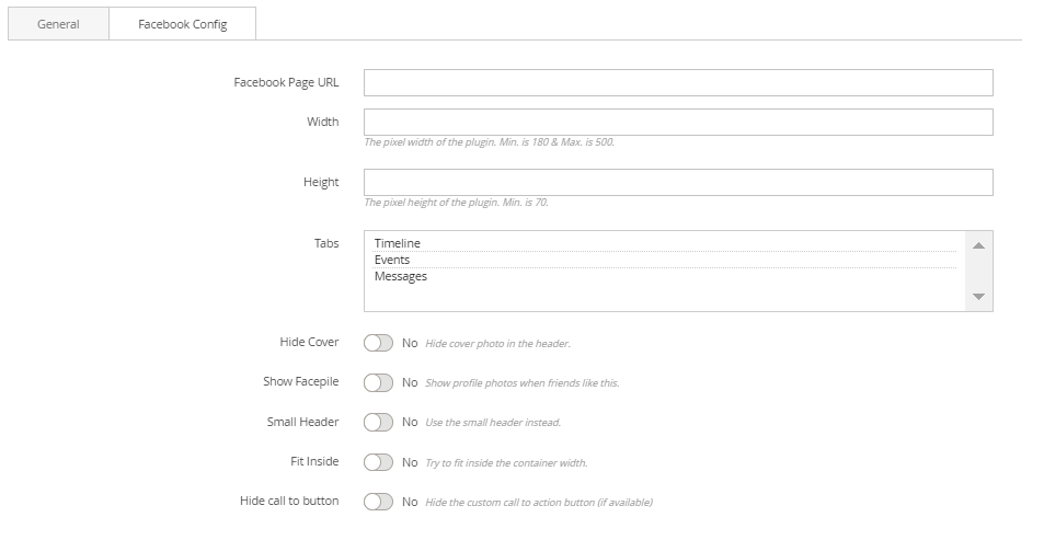
- Facebook Page Url: Enter the facebook fanpage url.
- Width and Height: Enter the size for facebook box.
- Tabs: Choose tabs to show (timeline, events, messages).
- Hide cover: Choose Yes to hide the cover photo in the header.
- Show Facepile: Choose Yes to show profile photos when friends like this.
- Small Header: Choose Yes to use the small header instead.
- Fit Inside: Choose Yes to try to fit inside the container width.
- Hide call to button: Choose Yes to hide the custom call to action button (if available).
- Finally, click Submit button to save your changes.
Twitter Timeline in Builder
The Twitter Timeline element helps to show Twitter timeline on your webpage. If you imported a demo homepage, you only need to enable the builder and edit it.
- Unordered List ItemOn Builder editor, click Add New Block button.
- On popup list blocks, click “Twitter Timeline” item.
 CONFIG BLOCK
Twitter Config Tab
- Timeline Url: Enter the Twitter timeline url.
- Width and Height: Enter the size for Twitter timeline box.
- Theme: Choose theme to show timeline box. There are 2 options: Dark and Light.
- Link color: Enter the color of link in timeline box.
- Language: Choose among languagues for the imeline box .
- Finally, click Submit button to save your changes.
Instagram Block
The Instagram element helps to show Instagram images on your webpage with many options.
If you imported a demo homepage, you only need to enable the builder and edit it.
IMPORTANT: you have to fill your instagram's access token in admin, go STORES → Configuration → Front-end Builder [MGS] → Social. Visit this link to get an instagram access token
To create an Instagram block, click Add New Block then select Instagram
In Instagram Config:
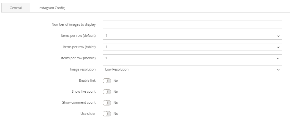
- Number of images to display: Set the number of images to display
- Items per row: The number of images per row to be displayed on some resolution.
- Image resolution: Select the image quality from instagram.
- Enable link: Choose Yes to enable the Instagram link on the image.
- Show like count: Choose Yes to show the number of likes on image.
- Show comment count: Choose Yes to show the number of comments on image.
- Use Slider: Choose Yes to display Instagram images as a slider.
Instagram Shop in Builder
The Instagram Shop element helps to show Instagram shop on your webpage with many options.
If you imported a demo homepage, you only need to enable the builder and edit it.
- On Builder editor, click Add New Block button.
- On popup list blocks, click “Instagram Shop” item.
 CONFIG BLOCK
Facebook Config Tab
 If you haven't got any Instagram Shop yet, you can see an announcement like this:
- Please follow our instruction in the box by go to Admin panel > MGS > Page Builder Setting > Social > Snapppt.
- After that, you will not see Instagram Shop config anymore. Instead, everything you need to do now is to make needed settings in General Config tab.
- Finally, click Submit button to save your changes.
Find out how to install the CMS Page Builder by MageSolution extension for Magento 2 via Composer.
magento_2/page_builder.txt · Last modified: 2021/09/10 08:54 by hshevtsova